Comment
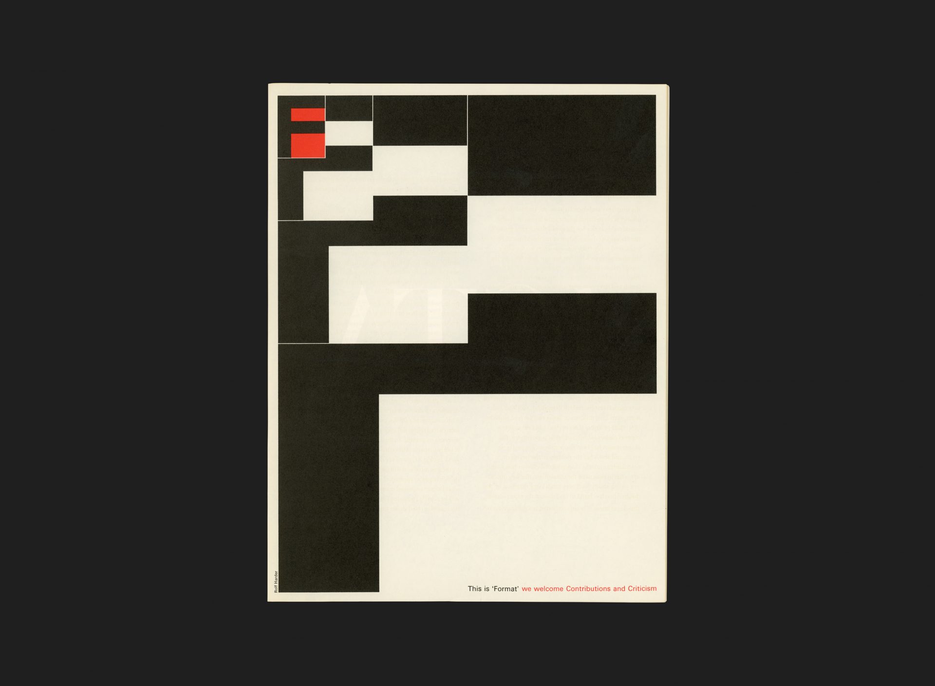
This advert by Rolf Harder was one of two that appeared in the very first edition of ‘Format’, a free magazine produced by the Society of Typographic Designers of Canada (the other was by Italian designer, Franco Gignani). The magazine was designed to set the work and thinking of Canadian designers within the wider context of International typography. It provided a sounding platform for designers and friends and was fully produced by TDC members.
The design of the advert communicates a simple message while reatining the sense of intrigue that is entirely representative of Harder’s work from this time. Conveying the theme of ‘format’ through relative positioning, scale and negative space, along with a nod to his German heritage and the DIN standard.
All Archives
Go Back


