Comment
Oshawa Transit was a public transit operator, run by Oshawa Public Utilities Commission, in Oshawa, Ontario, from 1960 to 2005. In 1972 an extensive review and evaluation was conducted of the system. Part of the actions to come out of this resulted in an improved level of service and a new visual identity. Progressive, fret-free bus services and a clean and sharp identity system.
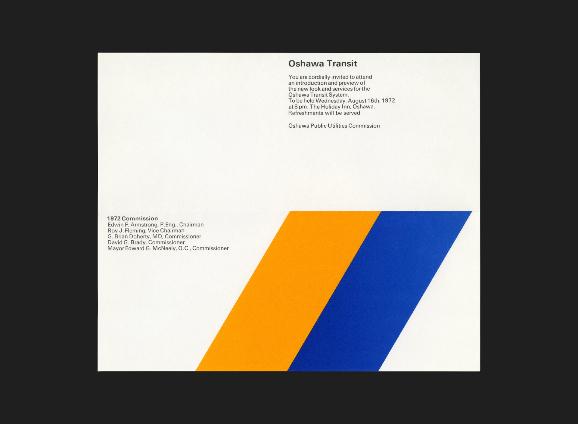
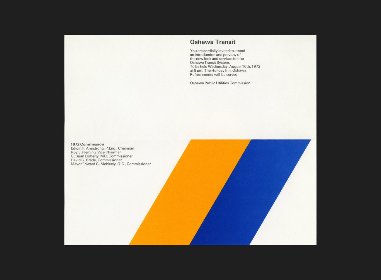
On August 16th, 1972 Oshawa Public Utilities Commission invited guests to attend an introduction to the new look and services for Oshawa Transit. This was the official invitation for that event. The piece is typographically set in Univers and proudly accompanied by the new symbol, comprised of two intersecting yellow and blue parallelograms. The piece folds in half horizontally to fit within an envelope and unprinted on the reverse.
See more G+A work for Oshawa Transit here
All Archives
Go Back


