Comment
The Mennonite World Conference (MWC) organises assemblies of the Anabaptist-Mennonite global family which are hosted at various locations around the world every six years. In 1978, the conference was held in Wichita, Kansas with the theme: ‘The Kingdom of God in a Changing World’. Representatives from over 48 nations were in attendance, including for the first time, a delegation from the Soviet Union. Together with a broader representation from five continents, this was a unique experience in Mennonite history.
In 1976, Glenn Fretz, who was raised as a Mennonite, was introduced to executive secretary Paul Kraybill in Chicago. Kraybill asked Fretz if he could assist with the design of the conference’s publications which were to be presented in five languages. Fretz reviewed the complete scope of the conference requirements and proposed that not only publications but displays and signage be coordinated and included in the scope of work. Fretz spent the next year and a half designing and producing the materials which included a modular cardboard display system and non-verbal pictographic signage.
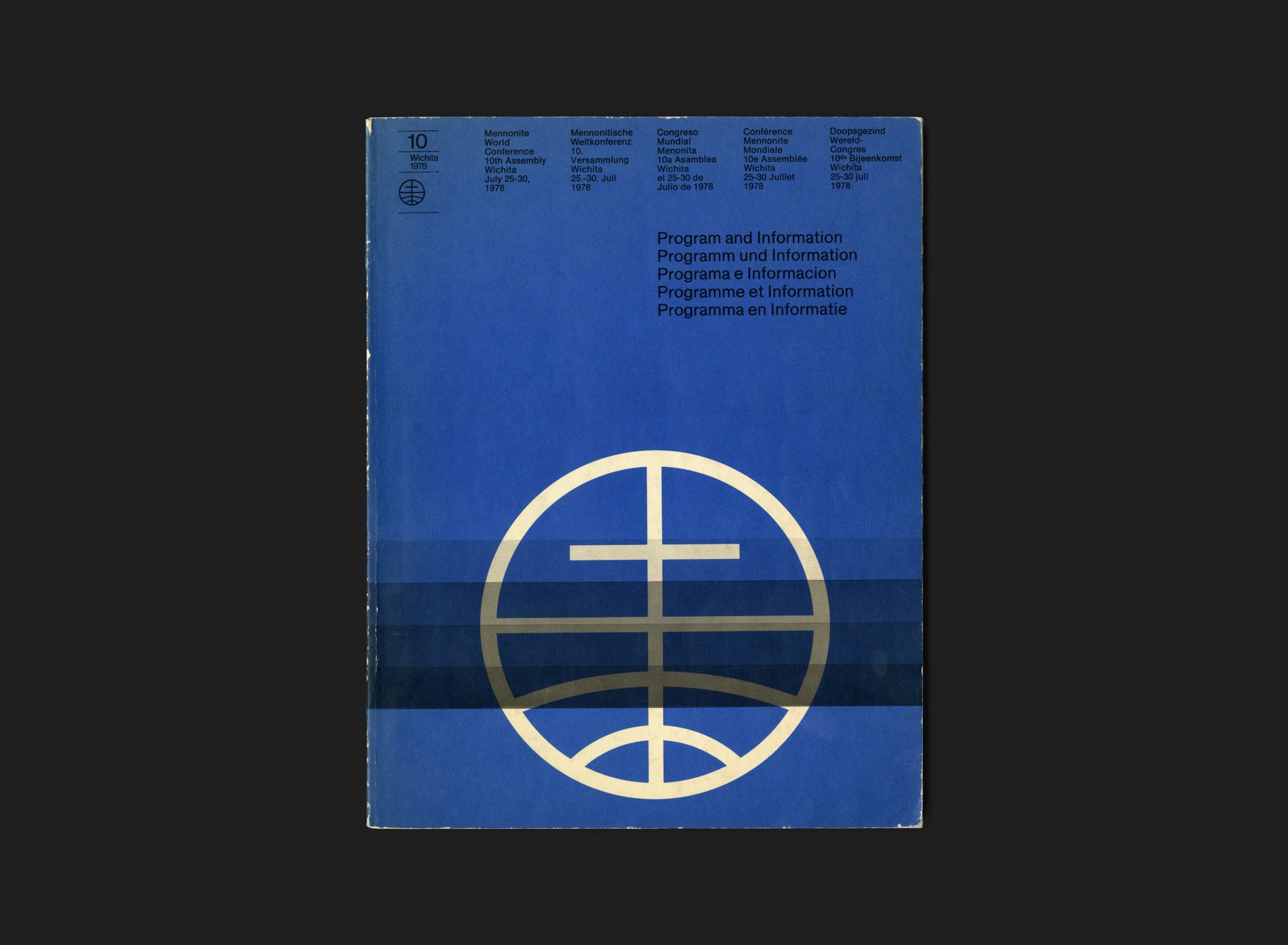
The symbol, which is still in use today, was developed ahead of the conference and represents a global community of members with a common Christian focus.
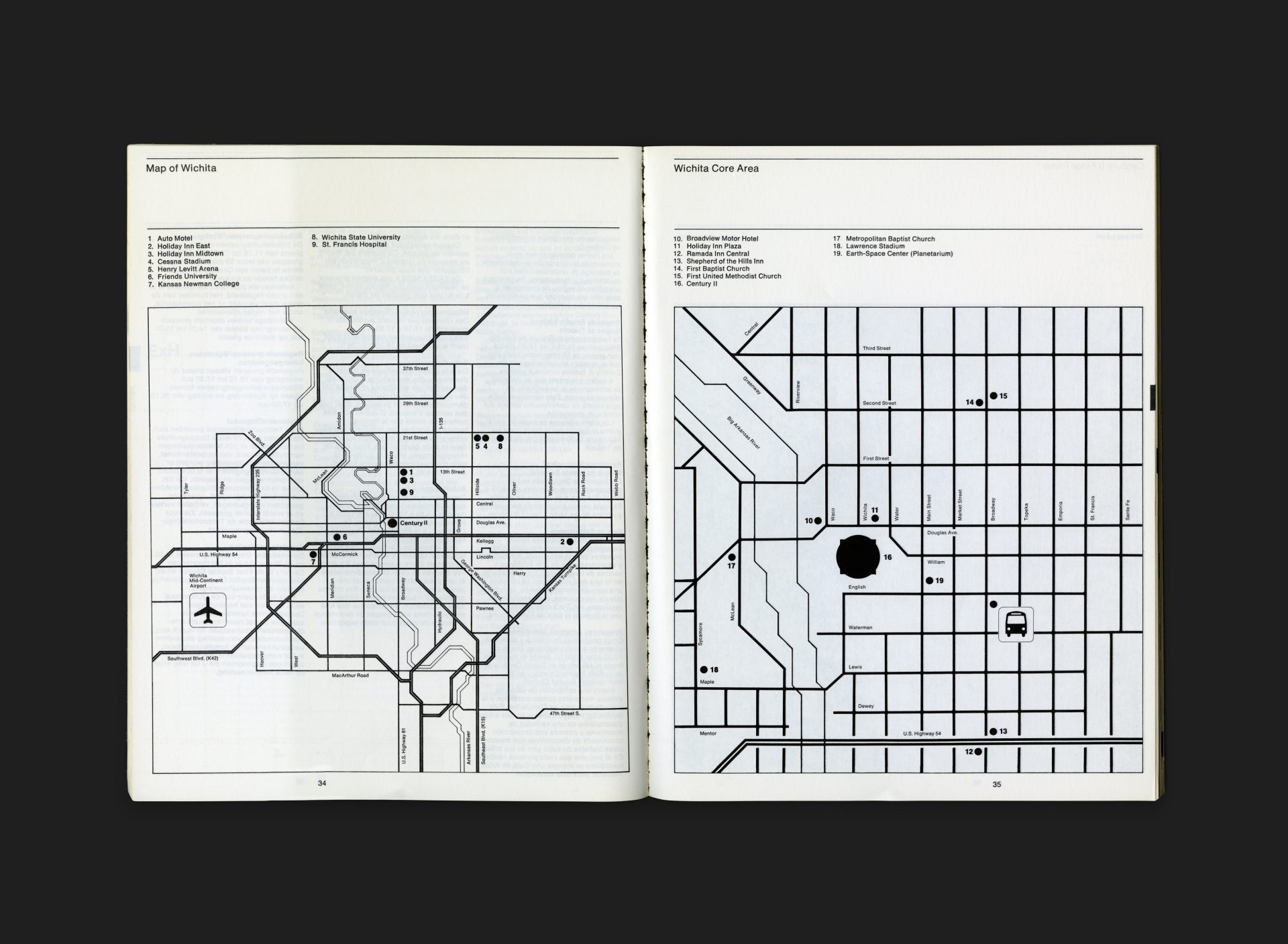
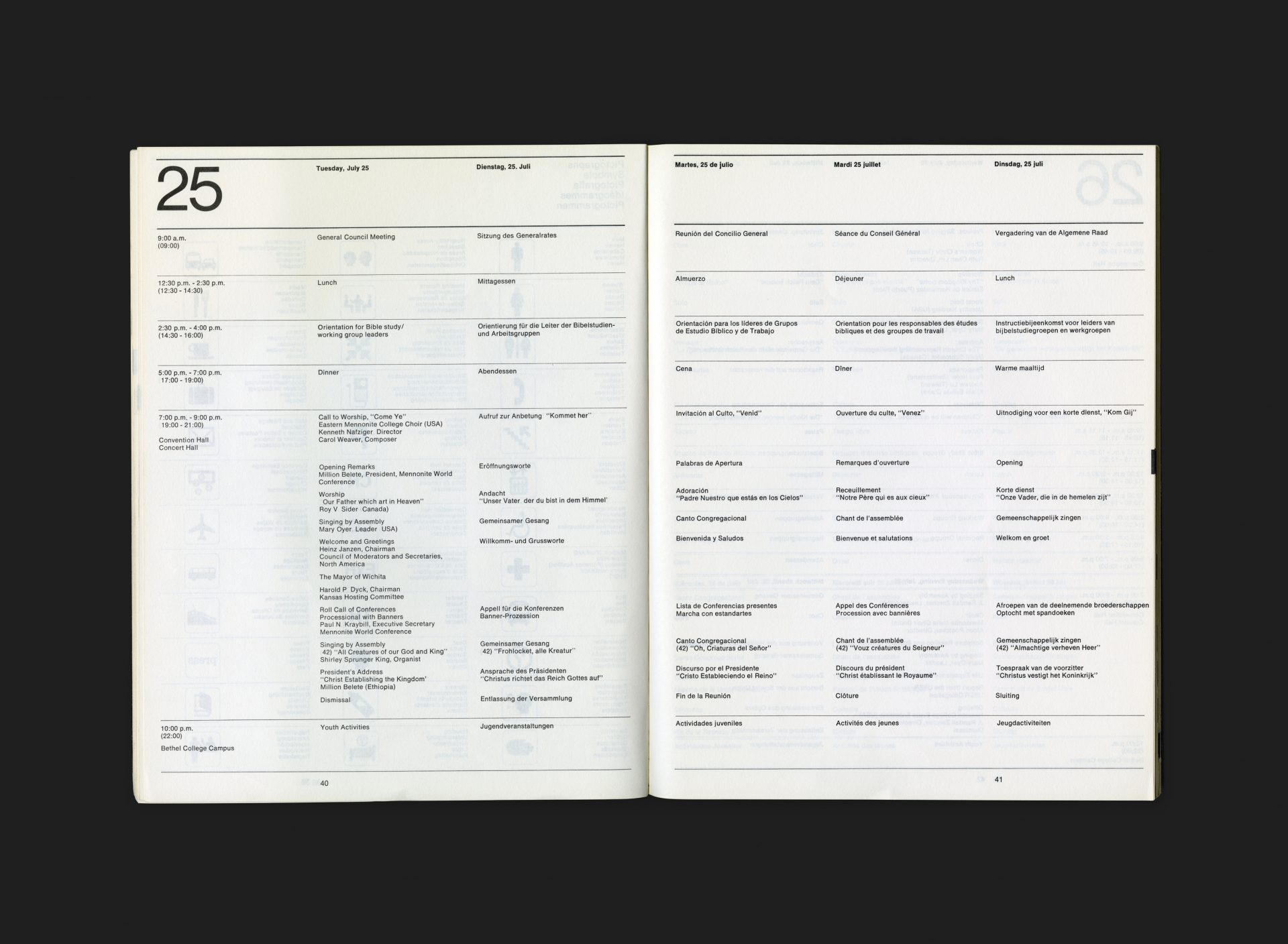
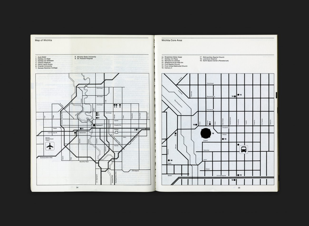
The cover, with its distinctive blue and overprinted graduated black bands, showcases the new MWC symbol which is boldly displayed in the lower half of the page. The text section is printed in black ink only on a strict 12 column typographic grid throughout with some signature Fretz pictographs and rather exemplary maps scattered within for discovery.
All Archives


