Comment
A press release to accompany the launch of Voyageur’s new identity in 1969. It tells the story behind the logo, with the team from Girard Bruce & Associates (led by Anthony Hobbs) travelling on a bus in search of inspiration, and finding it in the parallel lines of the highway, and in the buses themselves.
Unlike more recent logo launches, this one takes a matter-of-fact approach, avoiding hyperbole and grandiose ideas in favour of something much more accessible to the intended audience.
Here is a transcript of the release:
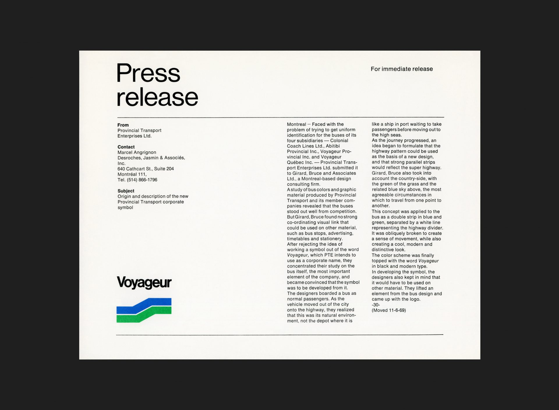
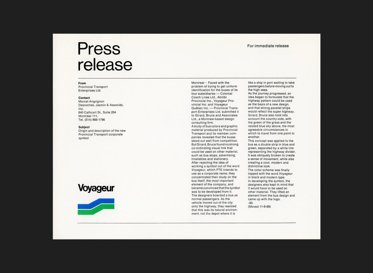
Montreal — Faced with the problem of trying to get uniform identification for the buses of its four subsidiaries — Colonial Coach Lines Ltd., Abitibi Provincial Inc., Voyageur Provincial Inc. and Voyageur Québec Inc. — Provincial Transport Enterprises Ltd. submitted it to Girard, Bruce and Associates Ltd., a Montreal-based design consulting firm.
A study of bus colours and graphic material produced by Provincial Transport and its member companies revealed that the buses stood out well from competition. But Girard, Bruce found no strong coordinating visual link that could be used on other material, such as bus stops, advertising, timetables and stationery.
After rejecting the idea of working a symbol out of the word Voyageur, which PTE intends to use as a corporate name, they concentrated their study on the bus itself, the most important element of the company, and became convinced that the symbol was to be developed from it. The designers boarded a bus as normal passengers. As the vehicle moved out of the city onto the highway, they realized that this was its natural environment, not the depot where it is like a ship in port waiting to take passengers before moving out to the high seas.
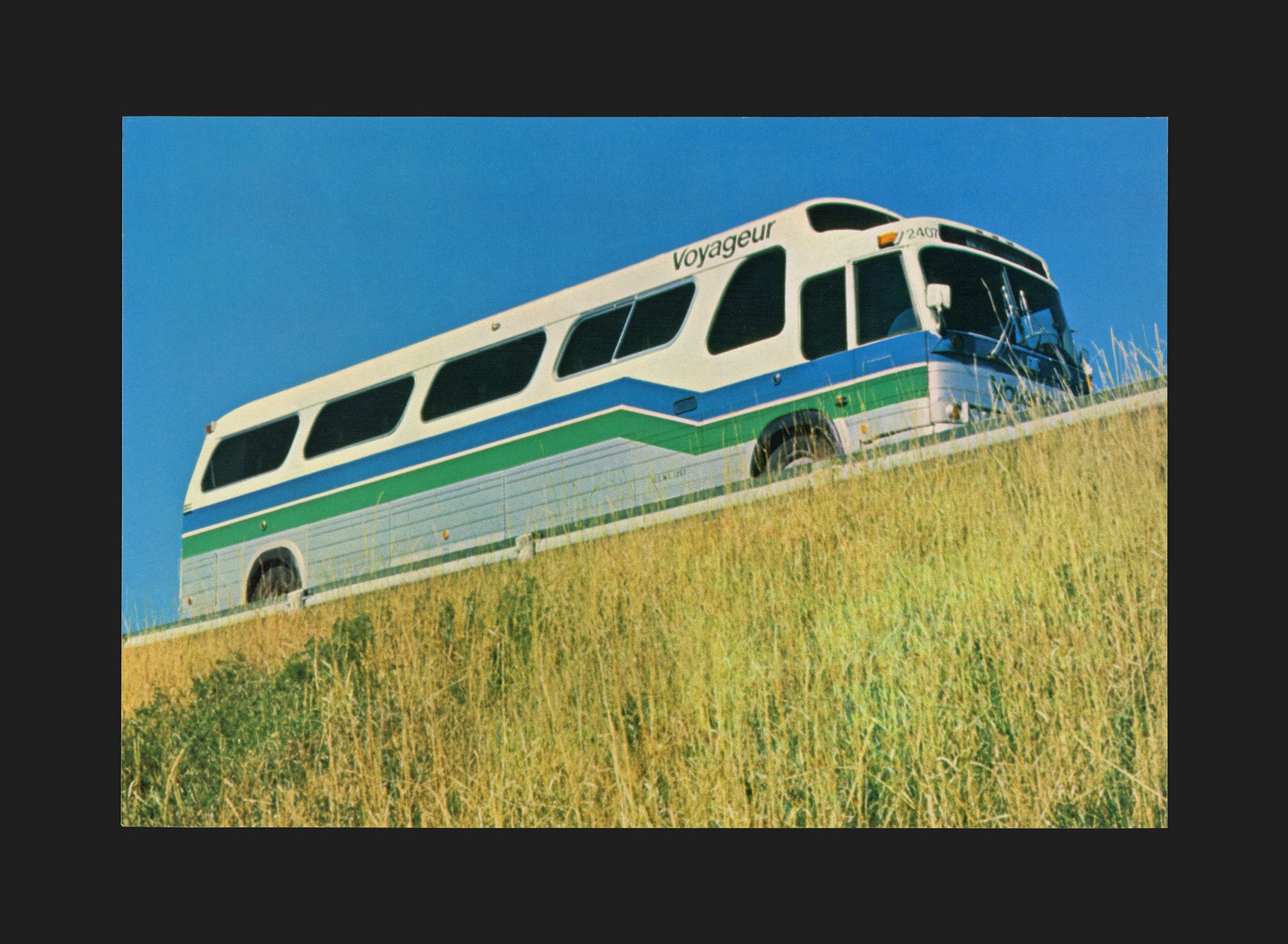
As the journey progressed, an idea began to formulate that the highway pattern could be used as the basis of a new design, and that strong parallel strips would reflect the super highway. Girard, Bruce also took into account the country-side, with the green of the grass and the related blue sky above, the most agreeable circumstances in which to travel from one point to another.
This concept was applied to the bus as a double strip in blue and green, separated by a white line representing the highway divider. It was obliquely broken to create a sense of movement, while also creating a cool, modern and distinctive look.
The colour scheme was finally topped with the word Voyageur in black and modern type. In developing the symbol, the designers also kept in mind that it would have to be used on other material. They lifted an element from the bus design and came up with the logo.
See the final Voyageur Corporate Design Manual
All Archives