


Trademark: TM63
Title: Vancouver Canucks
Year: 1970
Designer: Joe Borovich
Studio: Joe Borovich
Client: Vancouver Canucks
Sector: Professional Sports, NHL Team
Title: Vancouver Canucks
Year: 1970
Designer: Joe Borovich
Studio: Joe Borovich
Client: Vancouver Canucks
Sector: Professional Sports, NHL Team
The Vancouver Canucks are a professional hockey team who compete in the National Hockey League (NHL) as members of the Pacific Division of the Western Conference. The team entered the NHL 1970-71 season as part of the league expansion draft, along with the Buffalo Sabres.
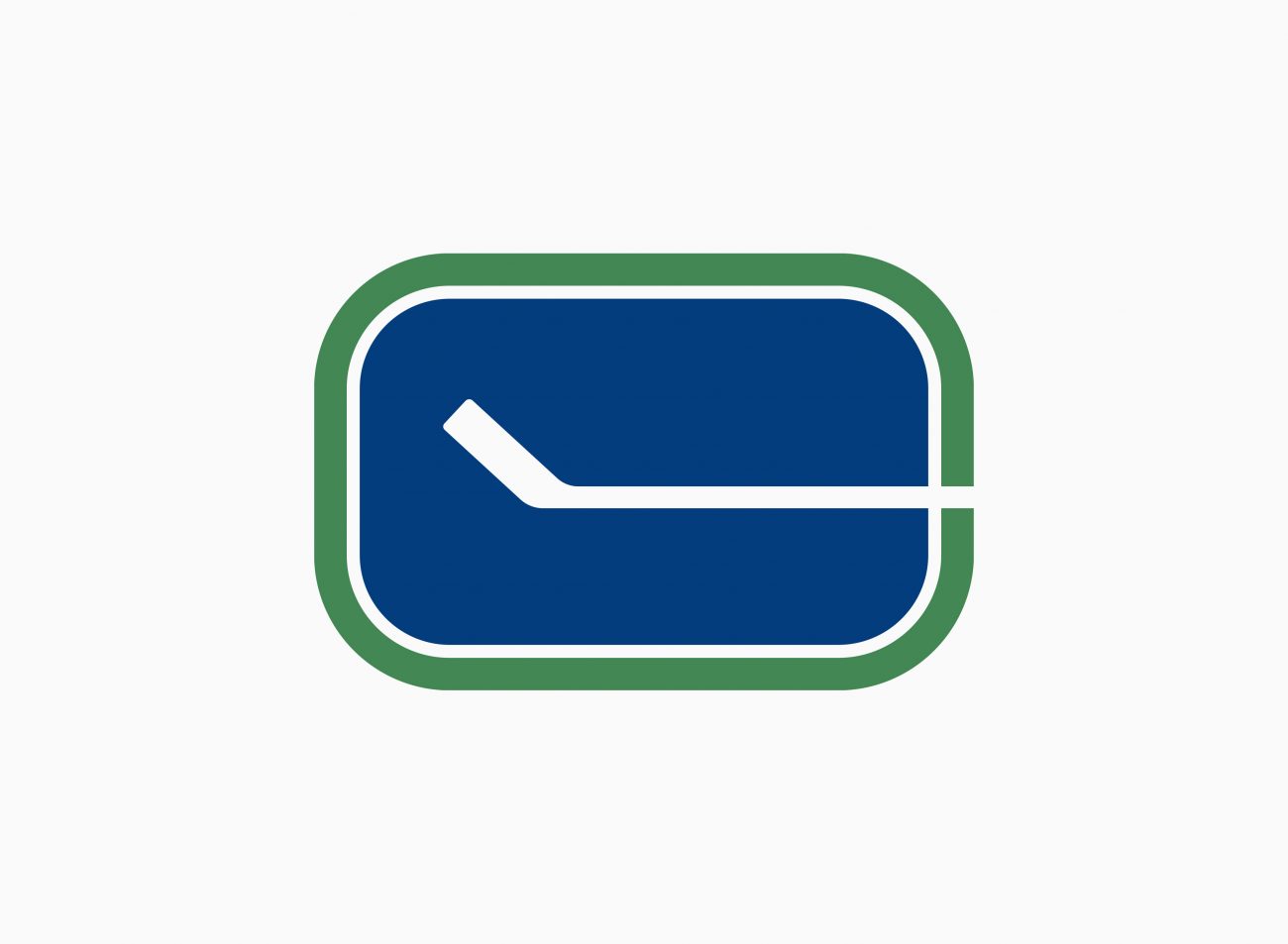
The original Canucks logo was designed by freelance graphic designer Joe Borovich, lifelong hockey fan and nearby resident to the home of the Canucks (the Pacific Colosseum). On hearing rumours that the Canucks would be entering the NHL Borovich speculatively invested some time to develop a new team logo in an attempt to submit it for consideration. His beautifully simple solution incorporates 3 essential elements; the superellipse of the hockey rink, the hockey stick, and the letter C for Canucks. The colours were selected to represent the blue of the Pacific Ocean, the green of British Columbian forests and the White of snow capped mountains. Joe took his concept to owner of the Canucks, Tom Scallen who was taken aback by Borovich’s outstanding work. About a month later Scallan followed up with the designer, having gained full approval to proceed, and invited him in to work on the full roll-out of the new identity program, including uniforms, ticketing and marketing promotion.
After several identity changes during the years that would follow, the original logo and jersey design was reintroduced for a few games in celebration of the Canucks 40th anniversary in 2010.