Comment
The Unity Bank of Canada was a small Canadian bank that was established in Toronto, Ontario in 1972 by Benjamin (Bunny) V. Levinter. The bank was set up, through its charter, as an ‘ethnic’ bank focused on minorities who frequently faced difficulties getting credit and services from a Wasp-dominated financial structure.
President of Unity Bank was Richard Higgins, who at the time of appointment was the youngest ever president of a Canadian Bank at only 39. Whilst the bank expanded rapidly in its first few years, continual controversy erupted in many areas of the business, but most notably stock evaluation, commitment to their constitution, loans, liquidity and problems within their own board of directors. Richard Higgins, as it turned out, was a man who was very charming, very smart, and very crooked. He eventually wound up in jail, and almost nothing about what really happened ever appeared in Canadian newspapers. On February 14, 1977 the Unity Bank amalgamated with the Provincial Bank of Canada, and with that, sweeping its problems under the carpet.
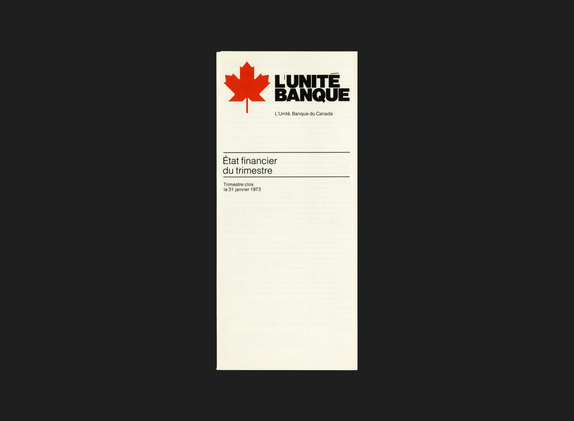
Girard Bruce & Associates, where Anthony Hobbs served as President at this time, undertook the entire corporate identity program for Unity Bank when it opened in 1972. This piece, a French edition of the bank’s quarterly financial statement, was printed economically in black ink with a single hit of red, reserved exclusively for the maple leaf in their logo. The contents arranged in two weights of Helvetica over a standardized tri-fold format, forming part of the larger, consistent, suite of printed collateral.
All Archives
Go Back


