Comment
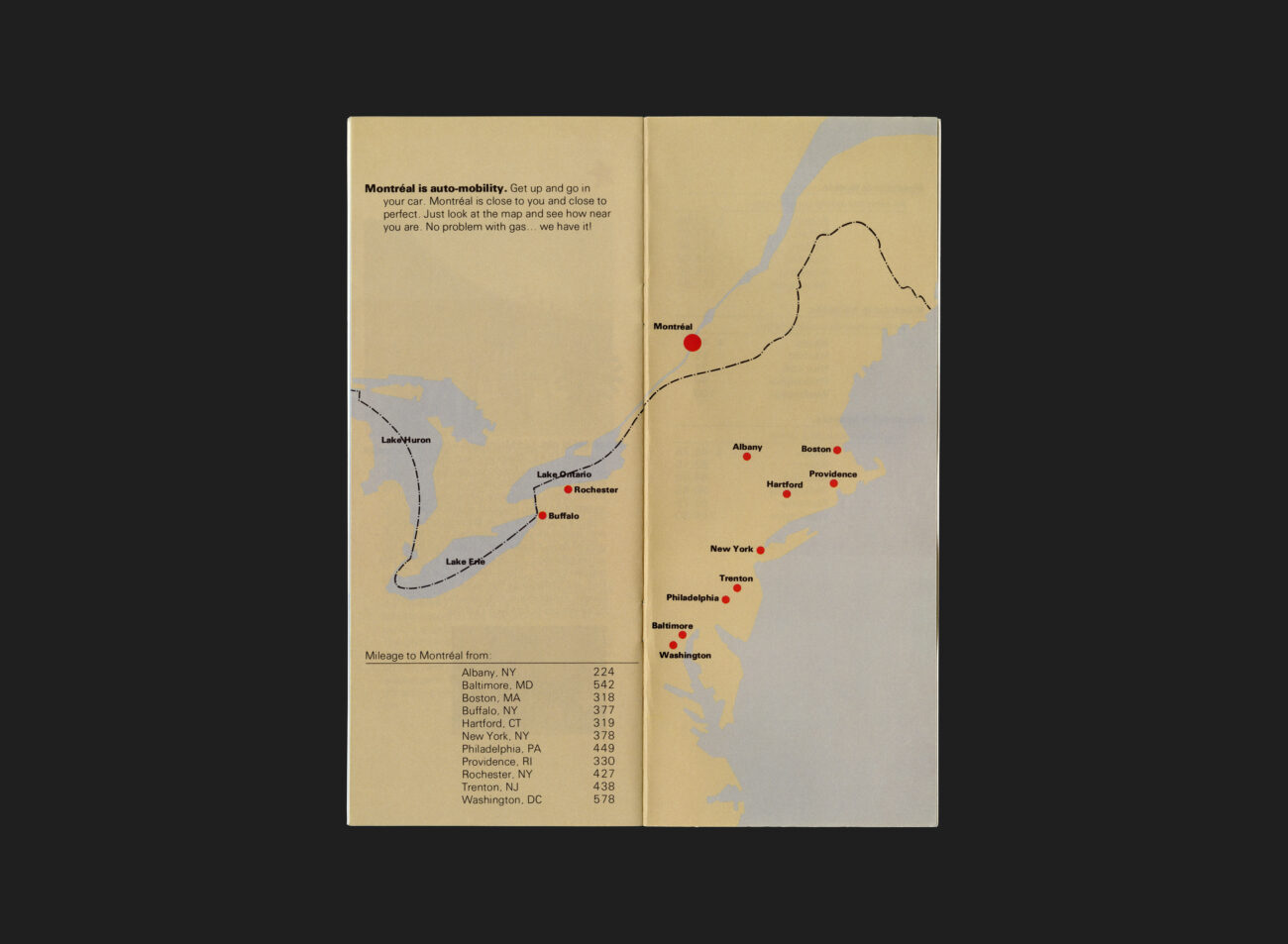
Montréal played host to two landmark international events: Expo 67 and the 1976 Summer Olympic Games. These events spurred significant urban development, blending the city’s historical charm with modern architectural advancements. Due to its proximity to the United States — less than an hour’s drive from the borders of New York State and Vermont — Montréal emerged as a culturally distinct and accessible tourist destination.
However, the late 1970s brought economic challenges, with North America, particularly Canada and the United States, experiencing a severe downturn. By January 1980, the U.S. had fallen into a deep recession. In response, the Snow Ball Superstop program was launched to boost tourism in Montréal. This initiative focused on promoting the city’s winter attractions, the rich cultural and historical heritage of Quebéc, and the appeal of its affordability and easy accessibility, especially through partnerships with U.S. travel agencies.
This piece is undeniably ‘accessible’ in its design and intent. Crafted to resonate with a broad demographic, it strikes a balance between being visually engaging and straightforward in its communication. The layout is clear, the information is easily digestible, and the overall tone invites readers from diverse backgrounds to engage with its content.
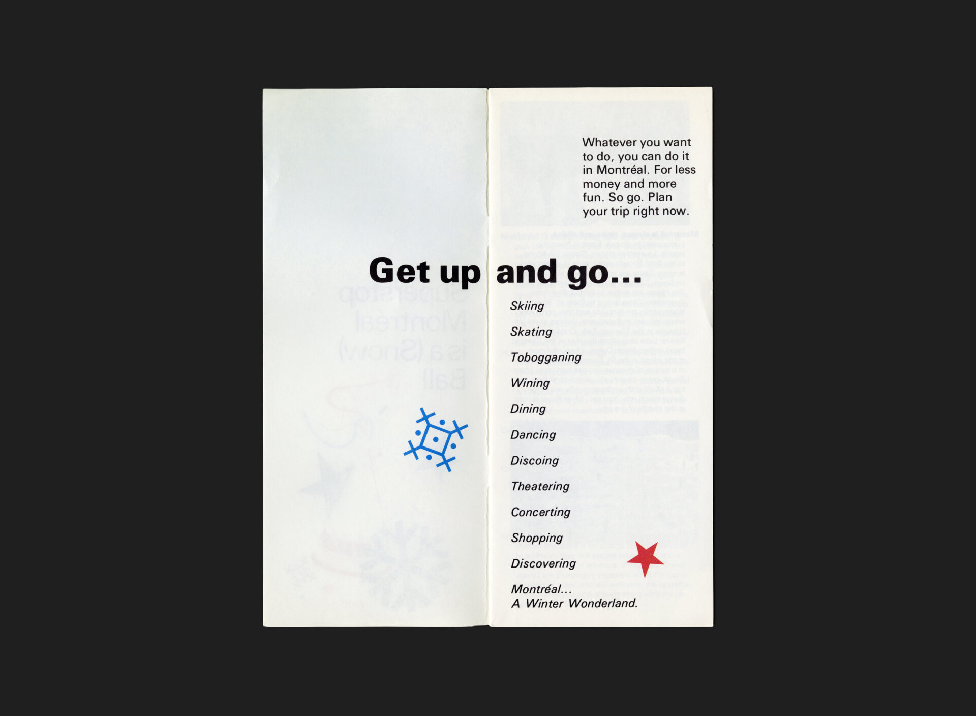
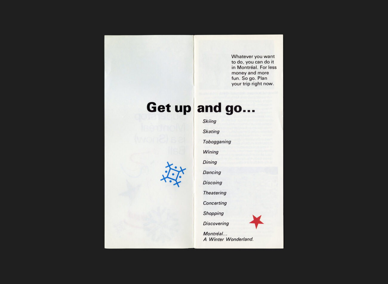
The cover reflects G+A’s hallmark aesthetic of refined minimalism, with a touch of playful energy. Illustrated elements and thoughtful design choices subtly capture Montréal’s enduring joie de vivre — its vibrant spirit and cultural richness. Typography plays a crucial role in the brochure’s impact. The Univers typeface is used exclusively throughout, reinforcing a sense of cohesion and modernity. Its clean, geometric structure aligns perfectly with the piece’s overall design philosophy, further enhancing its clarity and accessibility.
The brochure was designed by Hélène L’Heureux, who would later become a partner at the Montréal-based G+A studio. This project is likely one of her early assignments, offering a glimpse of the design sensibilities that would later define her career. Her approach demonstrates an emerging confidence in visual storytelling and conceptual clarity.
All Archives
Go Back