


Trademark: TM91
Title: Royal Bank
Year: 1979
Designer: Freddi Jaggi, Fritz Gottschalk (Creative Direction)
Studio: Gottschalk+Ash
Client: Royal Bank of Canada
Sector: Banking, Financial
Title: Royal Bank
Year: 1979
Designer: Freddi Jaggi, Fritz Gottschalk (Creative Direction)
Studio: Gottschalk+Ash
Client: Royal Bank of Canada
Sector: Banking, Financial
Founded in 1864 in Halifax, Nova Scotia as the Merchants Bank of Halifax, the institution that would become Royal Bank of Canada grew in near-perfect parallel with Canada itself, pushing westward, consolidating its national presence, and steadily extending its reach beyond our borders. By the mid-twentieth century, that scale demanded a visual identity equal to it.
In 1962, New York-based Lippincott & Margulies answered that call, bringing the bank’s heraldic lion and globe together into a coherent corporate mark. It was a considered evolution, one that preserved the institution’s symbolic heritage while aligning it with the emerging language of post-war corporate design. A solid foundation, and a meaningful one.
By the 1970s, though, the ground had shifted considerably. Branch banking was expanding at pace, architectural signage was becoming increasingly critical, and the sheer complexity of print and environmental applications had outgrown what refinement alone could solve. What was needed now wasn’t a polish. It was a system.
This was the context in which Gottschalk+Ash were commissioned, in 1979, to redesign the Royal Bank identity. The project was led by Freddi Jaggi, one of the firm’s most gifted designers, working under the direction of Fritz Gottschalk in Montréal. It was exactly the kind of brief that G+A were built for.
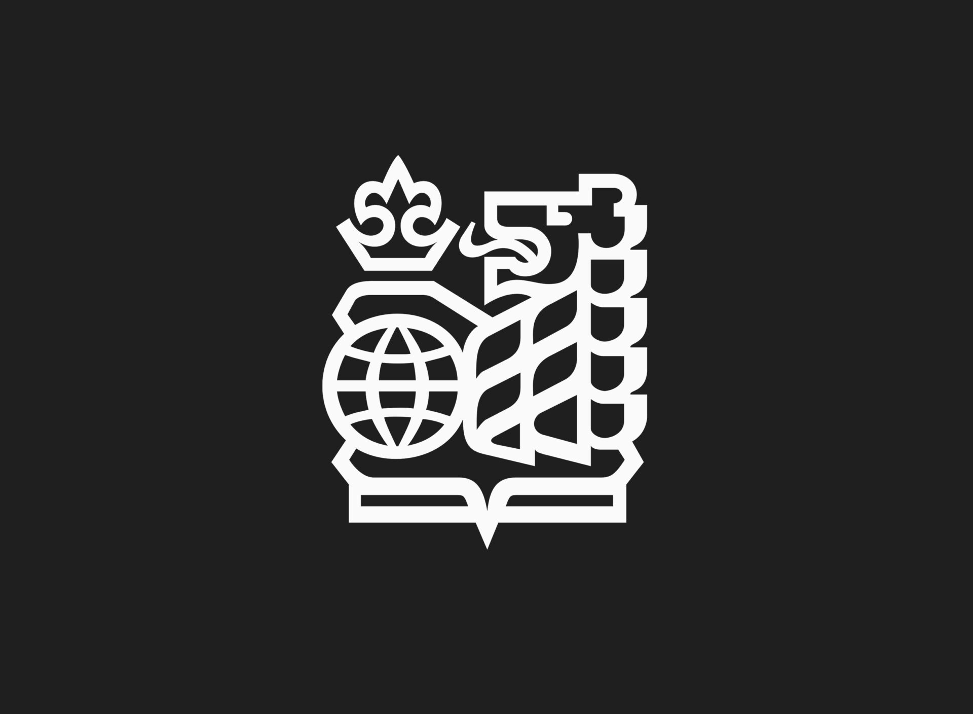
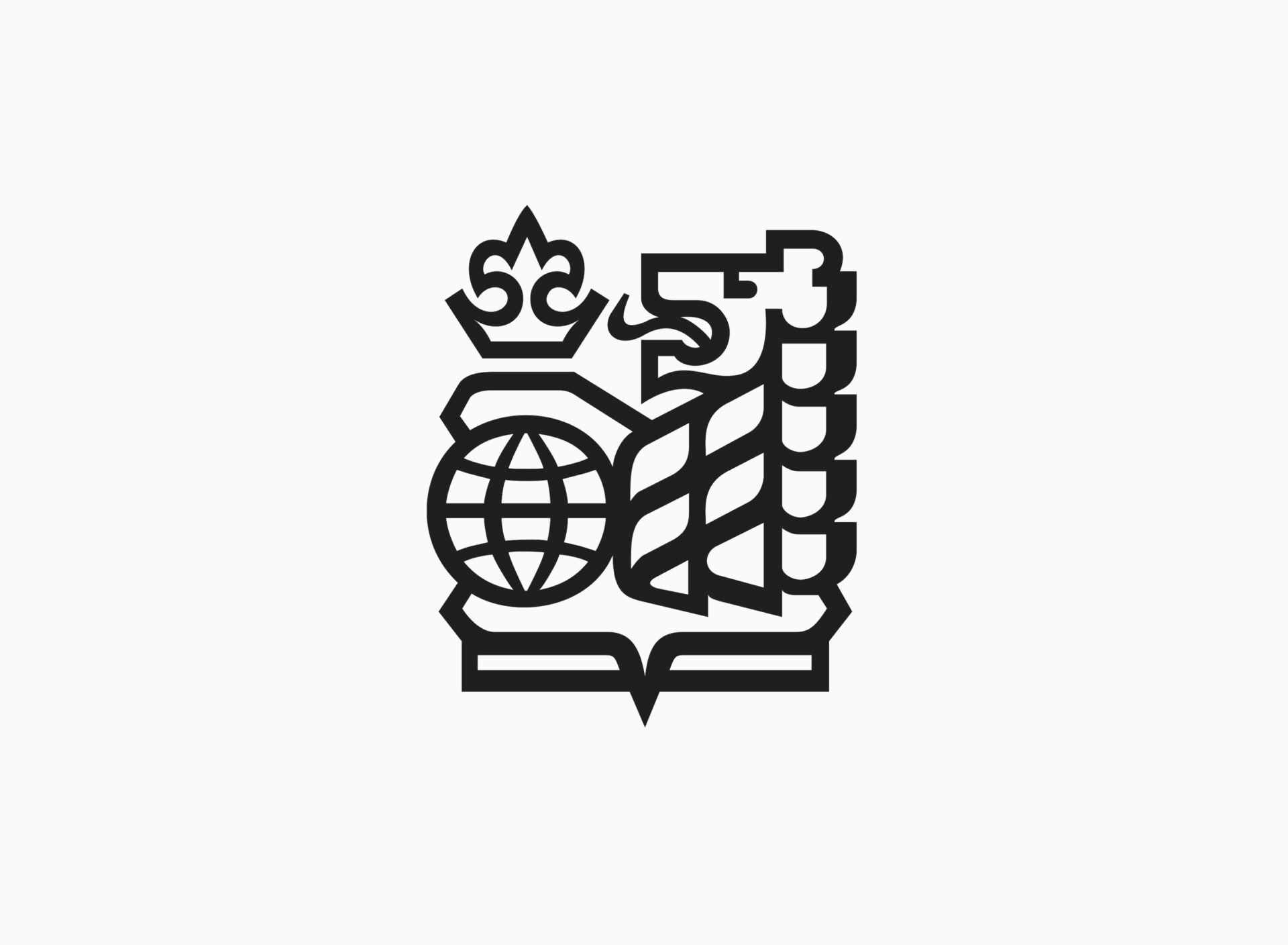
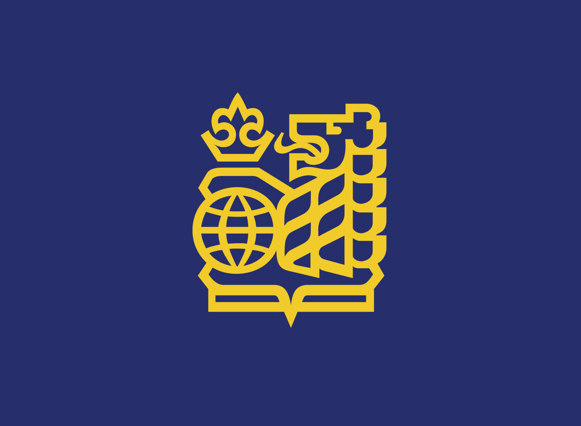
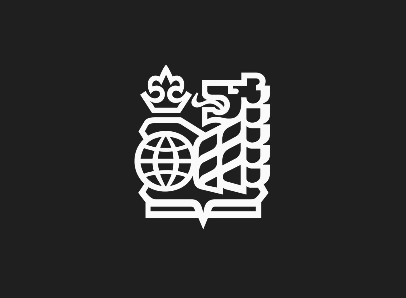
Their approach was evolutionary in appearance, but fundamentally modernist in intent. Crucially, the underlying symbol was not reinvented. The lion and globe, already deeply embedded in the public consciousness, remained. What changed was the rigour with which they were constructed. Jaggi distilled the mark through a disciplined geometric lens: simplifying contours, building contrast, and redrawing the form for clarity and repeatability across every conceivable application. The lion became less illustrative and more declarative. Sharpened, architectural, and built for legibility at scale.
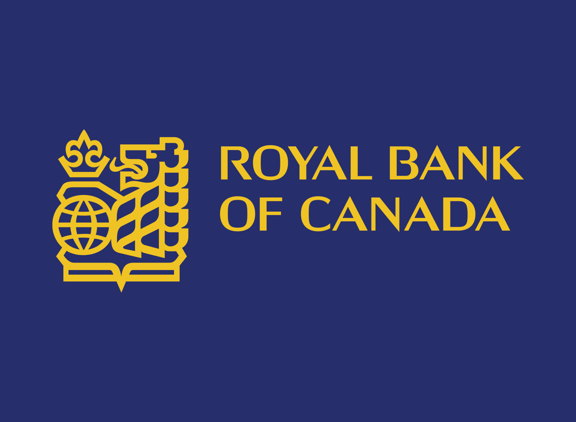
The customer-facing name was shortened to simply ‘Royal Bank’, a pragmatic and strategically astute decision that improved performance across signage and communications alike. The lettering was refined to sit in harmony with the symbol: clean, assertive, and formally resolved.
And of course, as with the finest identity programmes of the period, the logo itself was only part of the achievement. The fuller Gottschalk+Ash team (across both Canadian studios) developed a comprehensive graphic standards manual governing the identity’s use across every touchpoint, from branch exteriors and interior environments through to cheques, stationery, and annual reports. For a bank operating at national scale, this kind of systematic thinking wasn’t a luxury. It was the whole point.
In application, the results spoke for themselves. The bold, simplified lion translated with authority into illuminated signage and large-scale architectural graphics, where recognition and clarity are everything. Across print and environmental applications, the programme brought a new and welcome coherence to the bank’s public face, projecting stability, confidence, and modernity in equal measure. Very Canadian virtues, when you think about it.
The essential form of the Royal Bank symbol remains recognisable today, though it has not stood entirely still. Over the intervening decades the mark has softened, dimensionalised, and adapted to the shifting expectations of contemporary branding. In many respects, that’s understandable. Identities must live in their time.
Yet something was lost in the journey. What Freddi Jaggi and Gottschalk+Ash brought to the 1978 identity was resolution, a word that carries real weight in design. They didn’t simply tidy up the symbol; they rebuilt it on a geometric foundation, transforming a well-considered mark into a rigorously modern one. Where the earlier iteration retained traces of the illustrator’s hand, the 1979 version was conceived as structure. Less a drawing, more a piece of visual architecture, built on proportion, repeatability, and control.
It is precisely these qualities that allow the Gottschalk+Ash version to read as contemporary even now. That’s no small thing for a mark nearly fifty years old, and a testament to the clarity of thinking behind it.