Comment
Reed Paper Canada were, as the name suggests, a pulp and paper company and part of the giant British publishing and paper manufacturing conglomerate Reed International. Toronto-based Nash & Nash were Reed Paper Canada’s (formerly Anglo Canadian Pulp and Paper) official design firm and consultants. In June 1973, on Nash & Nash’s recommendation, Burton Kramer & Associates (which at this time included Allan Fleming), were selected and appointed to develop the corporate identity program for Reed Paper Canada.
You can read more about Reed’s symbol and identity here.
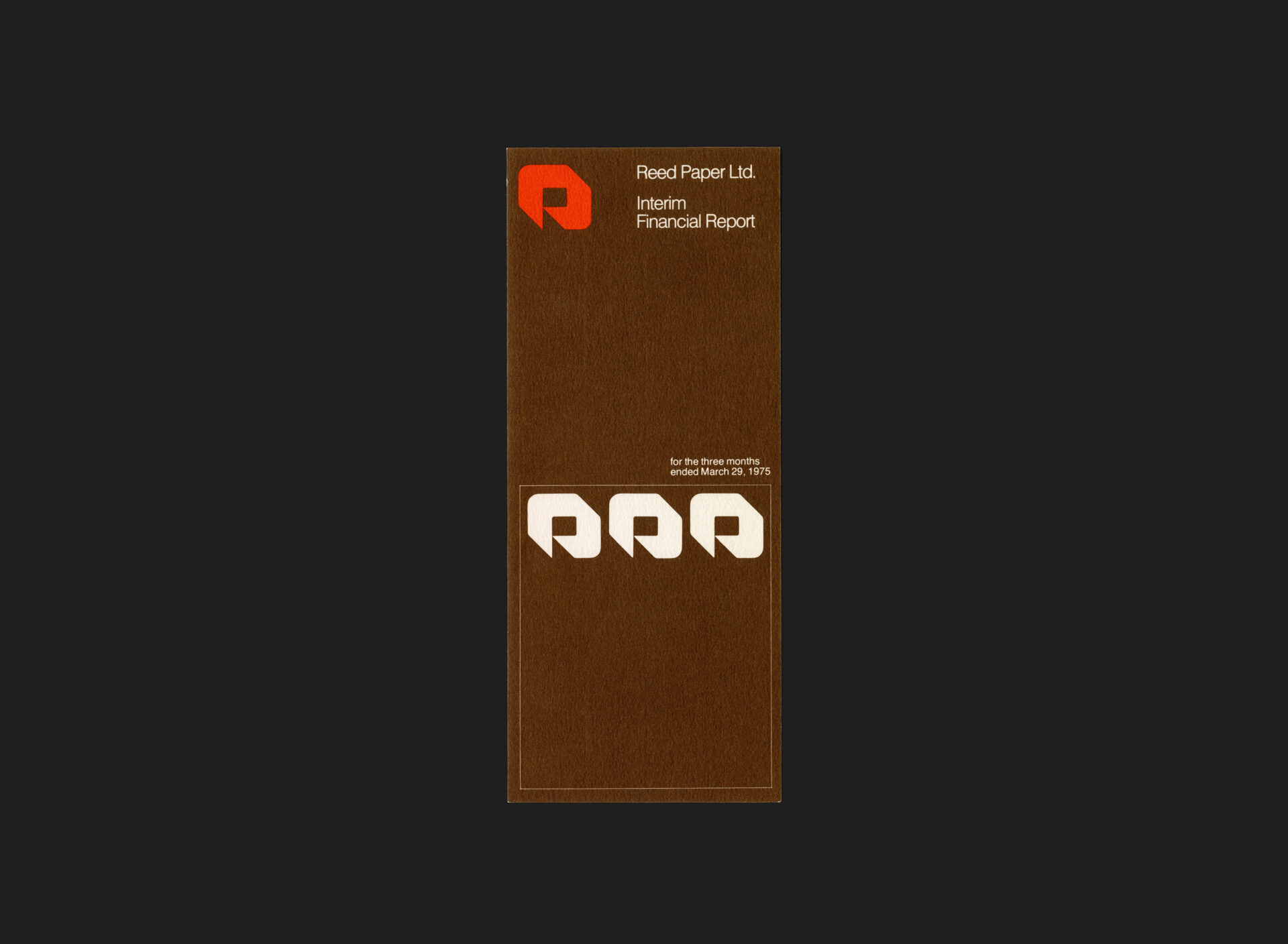
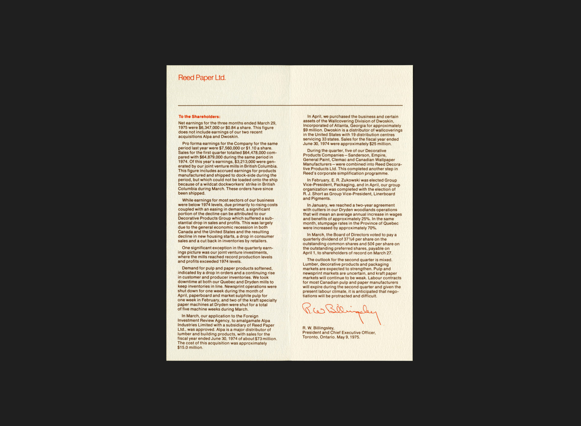
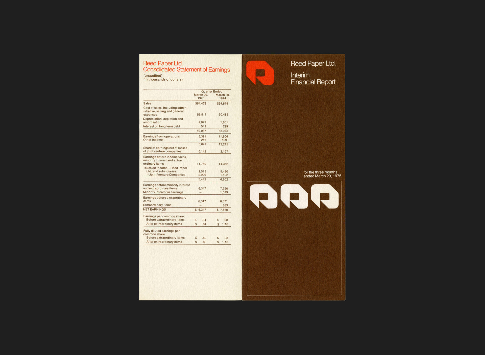
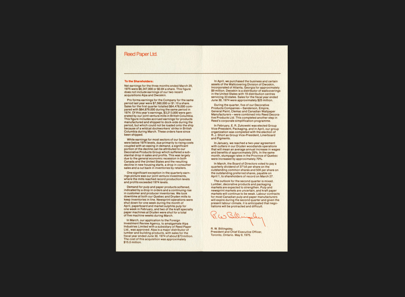
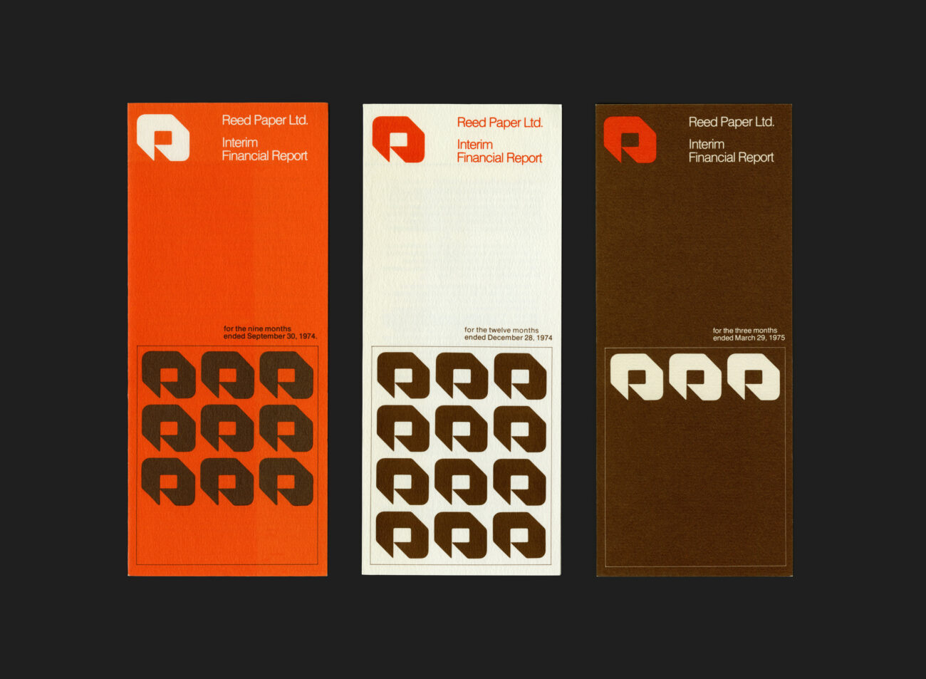
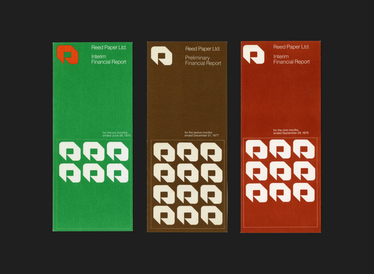
On completion of of the first stage of the identity roll-out (logo, letterheads, forms, vehicles, signage, etc.) by Burton Kramer & Associates, Nash & Nash continued with the work. One such example is this series of interim financial reports. Produced quarterly, the reports were intentionally straight forward and accessible in nature, providing the necessary highlights, plans, and financial figures at a glance. Each edition utilized a colour combination related to the official brand palette to distinguish from one another. The systematic arrangement of stacked symbols (in groups of 3) was a wonderful visual touch, used to illustrate the particular quarter being presented (each symbol representative of a single month) and where you were in the year. Rod and Liz Nash worked on these reports for around 6 years straight.
Nash & Nash continued to work with Reed (and later again Daishowa) for many decades and through a number of reorganizations, including takeovers and name changes. This ended when the problematic Enron took control.
Reed International today is largely concerned with publishing in the UK and USA.
All Archives


