Comment
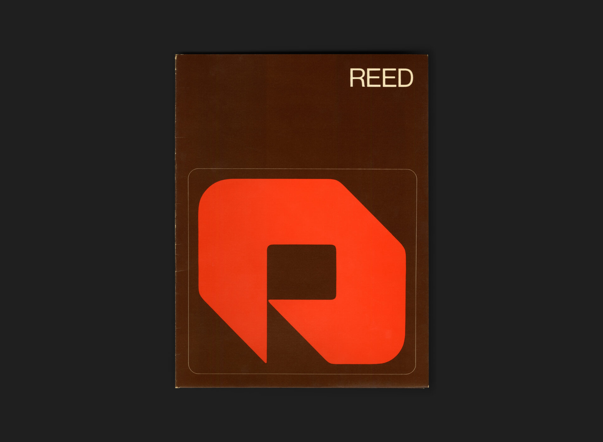
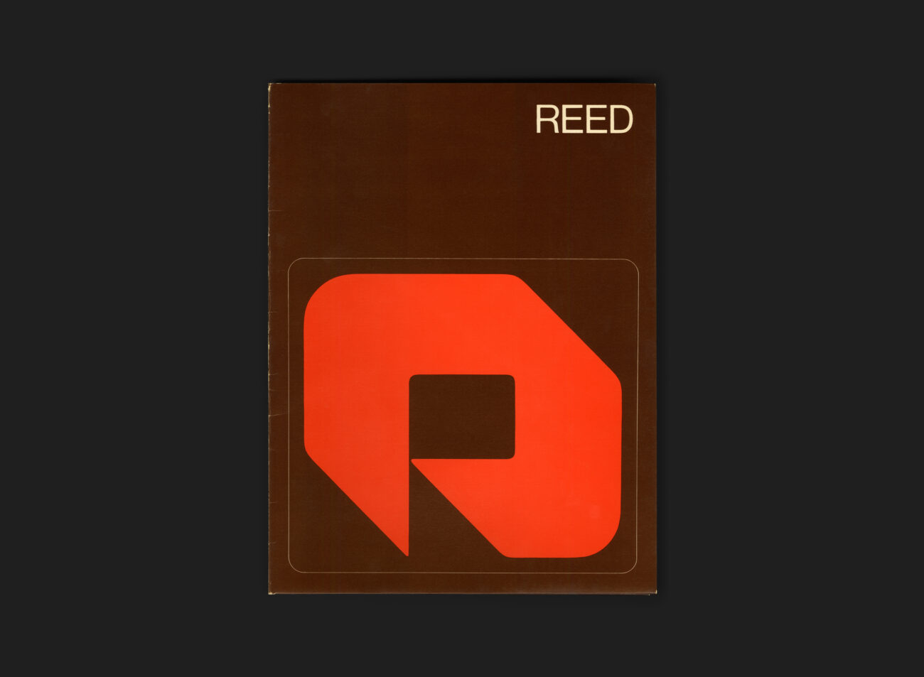
When Burton Kramer Associates were commissioned in June 1973 to develop a new corporate identity program for Reed Paper Canada, the work extended beyond symbols and guidelines to an extensive suite of stationery and business materials. Among these was this simple but carefully constructed card stock folder. Printed in Reed’s Brown and Orange-Red corporate palette, the cover pairs the Reed symbol, set within a rounded-corner offset rectangle, with the wordmark positioned at the top right, a composition that reflects the measured, modern character of the broader system.
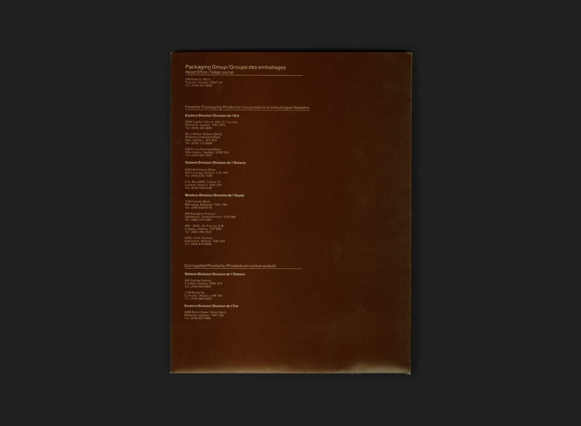
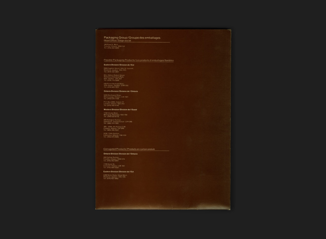
The back cover carries the practical information required of such stationery: headquarters for the Reed Packaging Group on Toronto’s King Street, followed by regional office listings for both flexible and corrugated packaging products across Canada beneath. Functional in purpose yet deliberate in execution, the folder illustrates the thoroughness and cohesion that defined Kramer’s identity work for Reed Paper.
All Archives
Go Back