Comment
In June 1973, Burton Kramer Associates were appointed to develop a new corporate identity program for Reed Paper Canada, part of the giant British publishing and paper manufacturing conglomerate Reed International.
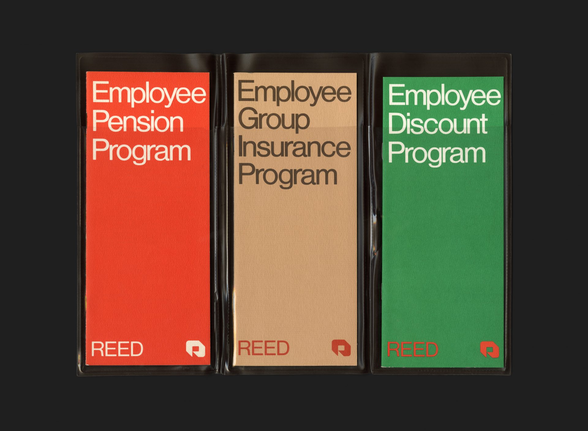
Following the roll-out of the identity program, and in the years that followed, Nash & Nash (who had previously been working with Reed) were retained and commissioned to implement much of the new look into various roll-out collateral, advertising and communications. This suite of employee benefits brochures is one such example.
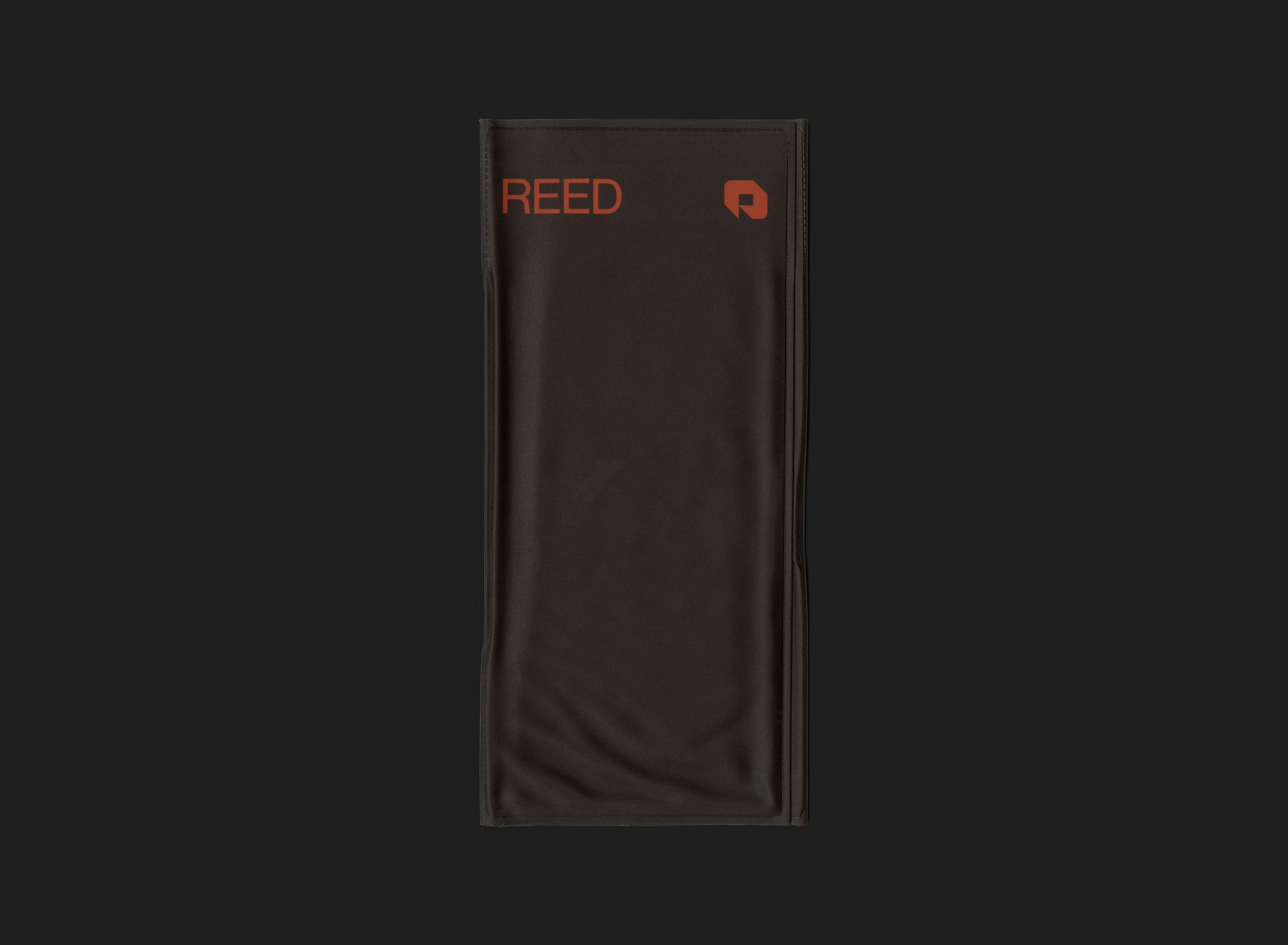
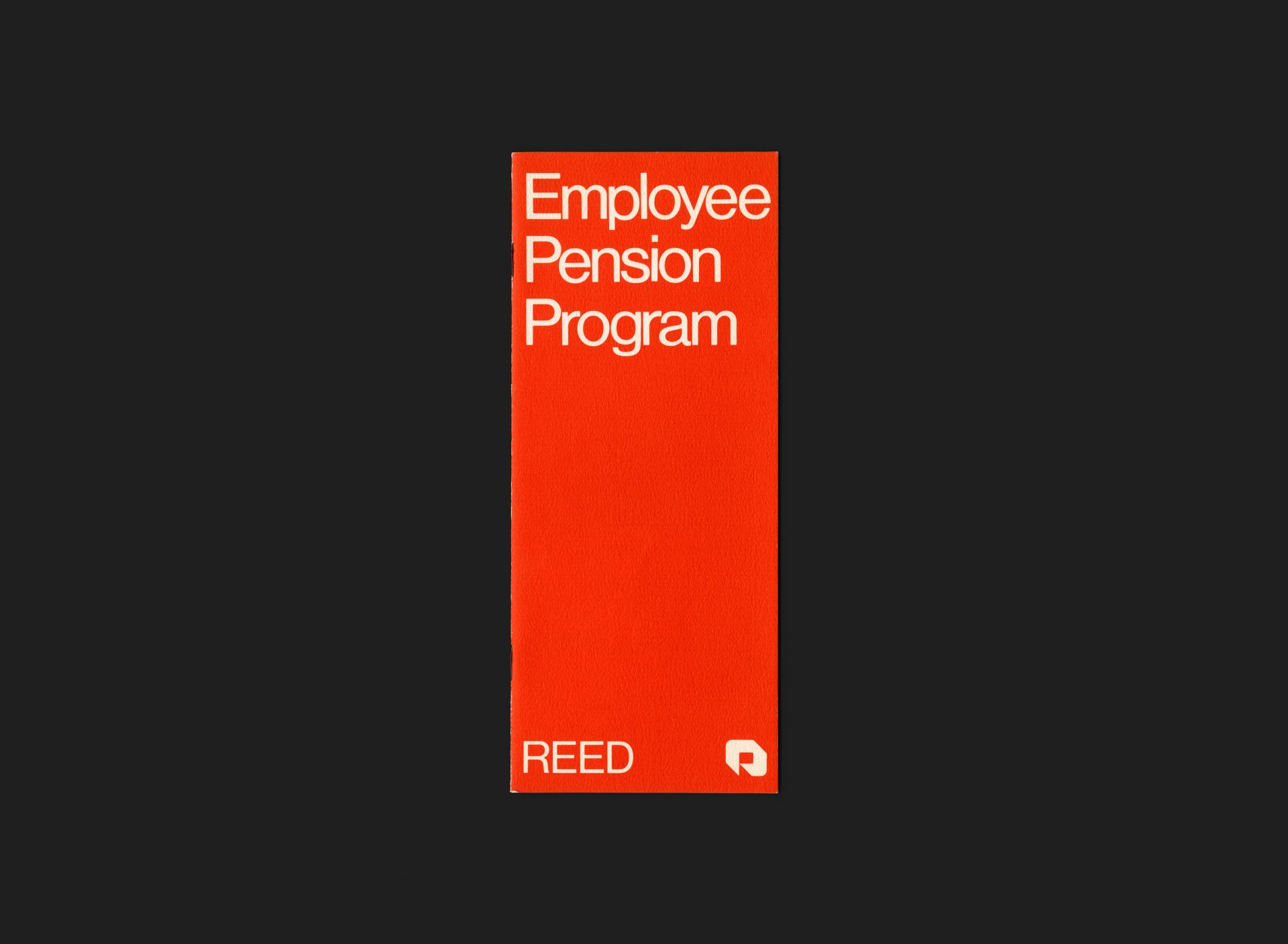
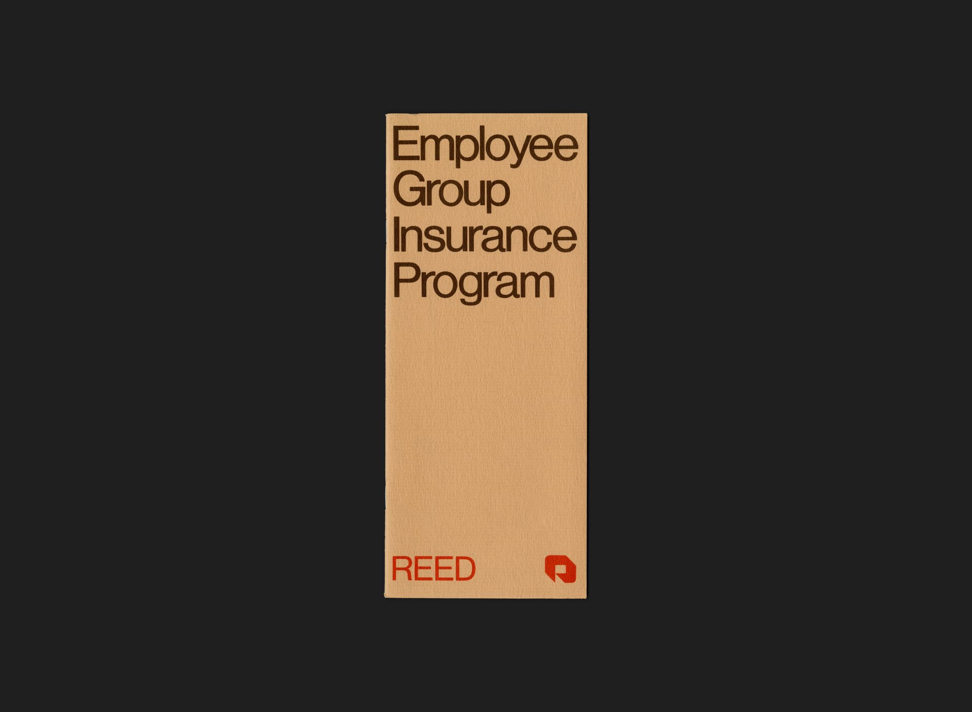
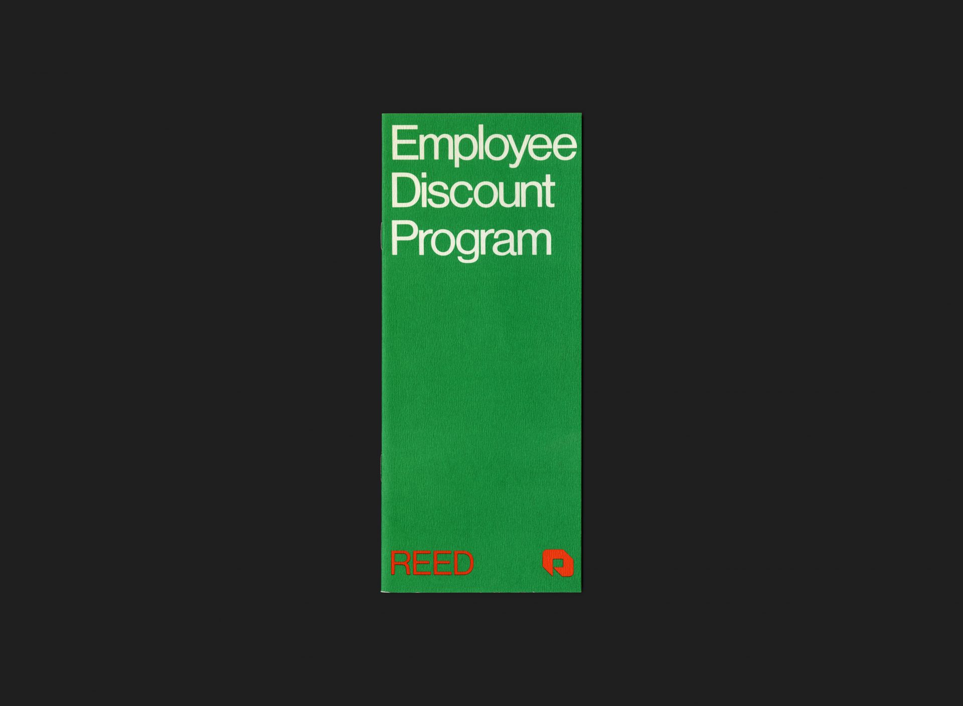
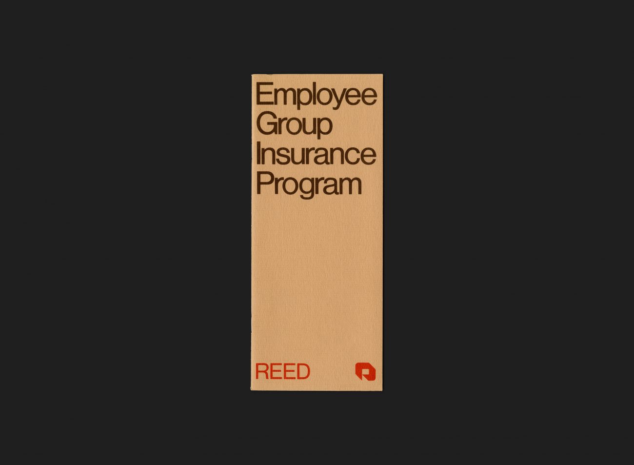
The suite comprises of a set of 3 informational brochures, each covering a particular benefit and forming part of the employee benefit program offered by Reed to its staff. The brochures are individually colour coded using the official brand palette: pensions in orange, insurance in beige, and discounts in green. They are compiled together in a brown, vinyl formed, tri-fold wallet, and each contained within’ a clear pocket inside. The front of the wallet is printed with the Reed wordmark (left) and symbol (right) in brand orange / red. Typography in Helvetica throughout.
All Archives
Go Back


