Comment
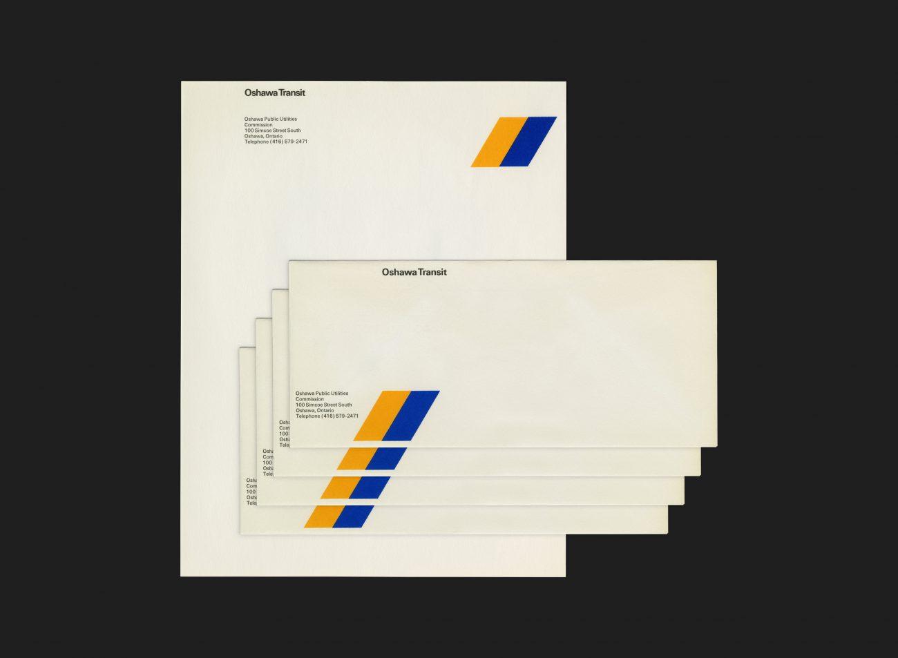
Oshawa Transit was a public transit operator, run by Oshawa Public Utilities Commission, in Oshawa, Ontario, from 1960 to 2005. In 1972 an extensive review and evaluation was conducted of the system. Part of the actions to come out of this resulted in an improved level of service and a new visual identity. Progressive, fret-free bus services and a clean and sharp identity system. The new look and services were launched on August 16th, 1972.
G+A created total identity systems for numerous transit authorities across Canada, including new names and symbols, plus a comprehensive set of applications that included vehicle livery, interiors/exteriors, stationery, timetables, maps, uniforms and advertising. These projects were commissioned through a relationship they developed with a firm of transit consultants, working with the relevant transit authorities and mayor’s office in each city. The aim for each was to increase passenger numbers by creating a strong public image that would reflect positively on each transit authority.
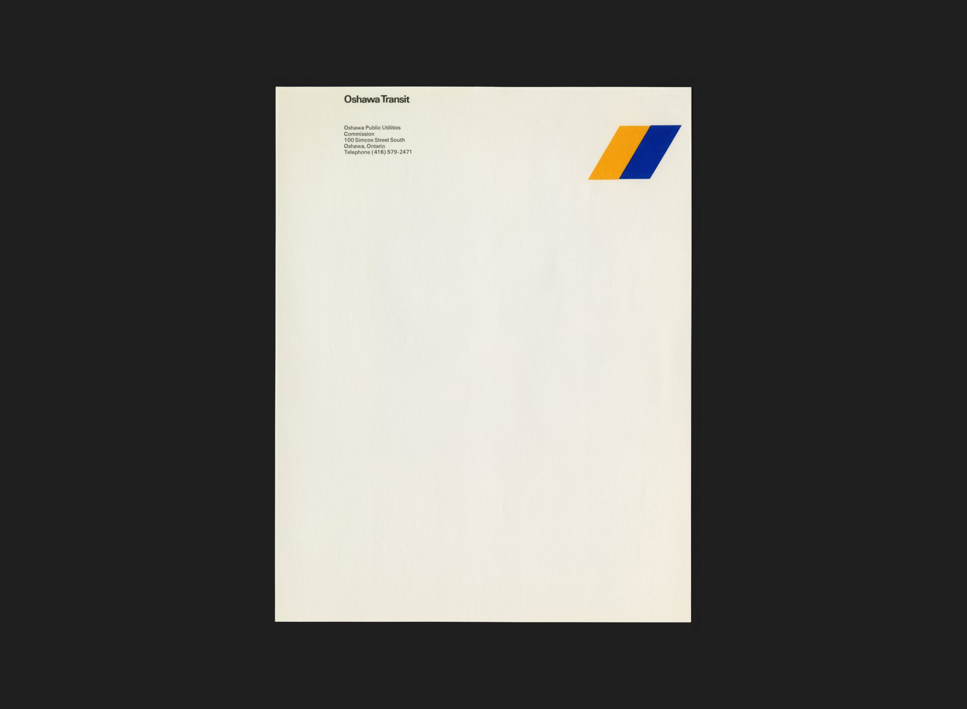
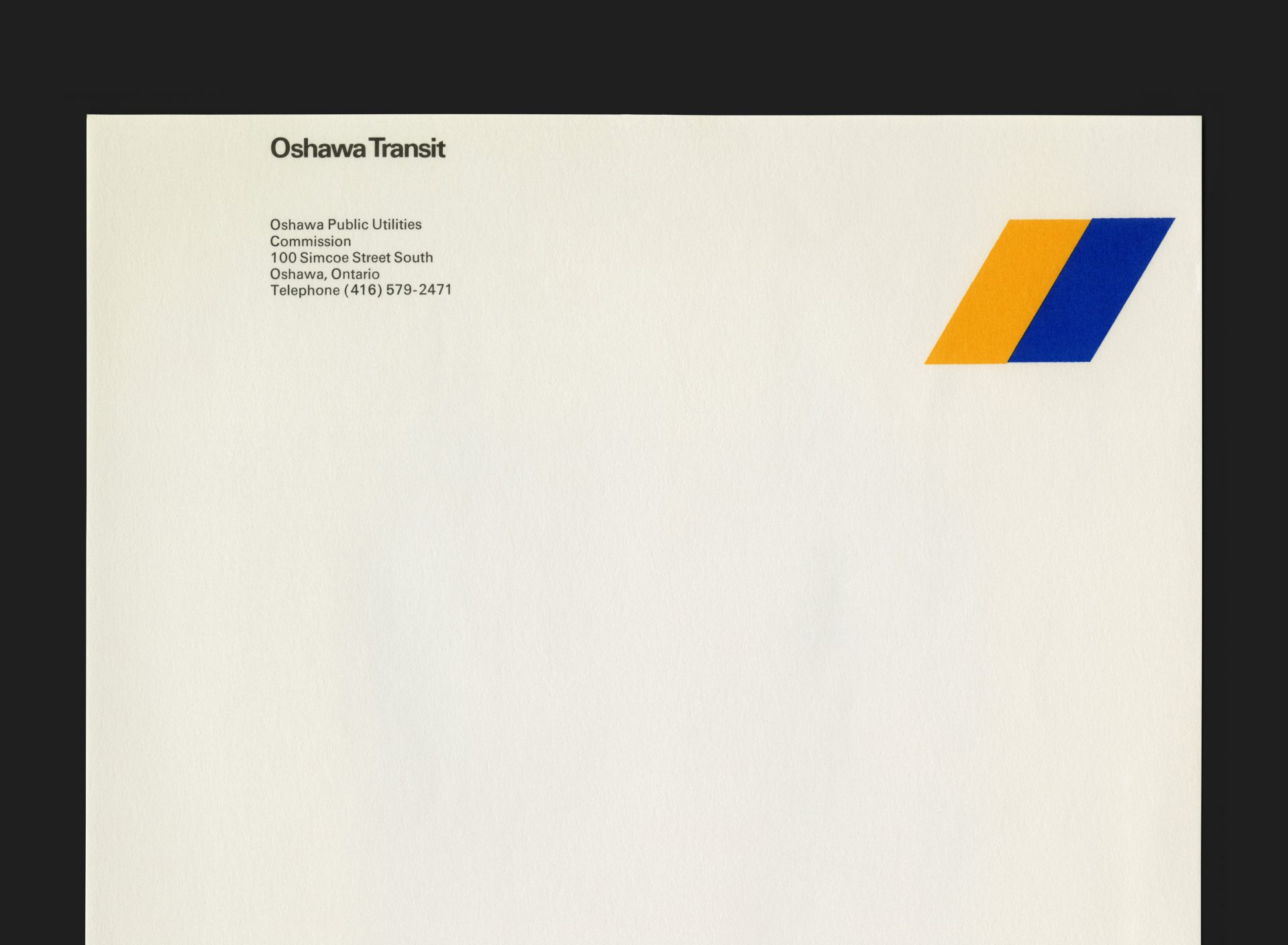
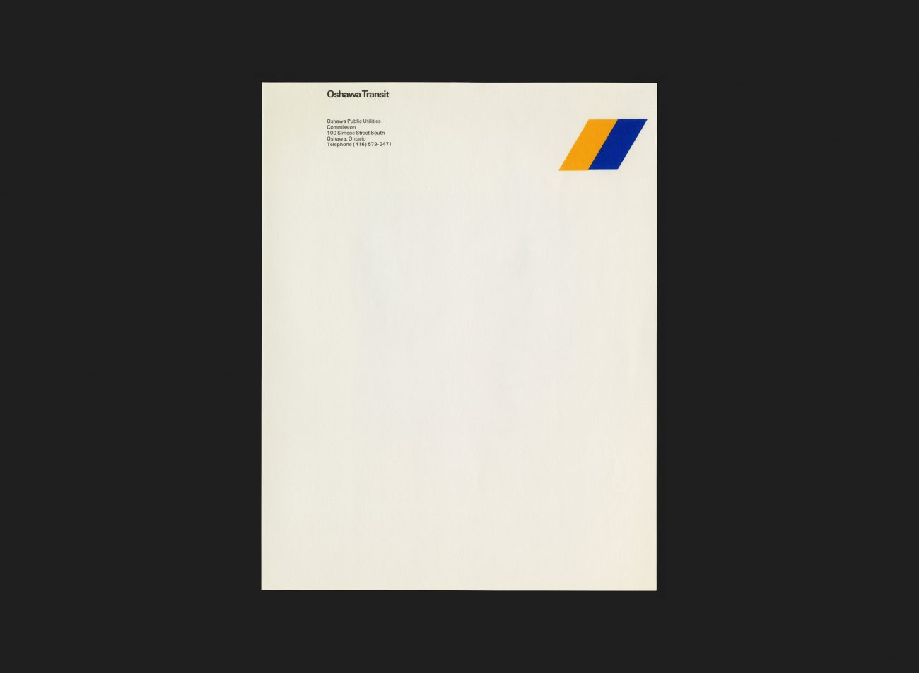
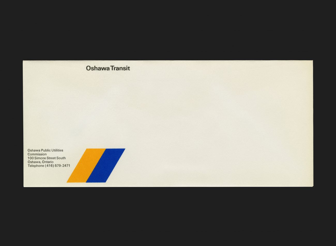
Stuart Ash led the work on Oshawa Transit with help from Tiit Telmet. This was one of the earliest in a series of projects for clients in this field. The symbol is comprised of two intersecting parallelograms, one yellow and the other blue. This provided a simple but hugely effective device which was both dynamic as a brand element, but more importantly — highly recognizable on the livery of the buses themselves at large ‘supergraphics’ scale. Typography reinforces the look and is set in Univers.
See more G+A work for Oshawa Transit here
All Archives


