Comment
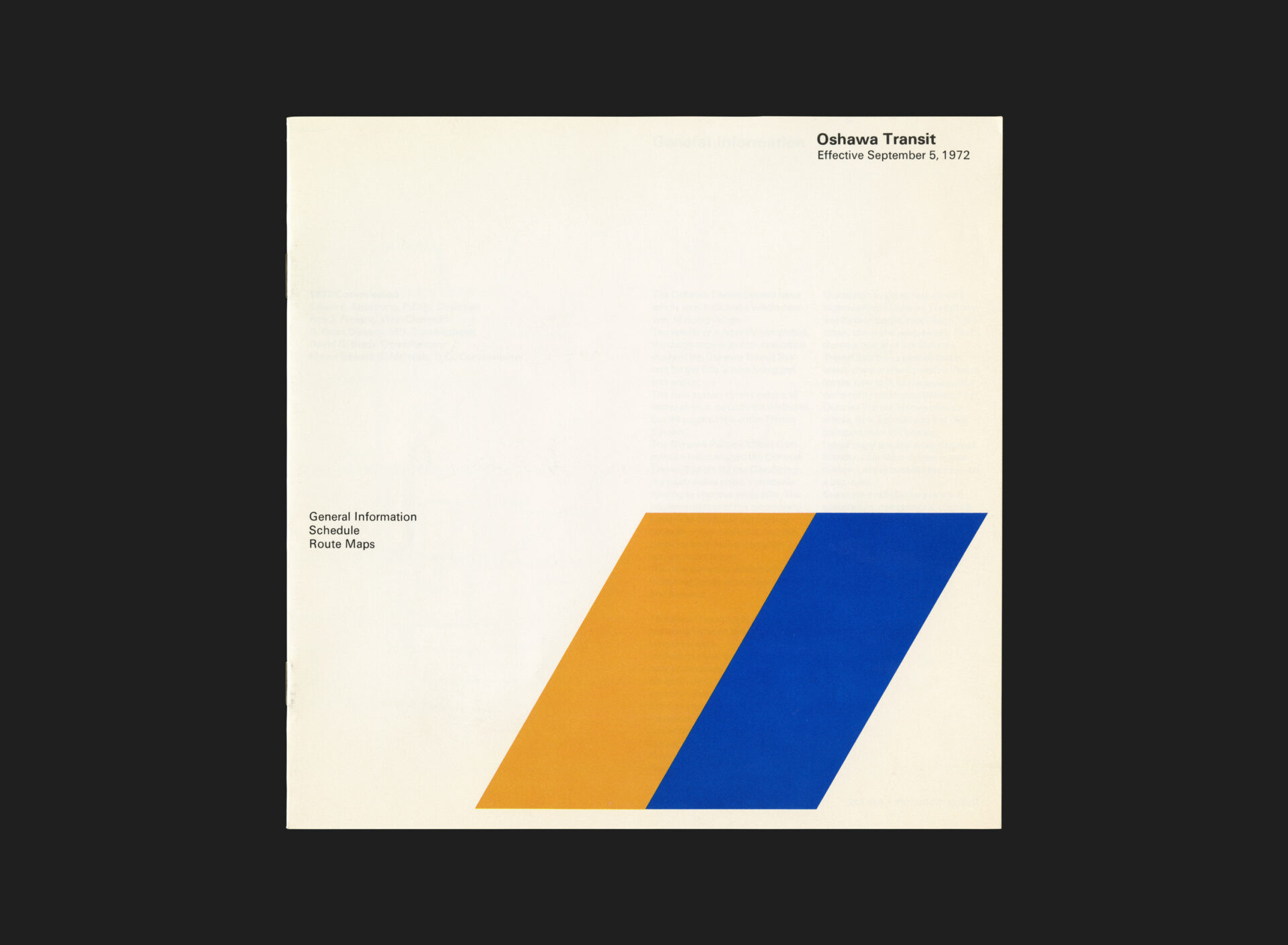
In the early 1970s, Oshawa Transit underwent a significant transformation aimed at modernizing its services and visual identity. Central to this initiative was the creation of a new transit schedule, designed to reflect the system’s renewed commitment to clarity and efficiency.
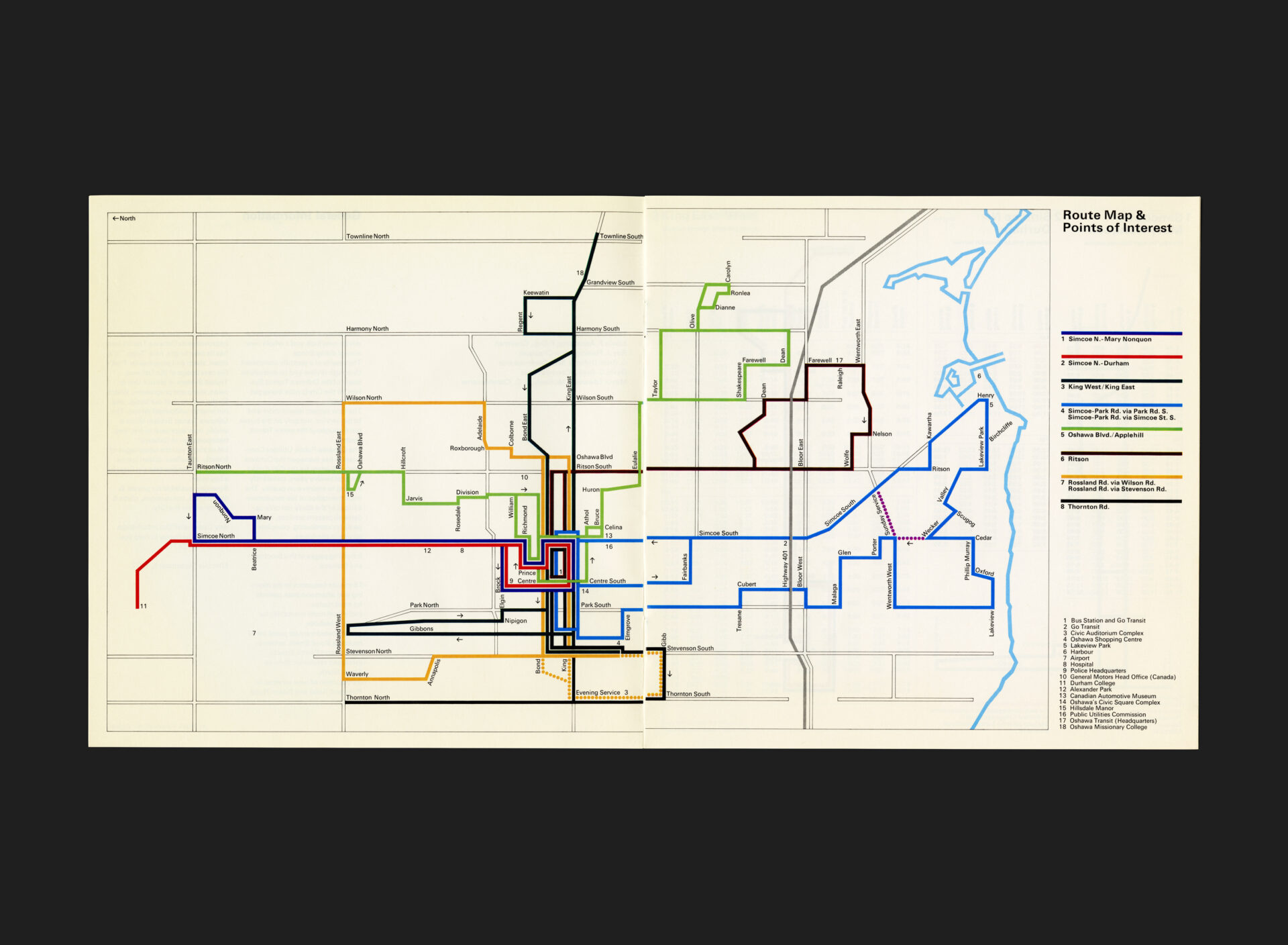
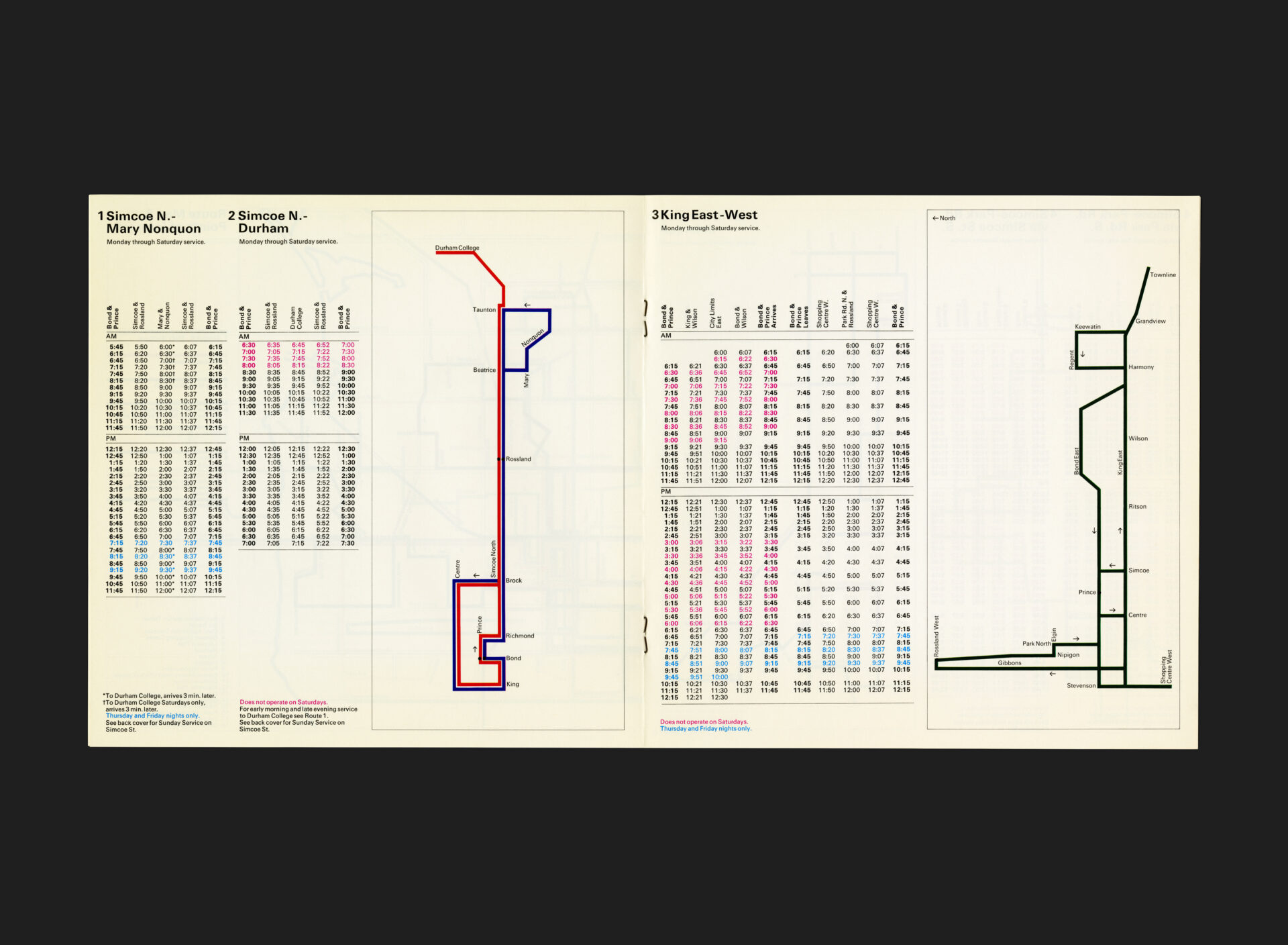
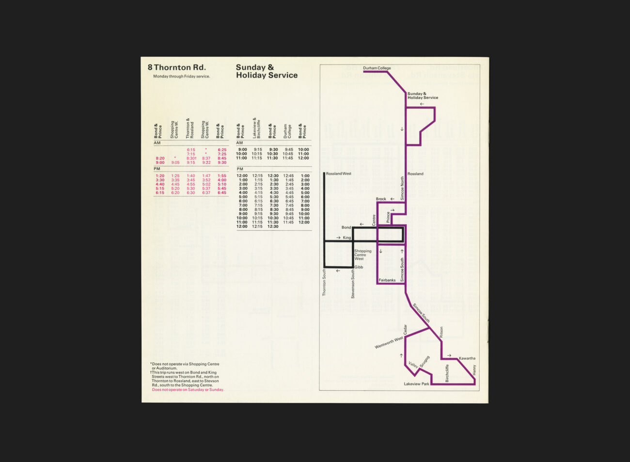
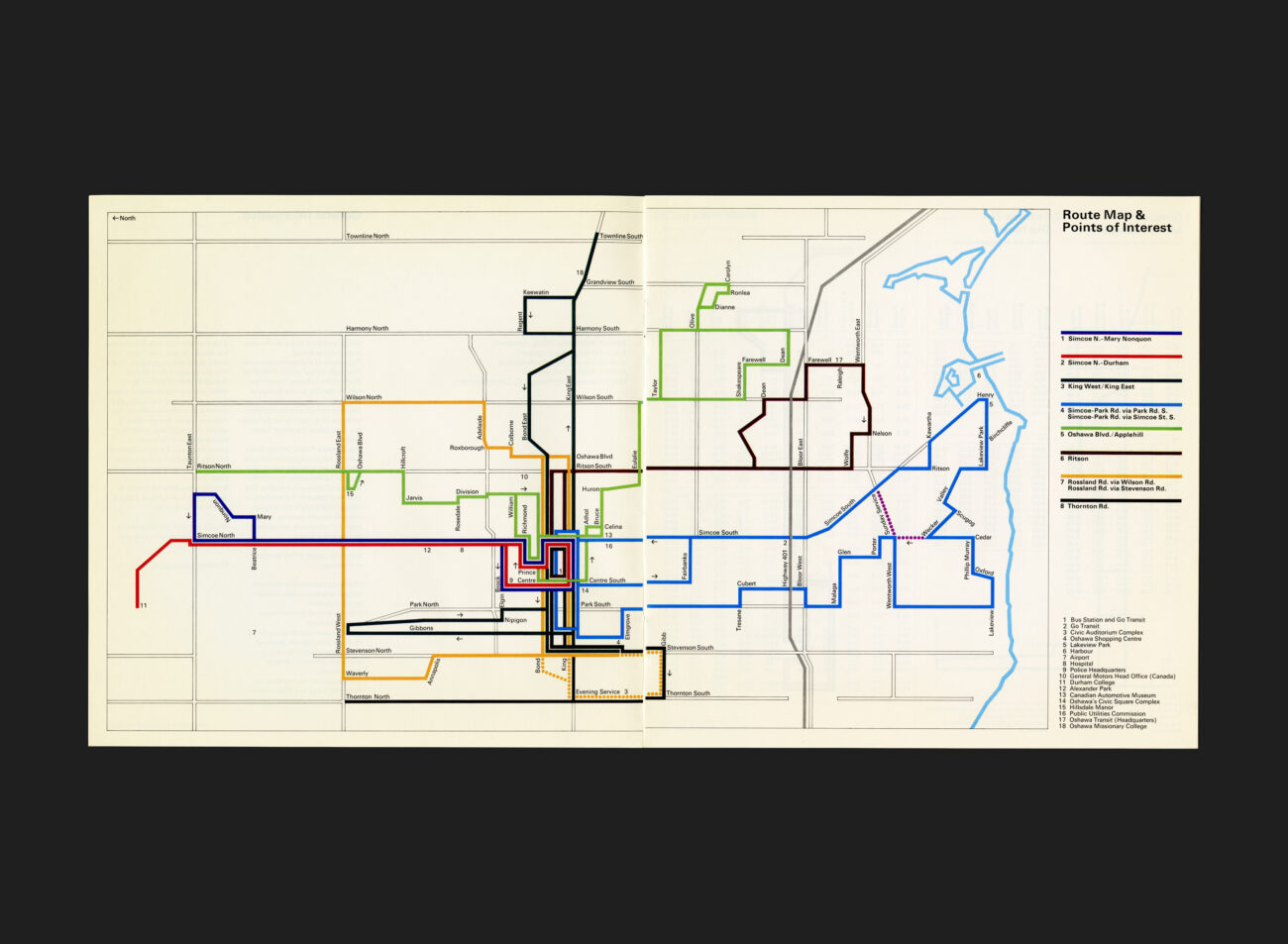
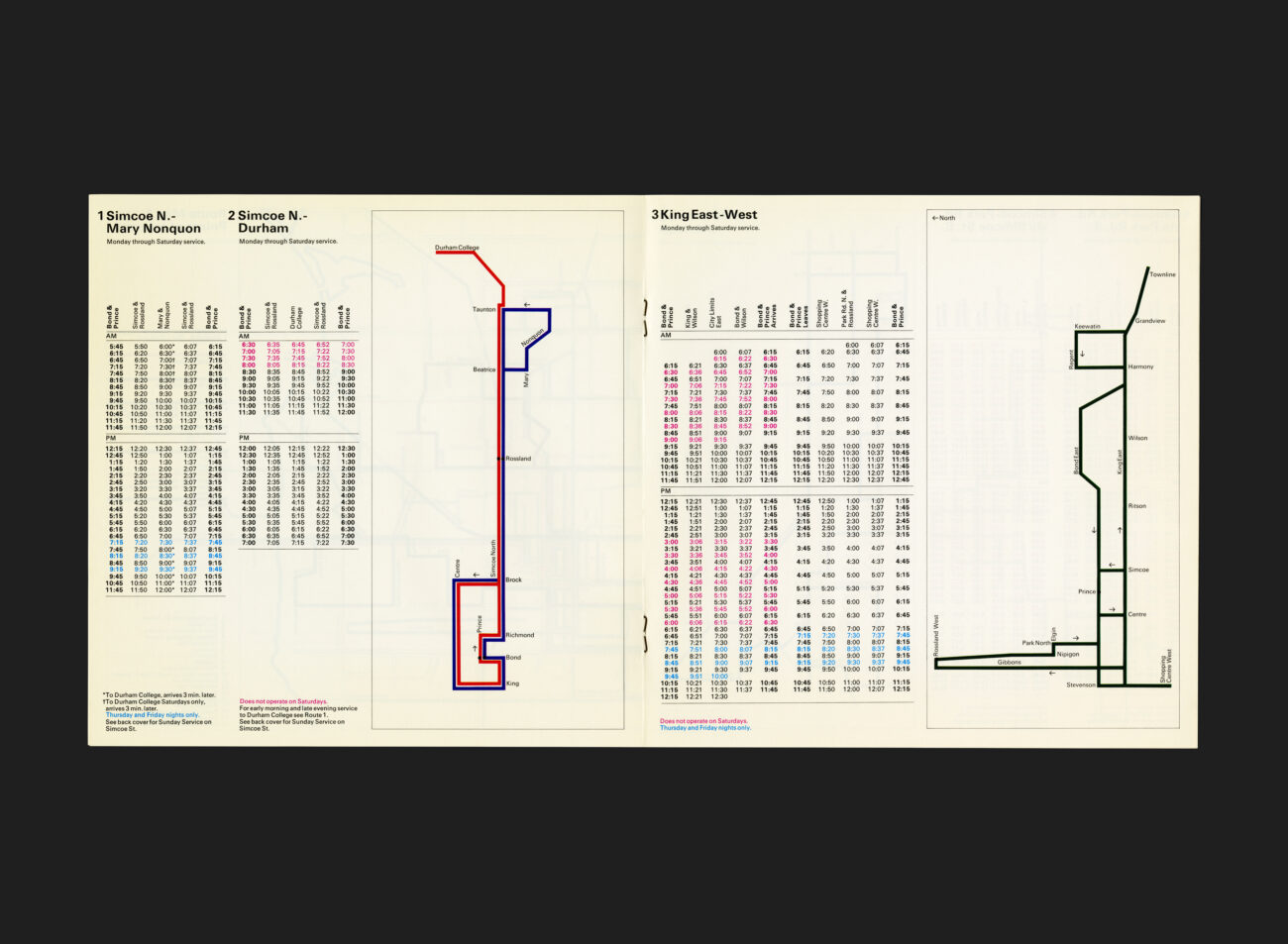
Designed by Stuart Ash of Gottschalk+Ash, the redesign included vehicle liveries, stationery, and promotional materials, all unified under a cohesive visual language. This schedule features clean layouts in a square format, Univers typography, colour coded route map, and the distinctive blue and yellow parallelogram graphic element which became synonymous with the service. These design choices were intended to make transit information more accessible and to project a modern, reliable image to the public.
The introduction of this new schedule coincided with improved service levels and a broader effort to increase ridership by enhancing the public perception of the transit system. This approach mirrored similar projects undertaken by Gottschalk+Ash for other Canadian transit authorities, such as Sudbury and Oakville, where design played a pivotal role in public engagement.
The Oshawa Transit Schedule stands as a testament to the power of design in public service, illustrating how thoughtful visual communication can contribute to the effectiveness and appeal of municipal services.
See more G+A work for Oshawa Transit here
All Archives


