Comment
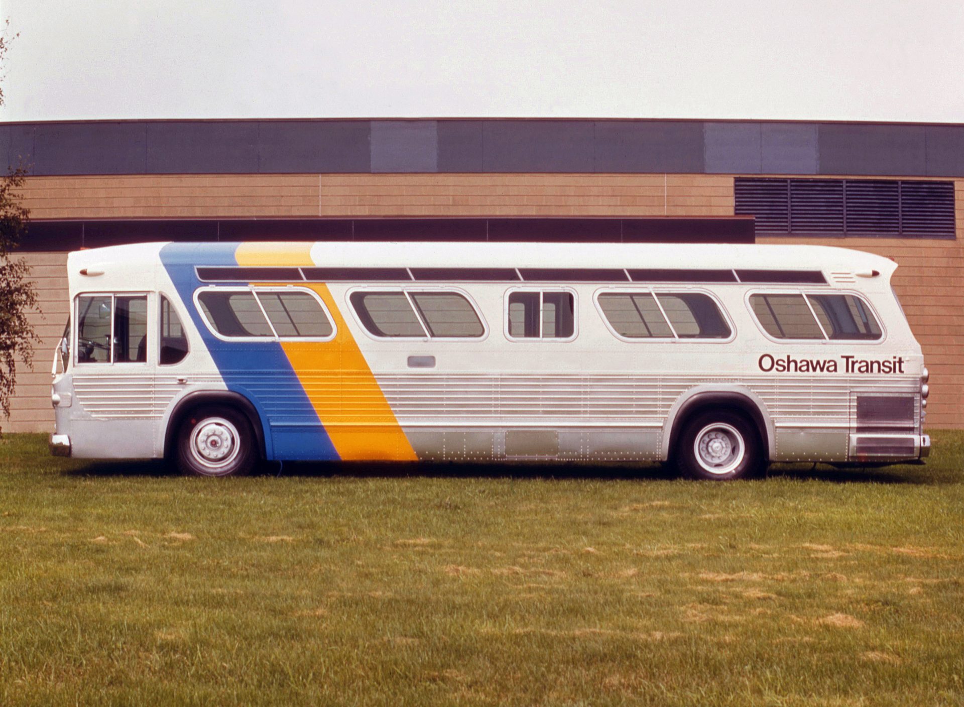
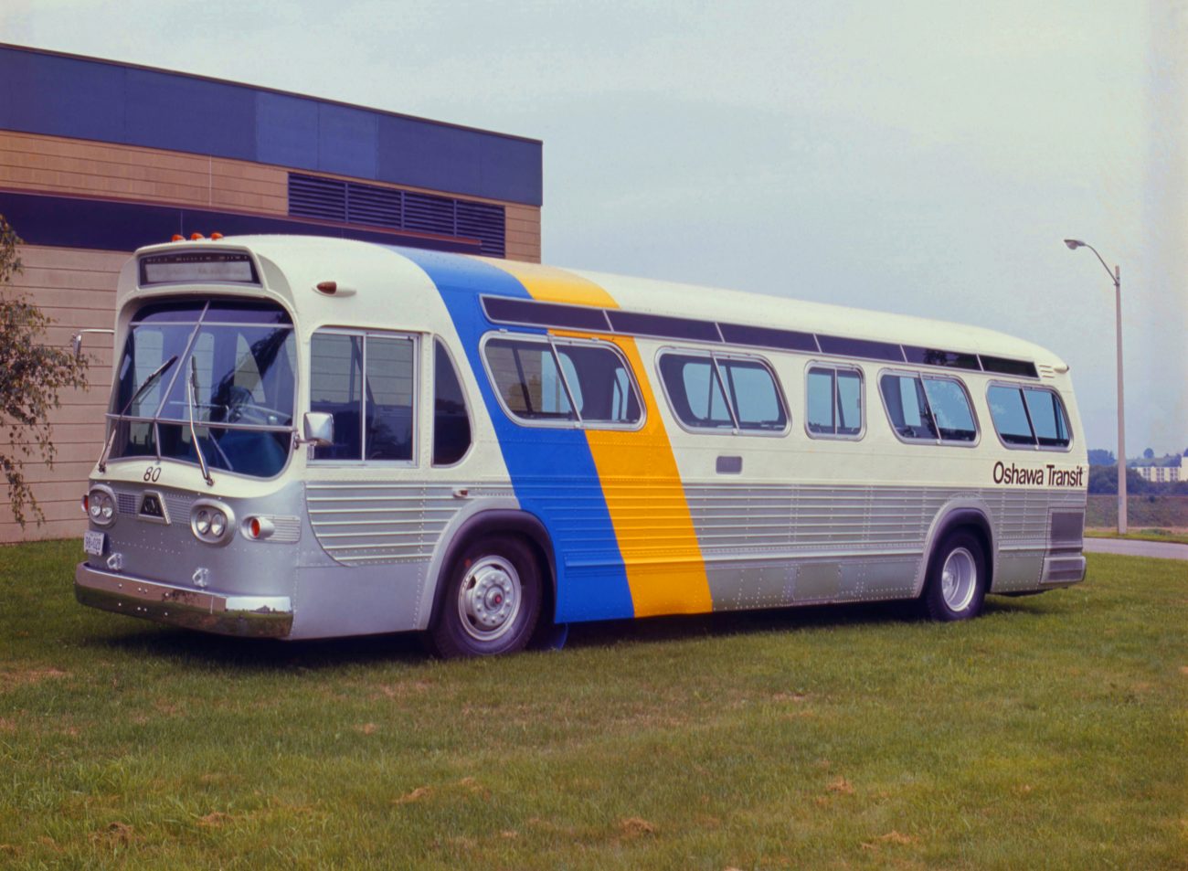
Oshawa Transit was a public transit operator, run by Oshawa Public Utilities Commission, in Oshawa, Ontario, from 1960 to 2005. In 1972 an extensive review and evaluation was conducted of the system. Part of the actions to come out of this resulted in an improved level of service and a new visual identity. Progressive, fret-free bus services and a clean and sharp identity system.
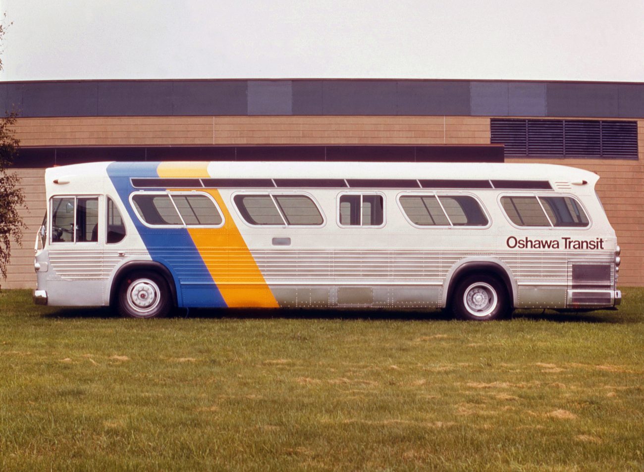
G+A created total identity systems for numerous transit authorities across Canada, including new names and symbols, plus a comprehensive set of applications that included vehicle livery, interiors/exteriors, stationery, timetables, maps, uniforms and advertising. These projects were commissioned through a relationship they developed with a firm of transit consultants, working with the relevant transit authorities and mayor’s office in each city. The aim for each was to increase passenger numbers by creating a strong public image that would reflect positively on each transit authority. Stuart Ash led the work on Oshawa Transit, which was one of the first in a series of programs undertaken by the Toronto office. These included Sudbury, Oakville and Broome. The symbol is comprised of two intersecting yellow and blue parallelograms. which is expanded and runs over the roof to repeat again on the other side. This provided a simple but hugely effective device that was perfectly suited to the core application (livery).
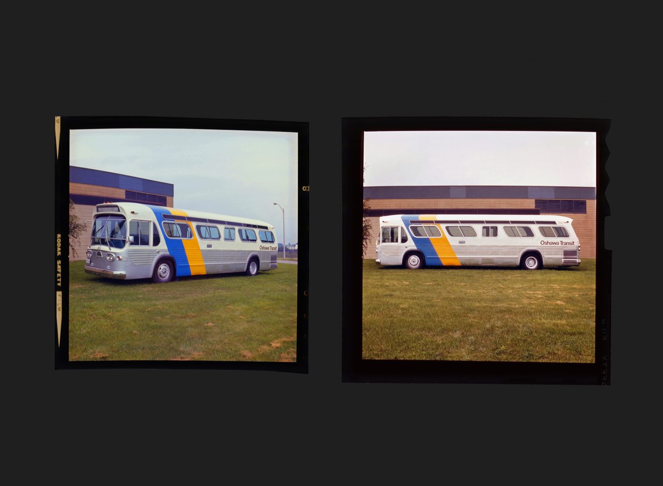
These images are scanned from original transparencies that were obtained from the G+A archive and now reside permanently in the Canada Modern archive.
See more G+A work for Oshawa Transit here
All Archives
Go Back


