Comment
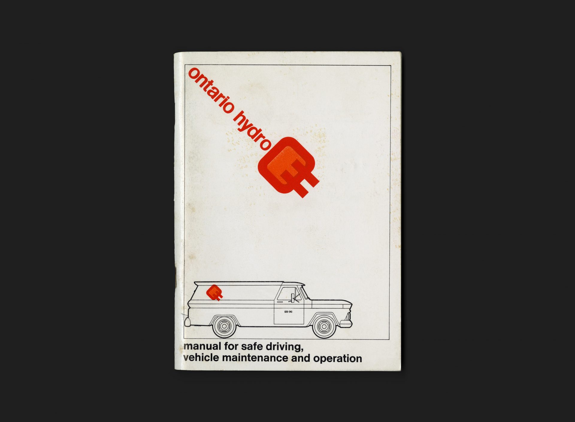
A practical manual created for Ontario Hydro drivers and vehicle fleet staff. The booklet is broken into 2 distinct sections — Part One: Vehicle Operation and Maintenance and Part Two: Safe Driving.
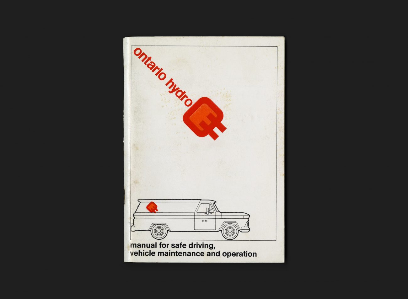
The cover is printed in corporate colours: red, orange and black and features the organization’s logo, anchored into the top left corner. A line illustration of a typical company vehicle (Chevrolet C/K Truck) sits at the bottom with the manual’s title printed below (set in Standard). The visual direction is consistent with other materials produced at the time of launch and introducing the new corporate identity. The contents are primarily comprised of text, with some illustrations and photographs and printed in black and white. These pages have not been designed inline with the cover, so it is assumed that Hathaway – Templeton did not work on the text section.
The Ontario Hydro logo was designed by Allan Fleming. You can read more about that here.
All Archives
Go Back


