Comment
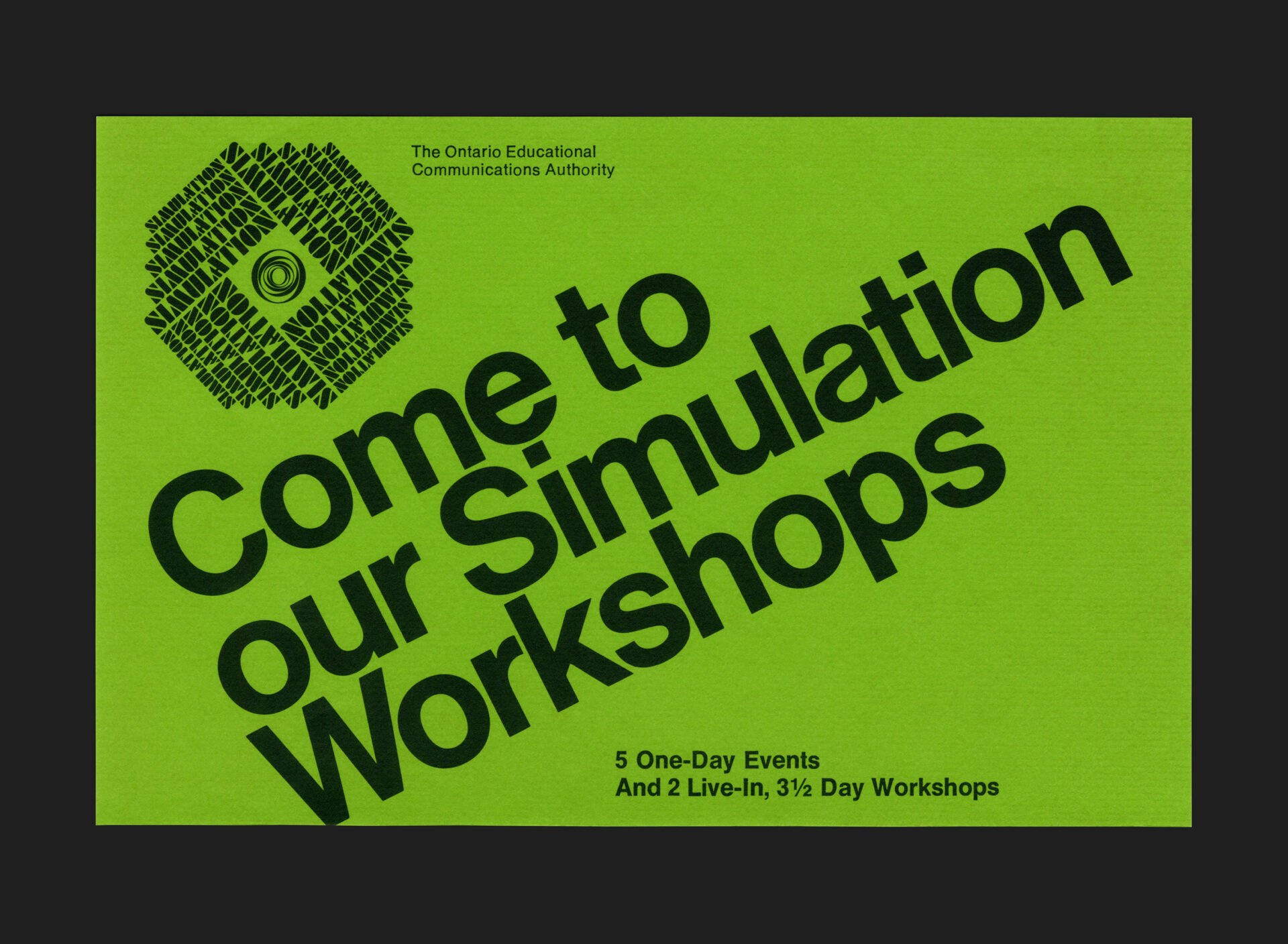
This compact mini-poster, designed by Rod Nash of Nash & Nash for the Ontario Educational Communications Authority (OECA), presents a clear and purposeful approach to communicating the Authority’s 1974 workshops on simulation. Printed in black ink only, on vibrant green stock, it uses modest production methods to strong visual effect. The cover face features a repeated, offset arrangement of the word SIMULATION, hand-set in a Letraset version of Futura Black Stencil (designed by Paul Renner in 1929), creating a rhythmic field that reinforces the idea of iteration central to simulation-based learning. At the centre, the OECA symbol, designed by Burton Kramer, provides an immediate point of recognition.
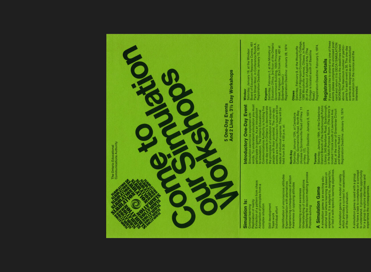
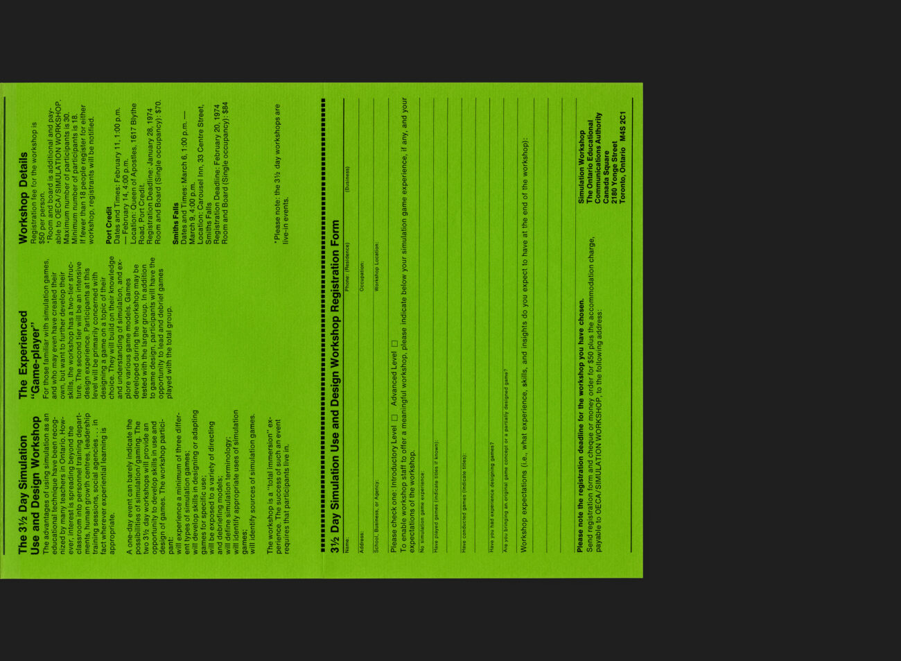
Inside, Nash employs the corporate typeface Helvetica in two weights to layout the workshop information with clarity and economy, supporting the practical intent of the piece. The fold-out structure allows it to function both as a small poster and as an informational flyer, guiding the reader from the broad idea of simulation through to detailed schedules, locations, and registration requirements. Despite its simplicity, the piece demonstrates careful typographic decision-making and an effective use of limited materials to deliver accessible, well-organized information.
Formed in 1970, the Ontario Educational Communications Authority was created to support educational broadcasting and instructional media across the province. In its early years, OECA invested heavily in clear, consistent visual communication as part of its mandate to make educational content more accessible to schools, libraries, and the public. Collaborations with designers such as Burton Kramer and independent studios like Nash & Nash helped establish a coherent visual presence across print, broadcast, and instructional materials—of which this brochure is a representative example.
All Archives
Go Back