Comment
In 1971, William G. Davis, the incoming Premier of Ontario, wanted to restructure the regional Government into six so-called “super ministries’. He appointed Norman B Hathaway Associates to tackle the brief, with a total budget of $10,000 to cover the symbol design, guidelines and applications (which at the time was a significant amount for such a project).
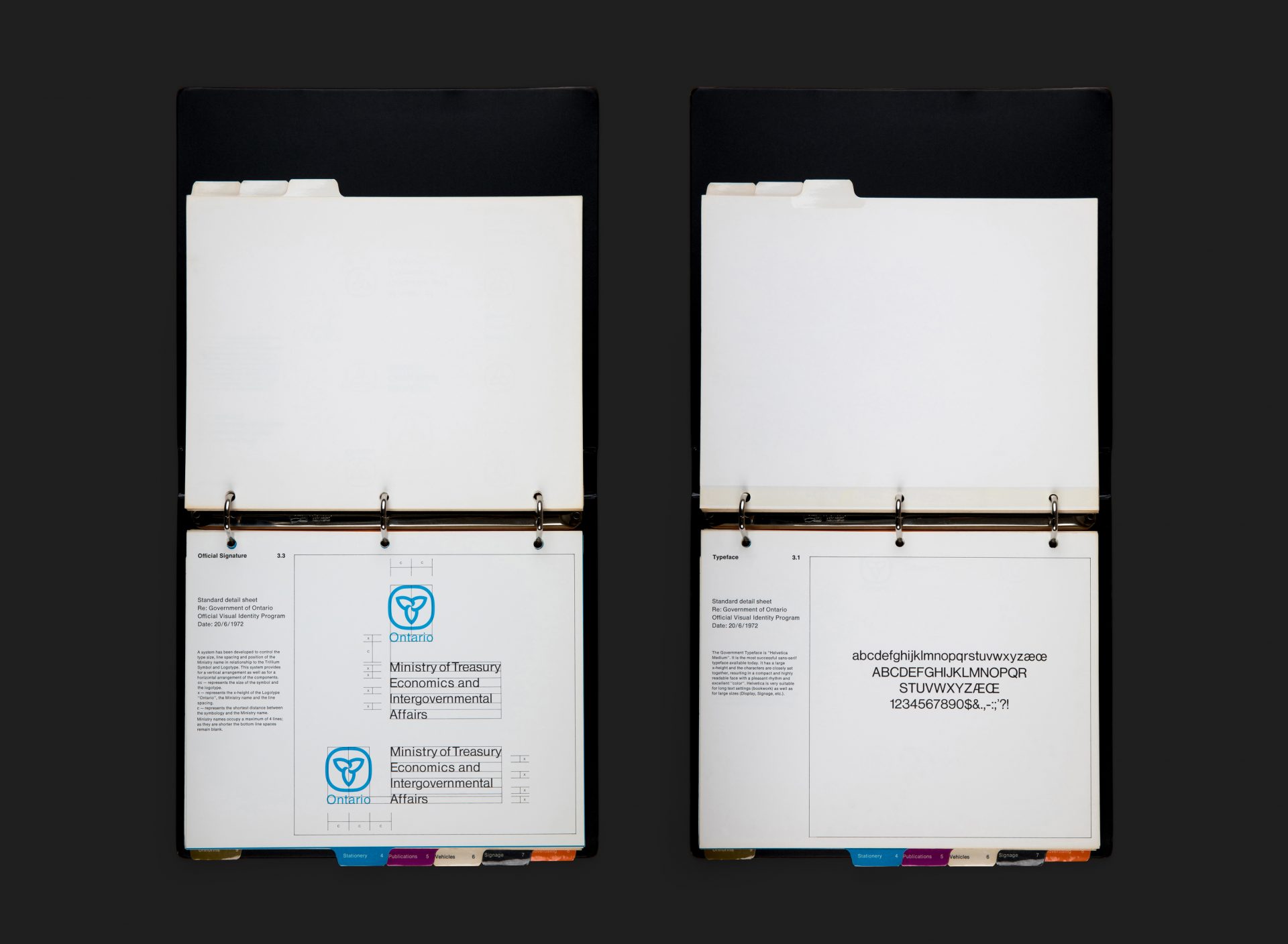
Hathaway in turn brought in Ernst Barenscher to oversee the project as design director, together with his wife Gundi Barenscher as a consultant. Ernst’s first suggestion was to redesign the Trillium symbol (which had originally been designed in 1964), a task he assigned to Glenn Fretz (a 23-year-old designer at NBHA not long out of arts school), while he set about reworking the Coat of Arms. Ernst and Glenn worked together on the typography and supporting applications, whilst Gundi took charge of the colour system. Ernst then designed this remarkably comprehensive Visual Identity Manual with input from both Glenn and Gundi throughout, launching the new structure and graphic standards in 1972.
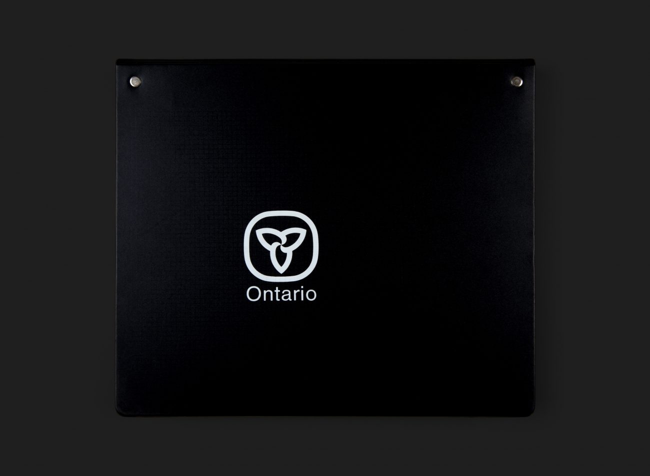
The overarching symbols (Trillium, Coat of Arms, Shield and Logotype) are produced in black and white, as is the Office of the Premier, while each of the five remaining ministries ‘owns’ a specific colour. The guidelines are bound with dividers for nine sections covering graphic standards for everything from stationery to signage, vehicles, uniforms and advertising. The binder itself is screen printed with matt white ink and a beautifully subtle gloss black/varnish grid subset behind the Logotype / Coat of Arms.
Notably, the coat of arms is still in use today. In 2007, the Trillium symbol was replaced (after 35 years) by an awkward version that did little justice to Fretz’s classic. However, in 2019, under the Ford government, a new version was yet again reintroduced, this time extremely close to the original.
All Archives
Go Back


