Comment
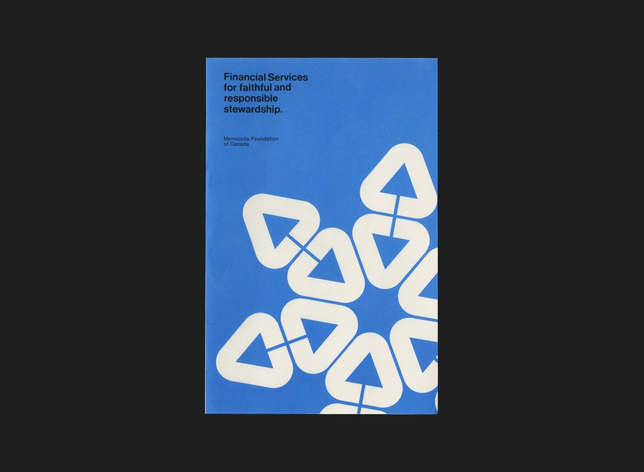
Part of the suite of stationery and marketing communications that was created by Glenn Fretz while developing the identity program for the Mennonite Foundation of Canada. This work was developed in the early days of his partnership with Anthony Goodhoofd (as Goodhoofd/Fretz).
The foundation was established to provide financial services, initially to Mennonites then subsequently to a wider Christian audience (now called Abundance Canada). The organization’s symbol, an upwards arrow within a strong outer form, combines ideas of growth and care, suggesting that charitable funds placed in their custody are protected, maximized and directed, as part of the Mennonite belief in ‘faithful stewardship’.
This simple two-colour leaflet spells out the organisation’s mission, and introduces the senior executives. The cover uses the new identity to create a circular pattern in a snowflake-style arrangement, representing the interconnectedness of the organisation and the people it supports.
More Mennonite Foundation of Canada archival pieces here
All Archives
Go Back


