Comment
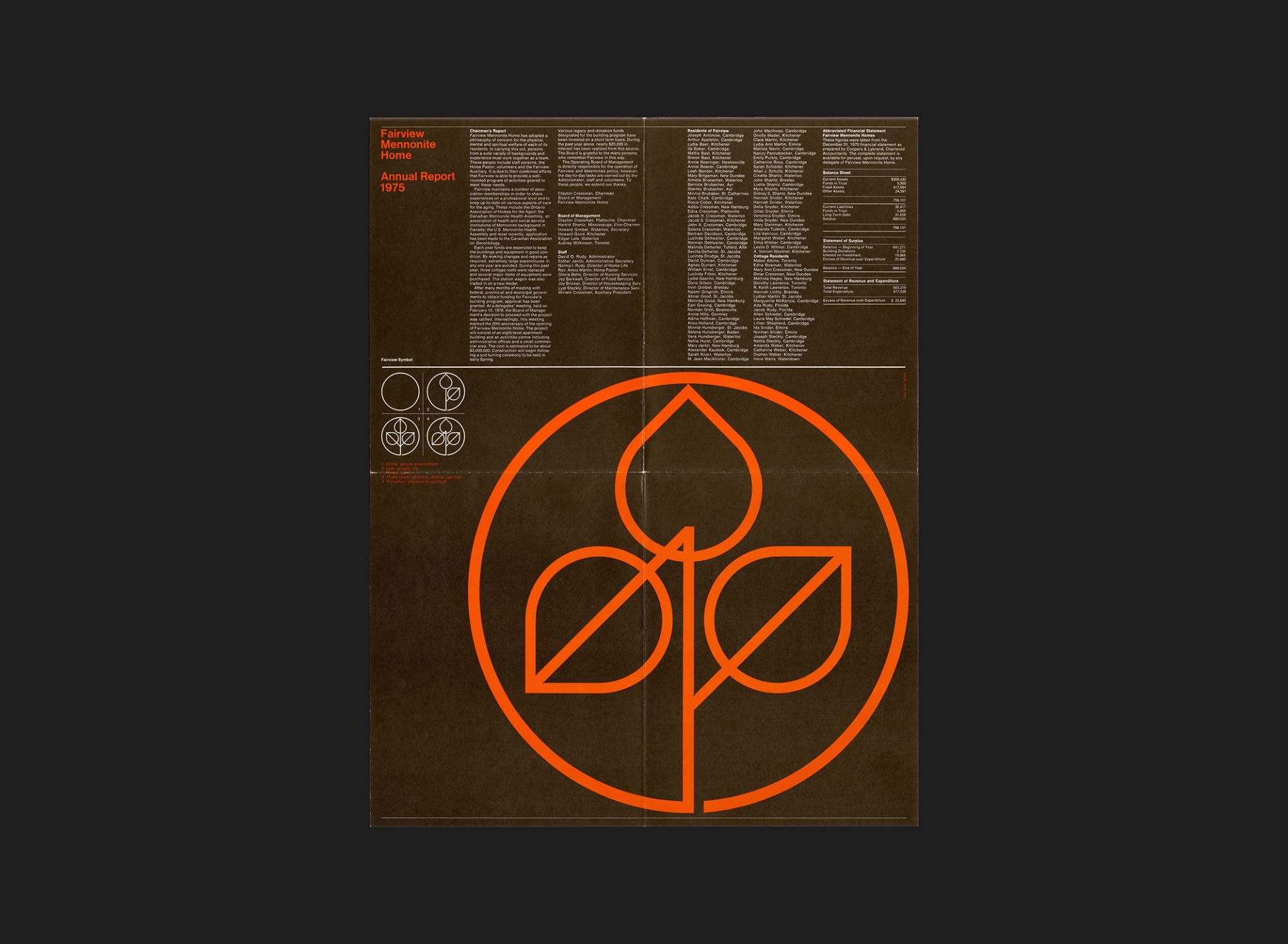
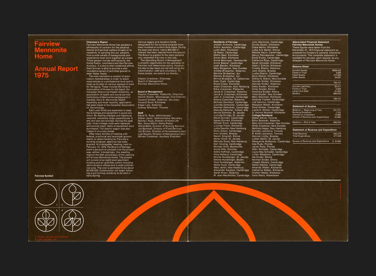
An annual report produced as a quarter-fold poster for the Fairview Mennonite Home, a senior retirement care facility in Cambridge, Ontario.
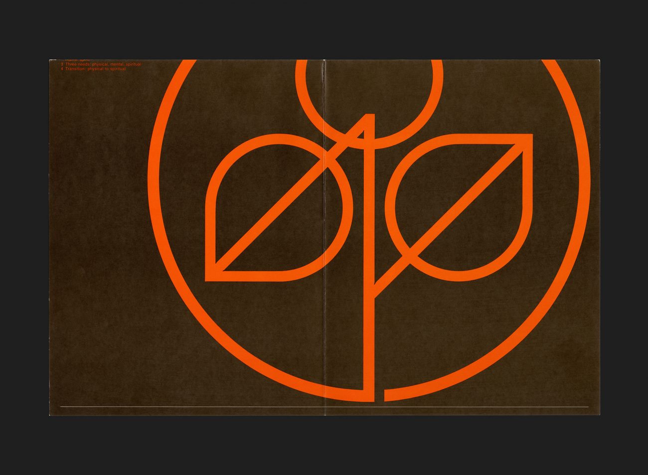
The report is dominated by Fairview’s symbol (also designed by Fretz) occupying 5/8 of the physical space and comprised of interlinked leaves and a flame within a circle. An explanation of the symbol is also provided: the circle represents a secure environment, the three shapes represent physical, mental (leaves) and spiritual (flame) growth as well as the inevitable transition from physical to spiritual. The written content begins with the Chairman’s report, a key development being that government funding was secured for Fairview’s building plan beginning in 1976 (some 20 years after the home opened). The report then goes on to list key management and staff members as well as residents at the home, followed by a summary of the accounts for that year. All set in Helvetica and printed in brown and orange ink.
The home is now named ‘Fairview Seniors Community’, and after over 75 years of service continues to meet the visions and needs of current and future tenants. A crude version of the symbol is still used by the organization.
All Archives
Go Back


