Comment
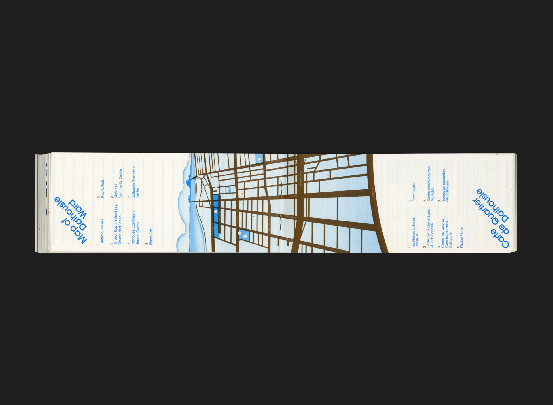
Located just west of Ottawa’s downtown core, Dalhousie and LeBreton Flats are neighbourhoods with deep historical roots. LeBreton Flats, once a thriving industrial and residential district, was dramatically transformed following the expropriation and demolition of the area in the 1960s. By the early 1980s, as community rebuilding efforts took shape, a renewed sense of identity and neighbourhood pride began to emerge. The Dalhousie LeBreton Community Handbook, produced in 1981, was part of this effort — designed to connect residents with local services, resources, and one another.
Designed by Neville Smith, who was also responsible for the destination’s visual identity, the handbook features a striking stylized heart motif on the cover which mimics Smith’s logo for LeBreton but introduces perspective and depth to reflect a forward-looking and connected community. The heart is set against a vibrant vermillion orange-red background, creating a bold and optimistic presence.
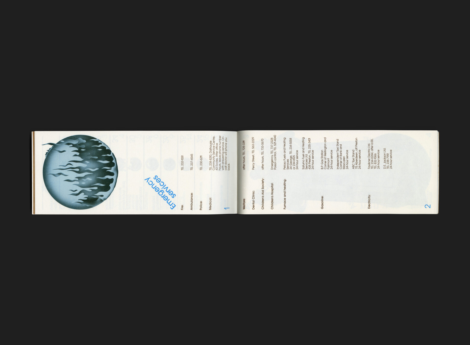
Physically, the handbook breaks with convention, presented in a horizontal 1/3 letter format — compact, tactile, and approachable. The typography, set in Avant Garde Gothic, reflects the clean, modernist ideals of the time. Opening sections are printed on brown kraft paper, adding a natural, earthy quality, while the inner pages combine brown, blue, and black inks in a restrained but engaging palette. Throughout, illustrations by Les Ames (including the hearts on the cover) lend warmth and accessibility, visually animating the content and capturing the community’s evolving spirit.
The guide is bilingual, with English and French each occupying their own dedicated half.
All Archives
Go Back