Comment
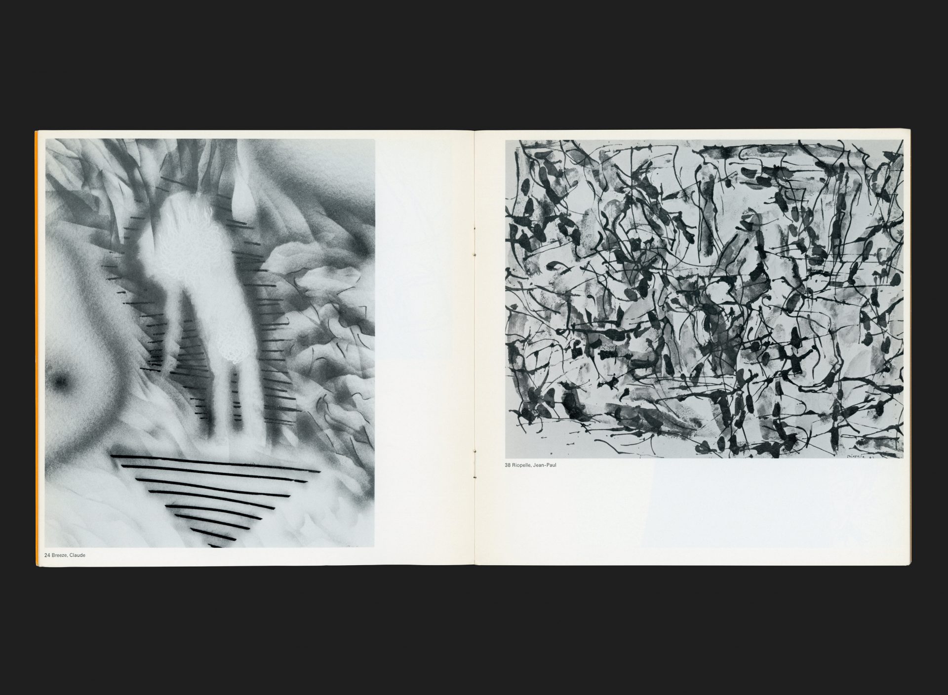
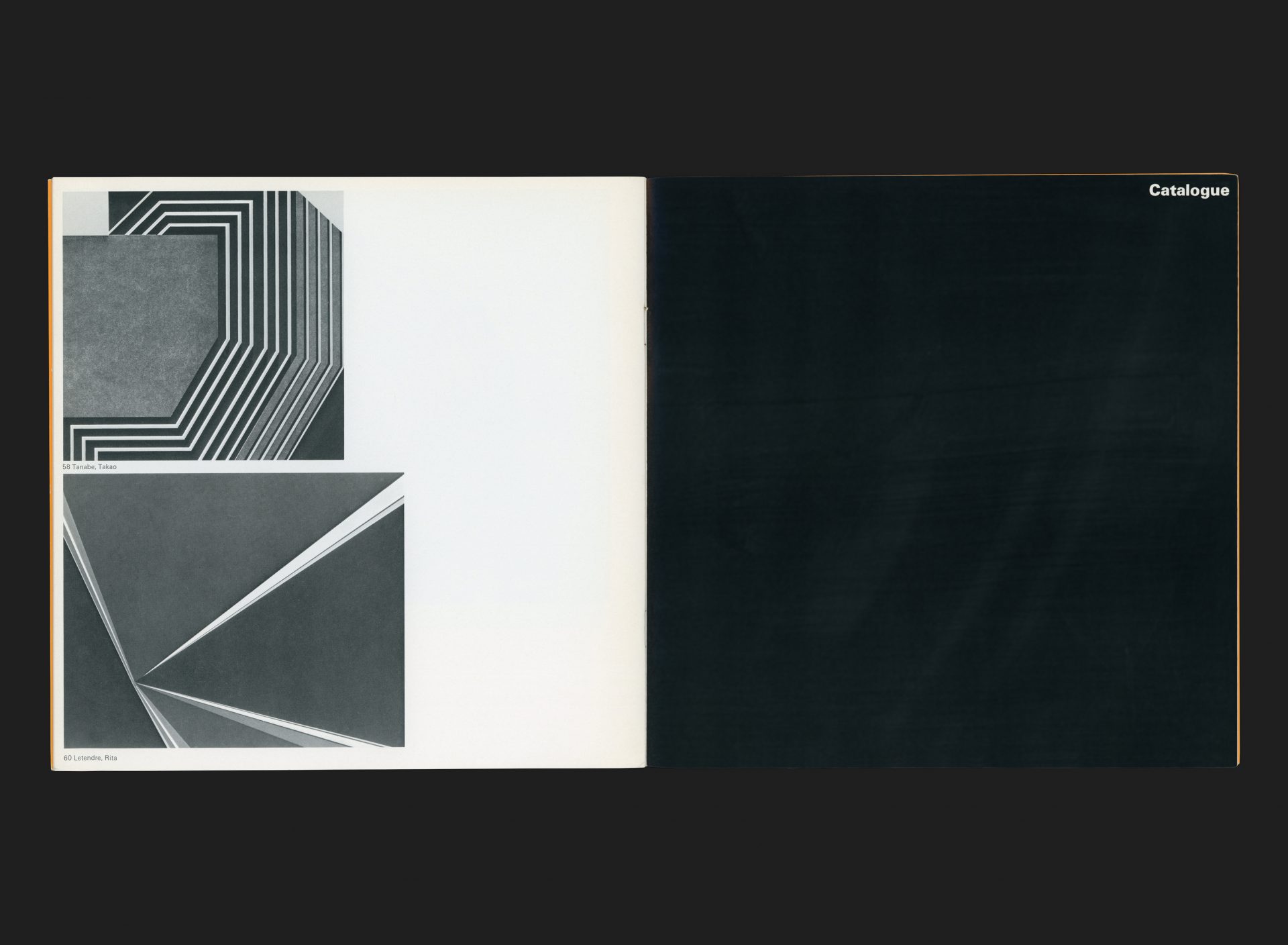
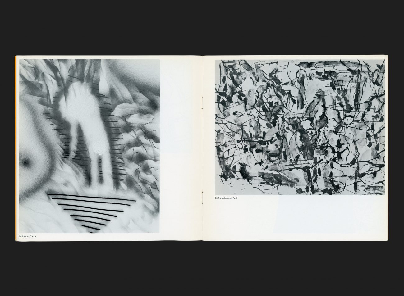
A volume of work to accompany an exhibition that traced the evolution of Canadian ‘graphic’ engraving since 1960. The technique had long been considered a poor relation to painting, but was enjoying something of a creative resurgence, with artists exploring new ways of working, embracing the limitations and imperfections of the art form.
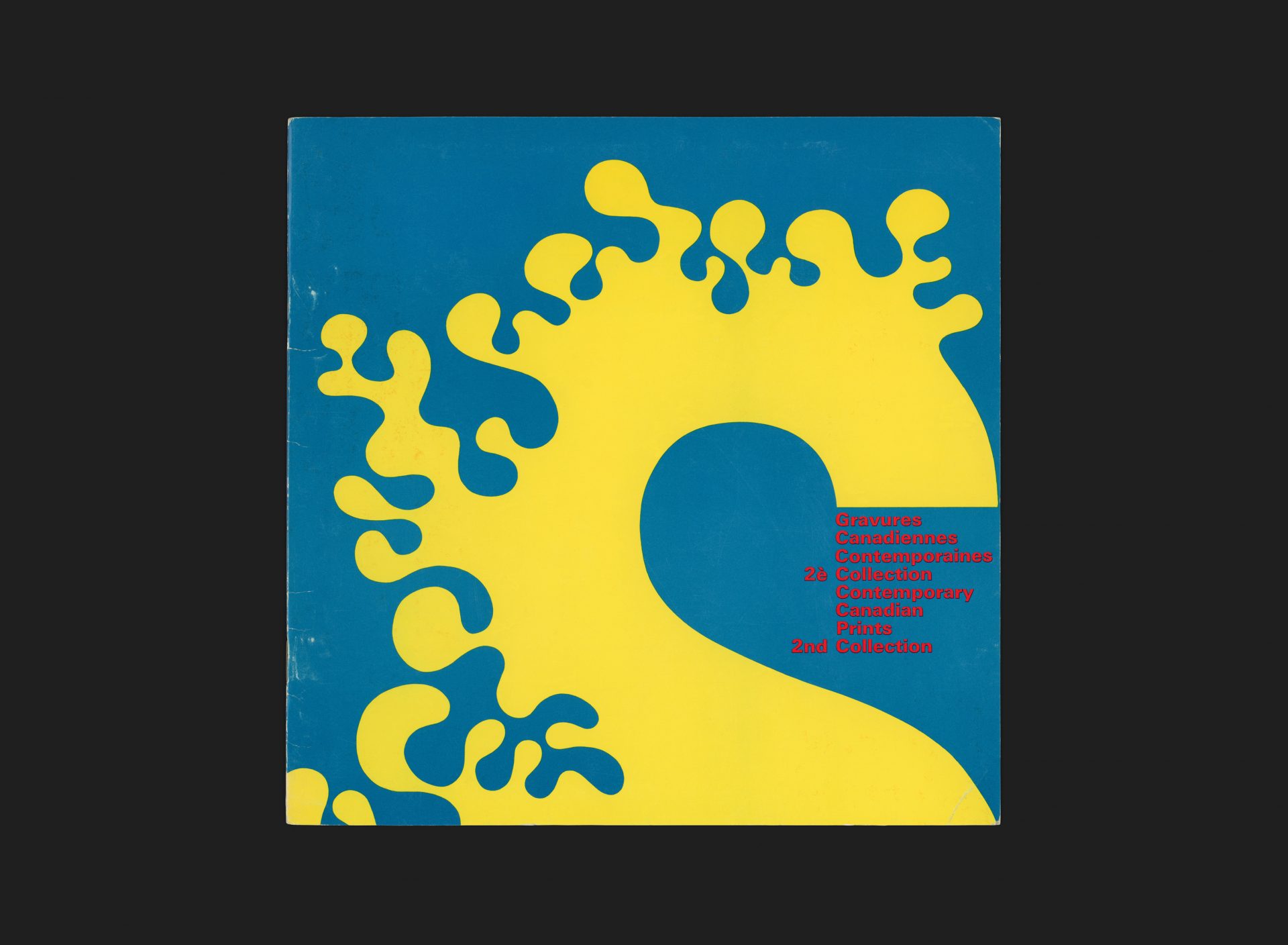
The cover embodies so much of Fritz’s approach to design. Hard edge typography juxtaposed against more expressive and emotive structure, offset against a vibrant palette for dramatic impact. In this case the large numeral 2 is reversed and the outer edge is given a fluid, almost playful form, while the end of the numeral provides a strong visual anchor for the title text to hang off.
All Archives
Go Back