Comment
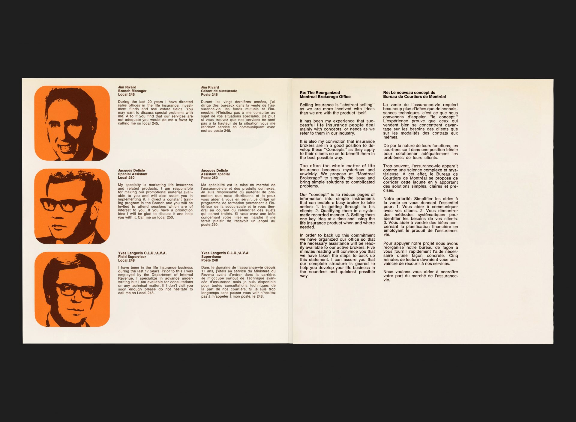
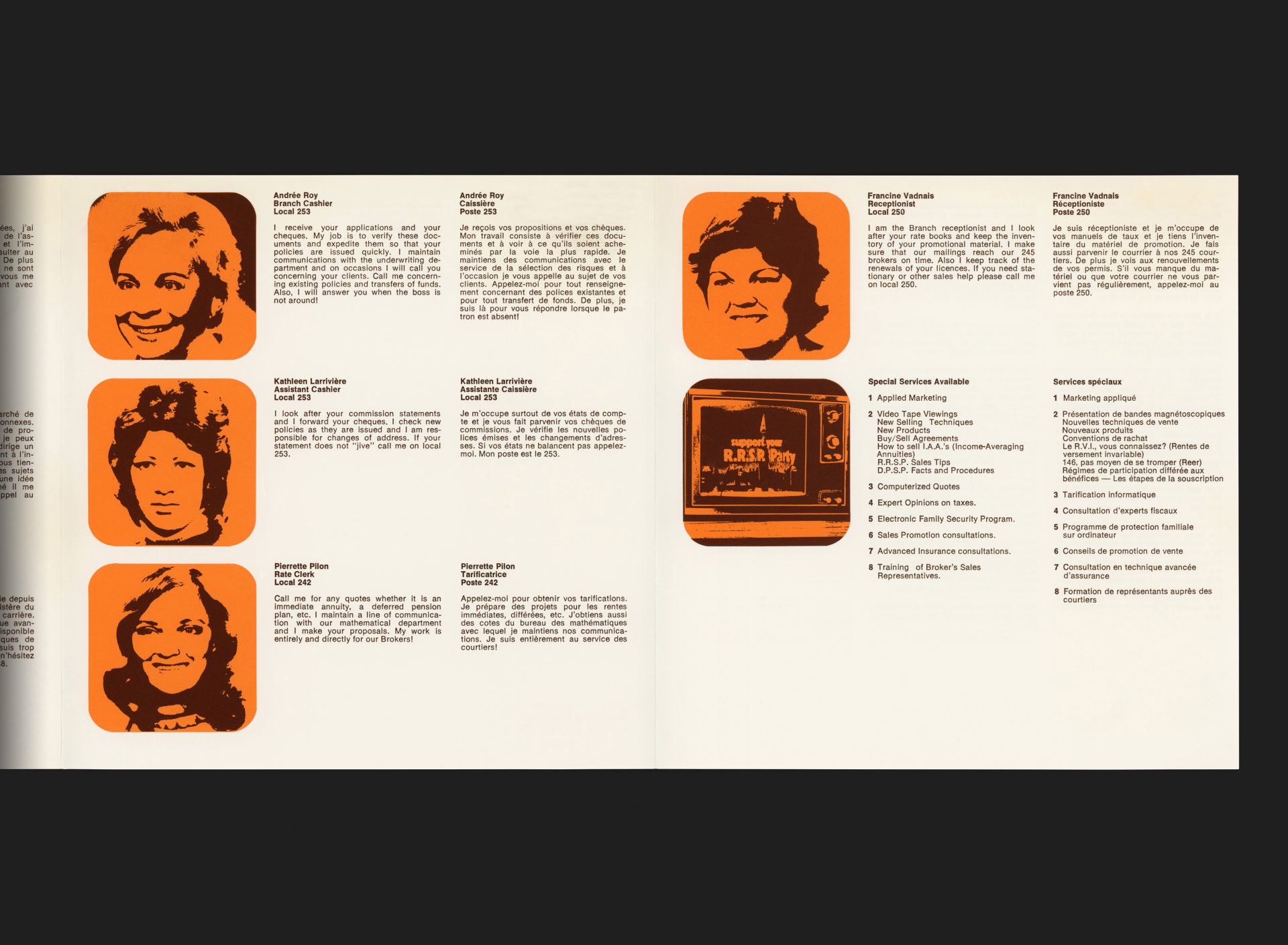
A brochure to support the life insurance brokerage within Sun Life of Canada’s Montréal office. Designed purposefully to eschew the staid language and presentation style of corporate financial services, this bold and uncompromising piece attempts to highlight the contrast between their service and more traditional rivals, with services organised around the customers’ needs (or ‘concepts’ as they are defined in the supporting copy). Individual brokers and support staff are introduced using the same orange and brown treatment, along with information about their role in the customer experience.
The Concept wordmark uses a Letraset display typeface by German-born Dieter Zembsch called ‘Beans’, forming part of the Letragraphica series. Beans was selected by an esteemed panel of top type designers in the Letraset, International Typeface Competition in 1972/73. A young Walter Bohatsch, the designer who worked on this piece, had only arrived in Canada from Austria the year before in 1973.
All Archives
Go Back


