Comment
Due to the sheer magnitude of the Canadian National Railway Company, and its universal embodiment of its own brand image, there has been an endless production of utilitarian products and ephemera by the organization over the years. With the overwhelming success of the company’s visual transformation in 1960 (undertaken by James Valkus Associates NY, logo by Allan Fleming at Cooper & Beatty Toronto, and the later implementation primarily carried out by Gagnon/Valkus in Montréal) the company established itself as a modern and progressive entity, and the use of branding (internally and externally to the public) only reinforced this philosophy.
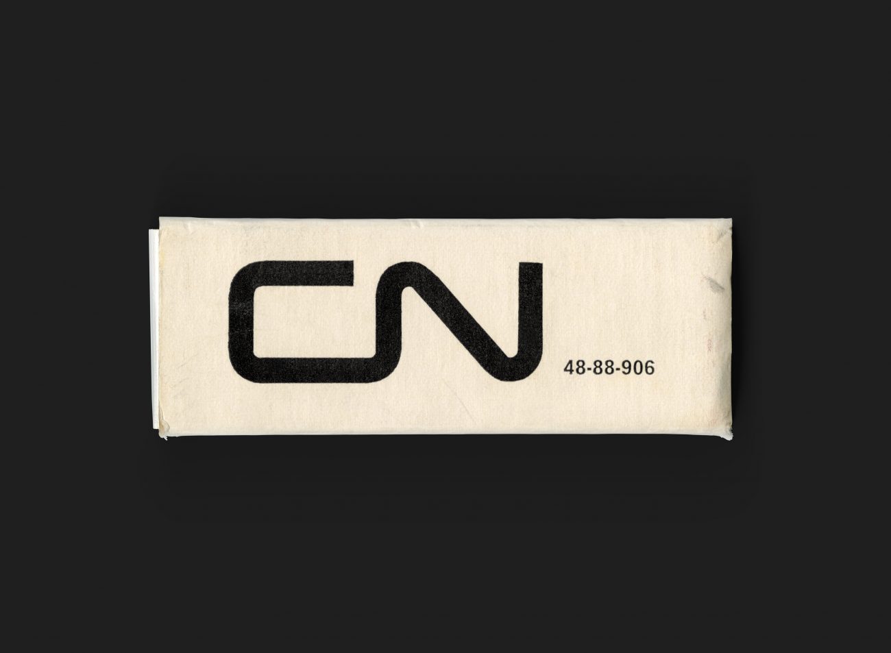
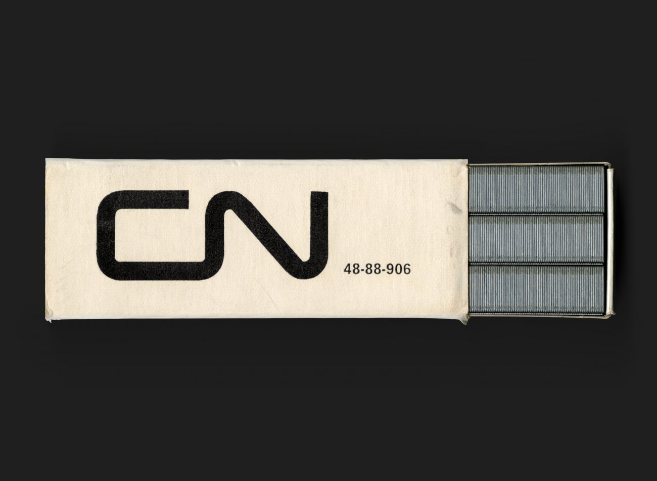
This simple box of 5000, standard, galvanized staples is an embodiment of the value placed on something as seemingly worthless as a box of staples. The outer sleeve printed confidently on the top with a large logo and accompanied by product code. The outer panels (one for French and one for English) provide further description of the contents and proudly state that the enclosed staples are ‘MADE IN CANADA’. The package providing a visual reference to the boxcars and shipping containers associated with CN cargo is a nice hidden metaphor.
All Archives
Go Back


