Comment
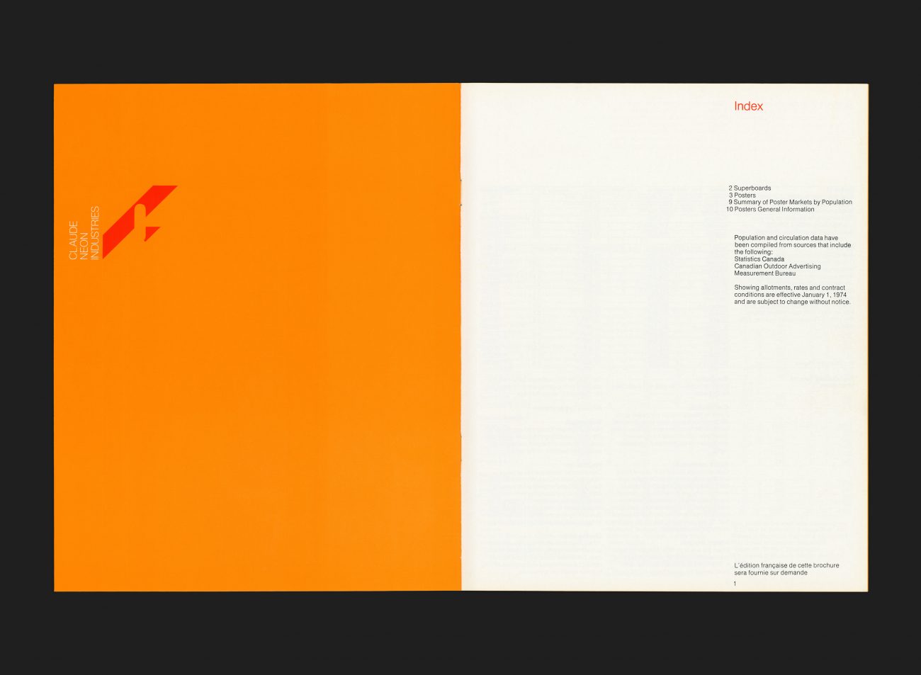
An advertising media rate card for supergraphics, billboard and poster sites. This was one of the earlier printed publications that G+A created for Claude Neon Limited, having launched their new name and identity earlier that same year (previously E.L. Ruddy Company). The flexible identity consisted of five versions of the initial letter “C”, each developed according to a grid, and reproduced in combinations using two of the four base colours (such as the red/orange variant seen here).
As the brand was communicating with a largely educated and creative audience, G+A had license to develop a much more expressive and avant-garde identity, that still feels remarkably fresh to this day.
All Archives


