Comment
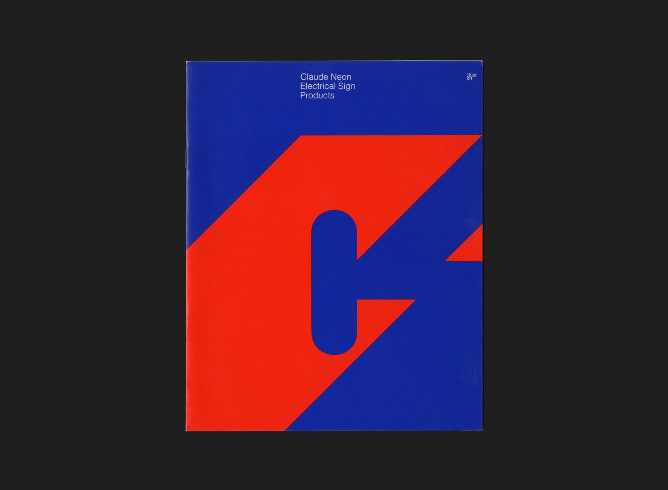
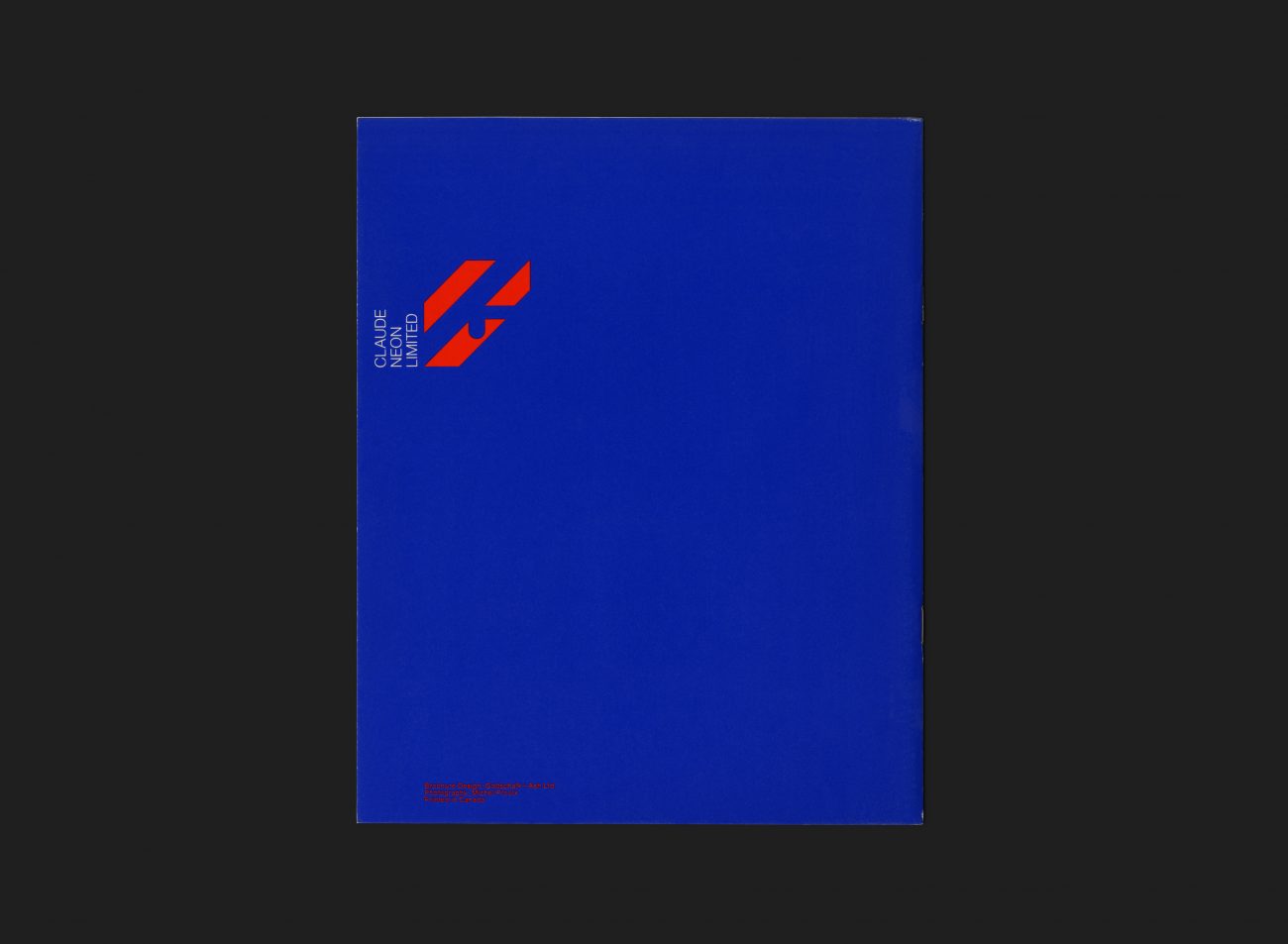
Claude Neon Ltd. was an outdoor advertising company originally founded in 1904 under the name The E.L. Ruddy Company. In 1973 the group of companies went through a process to consolidate all of its operations and subsidiaries under one Claude Neon name. Gottschalk+Ash was appointed to create and launch their new identity. The logo work was developed by Freddi Jaggi under the direction of studio principal Stuart Ash in Toronto (where the client relationship existed) and Fritz Gottschalk in Montréal (where Jaggi also worked). This innovative, flexible identity consisted of five versions of the initial letter “C”, each developed according to a grid, and reproduced in combinations using two of the four base colours (such as the blue/green variant seen here). The overarching theme of the identity was ‘change is the only constant’.
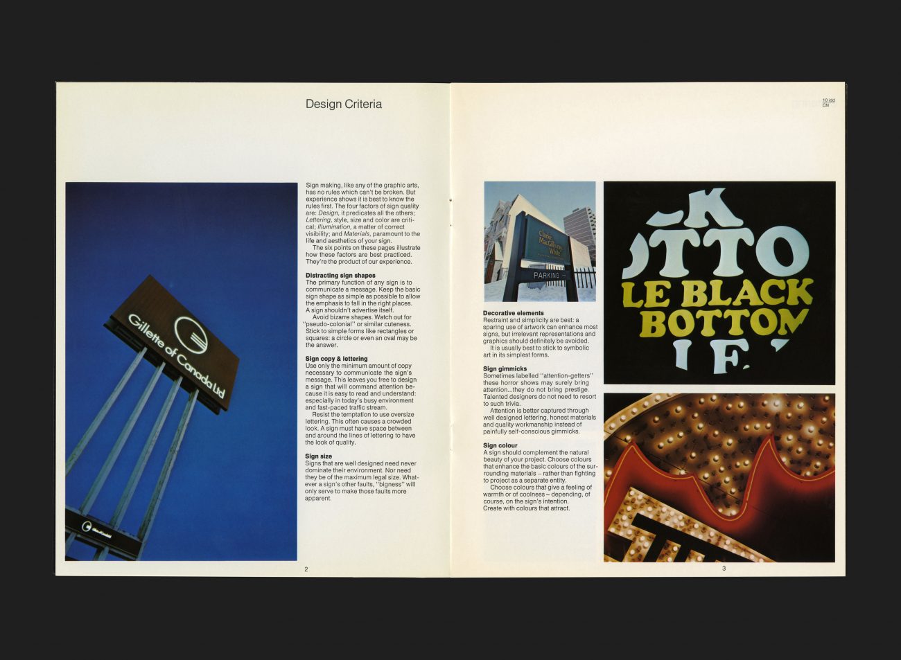
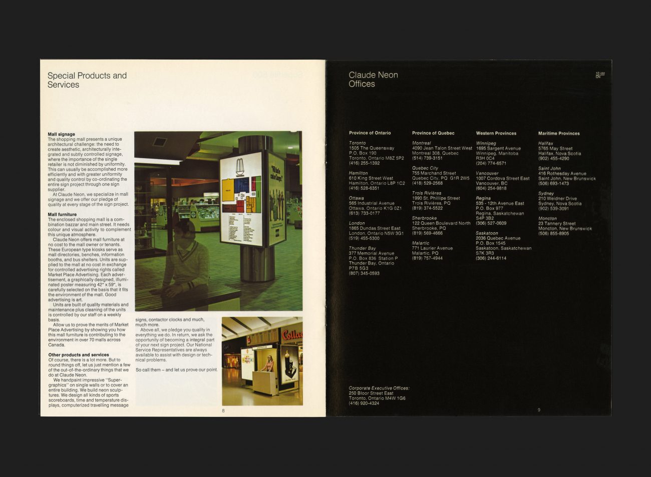
This brochure was developed to promote and showcase a specific area of Claude Neon’s business — electronic sign products. Written in the introduction the company states that like a good building, a sign must be aware of its environment and complimentary to it. Above all a sign must have quality at its core — in its design, in its fabrication, and in its service, It must never be a blot on the landscape. The inside pages primarily cover the type of electronic signs the company produced, from Lettering to illumination (including a Claude Neon exclusive product, the Superlite 500) to special products and services such as mall furniture and kiosks etc. The design language of the brochure utilizes one of the 60 unique permutations of logo and colour from the Claude Neon identity system, putting the blue and red combination to excellent use on the outer covers.
See more Claude Neon artefacts here
All Archives