Comment
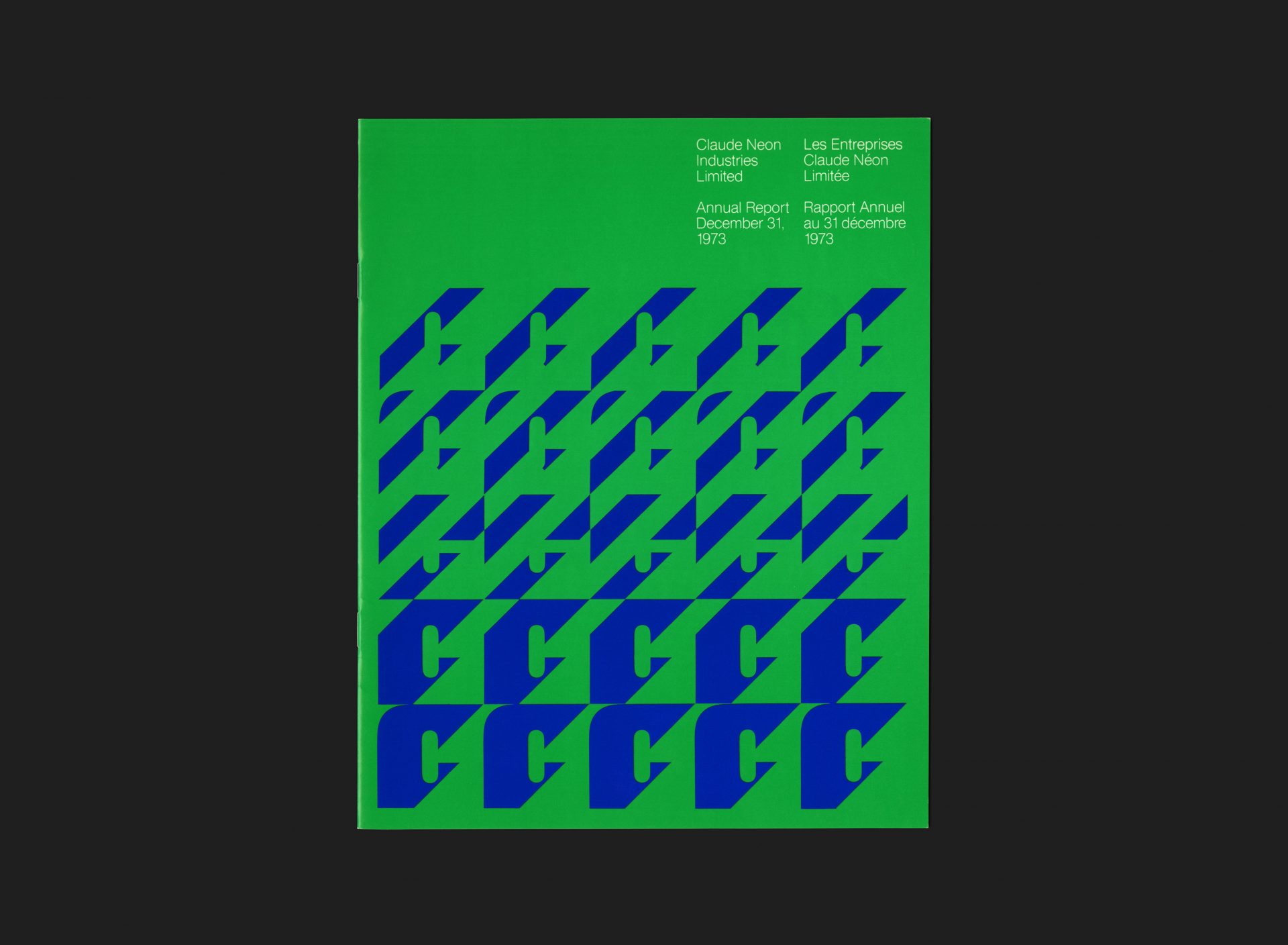
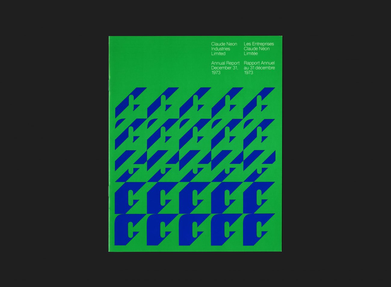
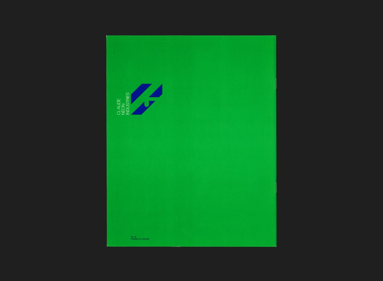
Claude Neon Ltd. was an outdoor advertising company originally founded in 1904 under the name The E.L. Ruddy Company. In 1973 the group of companies went through a process to consolidate all of its operations and subsidiaries under one Claude Neon name. Gottschalk+Ash was appointed to create and launch their new identity. The logo work was developed by Freddi Jaggi under the direction of studio principal Stuart Ash in Toronto (where the client relationship existed) and Fritz Gottschalk in Montréal (where Jaggi also worked). This innovative, flexible identity consisted of five versions of the initial letter “C”, each developed according to a grid, and reproduced in combinations using two of the four base colours (such as the blue/green variant seen here). The overarching theme of the identity was ‘change is the only constant’.
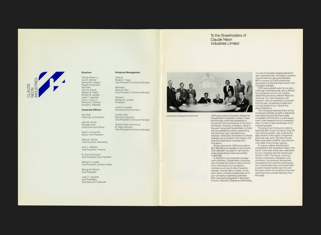
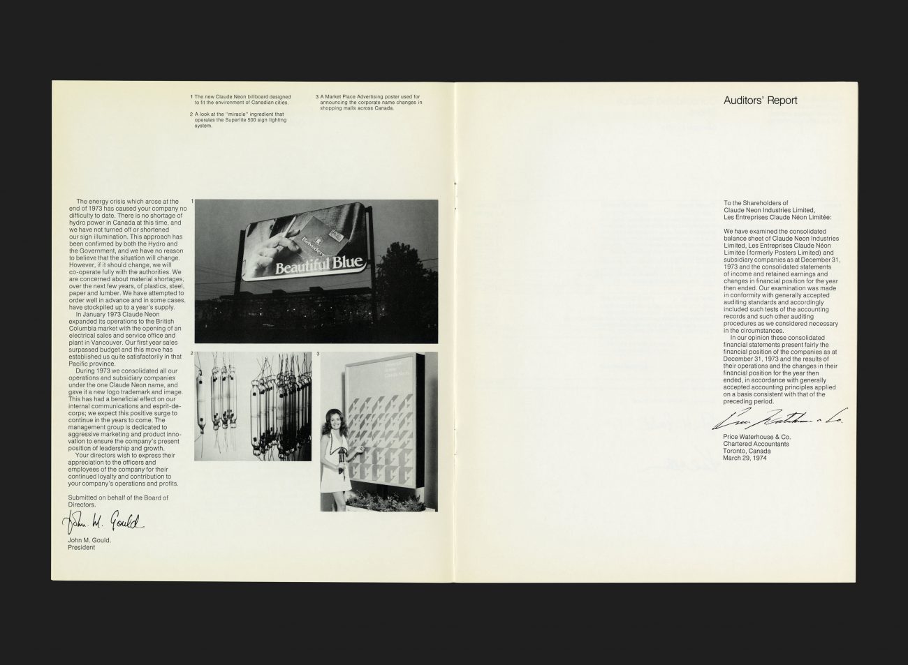
This was the company’s first annual report which coincided with the year the new brand was launched. The document states that the new identity had a beneficial effect on their internal communications and esprit-de-corps and that they expected this positive surge to continue in the years that followed. The management group themselves were dedicated to aggressive marketing and product innovation with the aim of ensuring the company’s market position of leadership and growth was maintained all all costs.
See more Claude Neon artefacts here
All Archives


