Comment
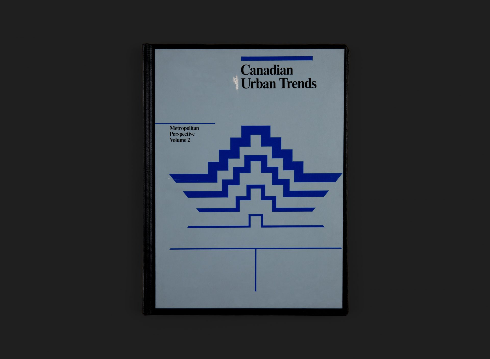
Roslyn Eskind and Malcolm Waddell had only recently departed from Gottschalk+Ash to establish their own practice when they created this, the second in a series of three publications (the first and third Urban Trends volumes were titled National Perspective and Neighbourhood Perspective respectively). The stylised leaf image on the cover represents a growing urban landscape but interestingly employs what feels like a native American aesthetic, like that of a pictograph or petroglyph symbol, perhaps referencing the progression of Canada into a vibrant modern economy.
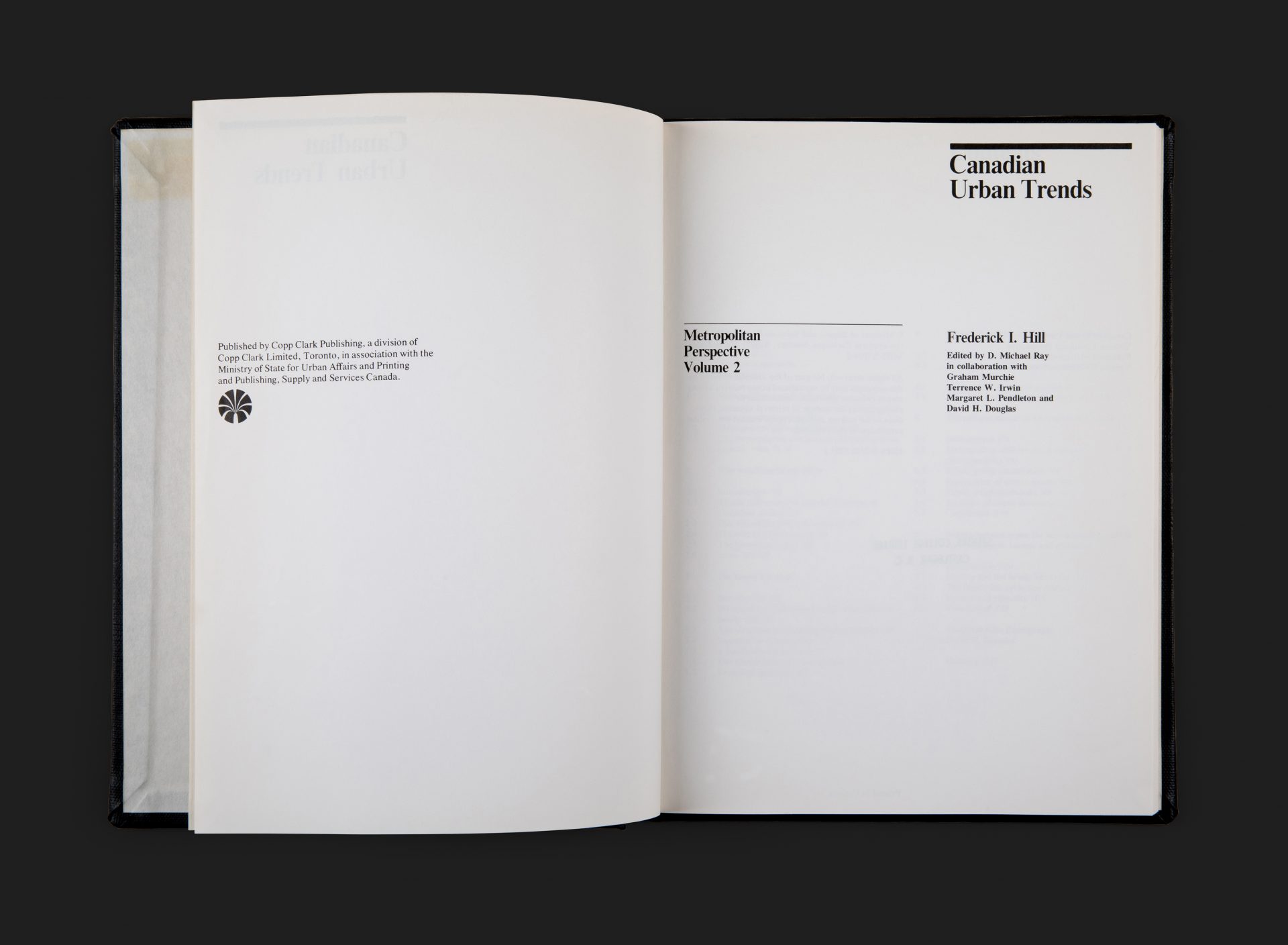
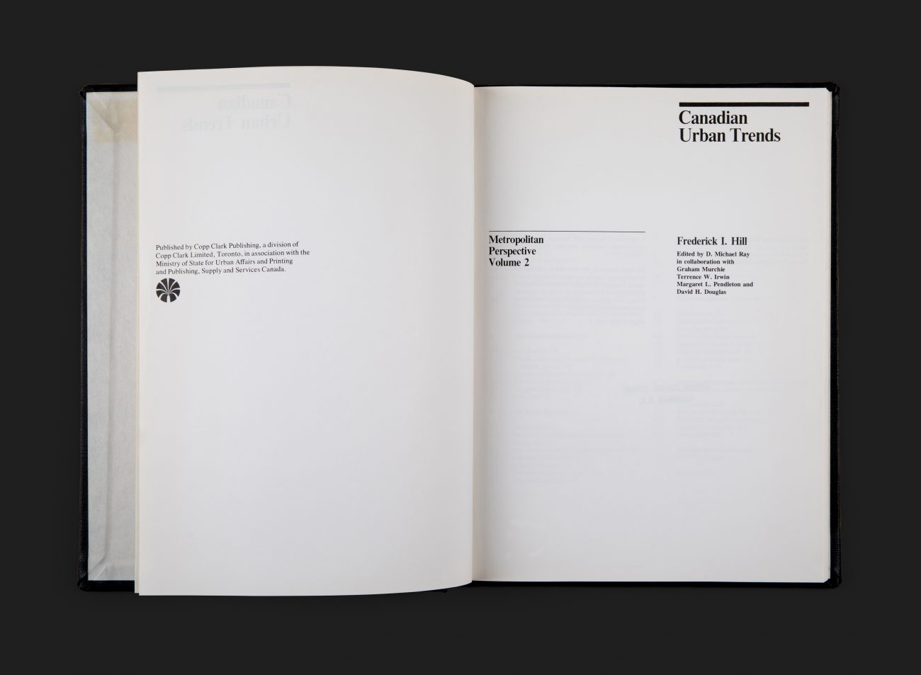
Typography throughout employs the use of a serif typeface which is tightly spaced, and the cover is bound in vinyl with a 2 colour printed label, perfectly applied. Designed in a rigorous International style, but with some warmer humanist typographic choices. A highly competent solution with exemplary skills in organizing what must have been a huge level of complex information.
All Archives
Go Back


