Comment
Among the earliest collaborations between Fritz Gottschalk and the Montreal Museum of Fine Arts, this 1967 catalogue reflects a quietly confident designer already beginning to shape a distinct visual language for one of the country’s most prominent cultural institutions. This piece accompanied a fall exhibition at the Museum before travelling west to the Norman Mackenzie Art Gallery in Regina the following spring.
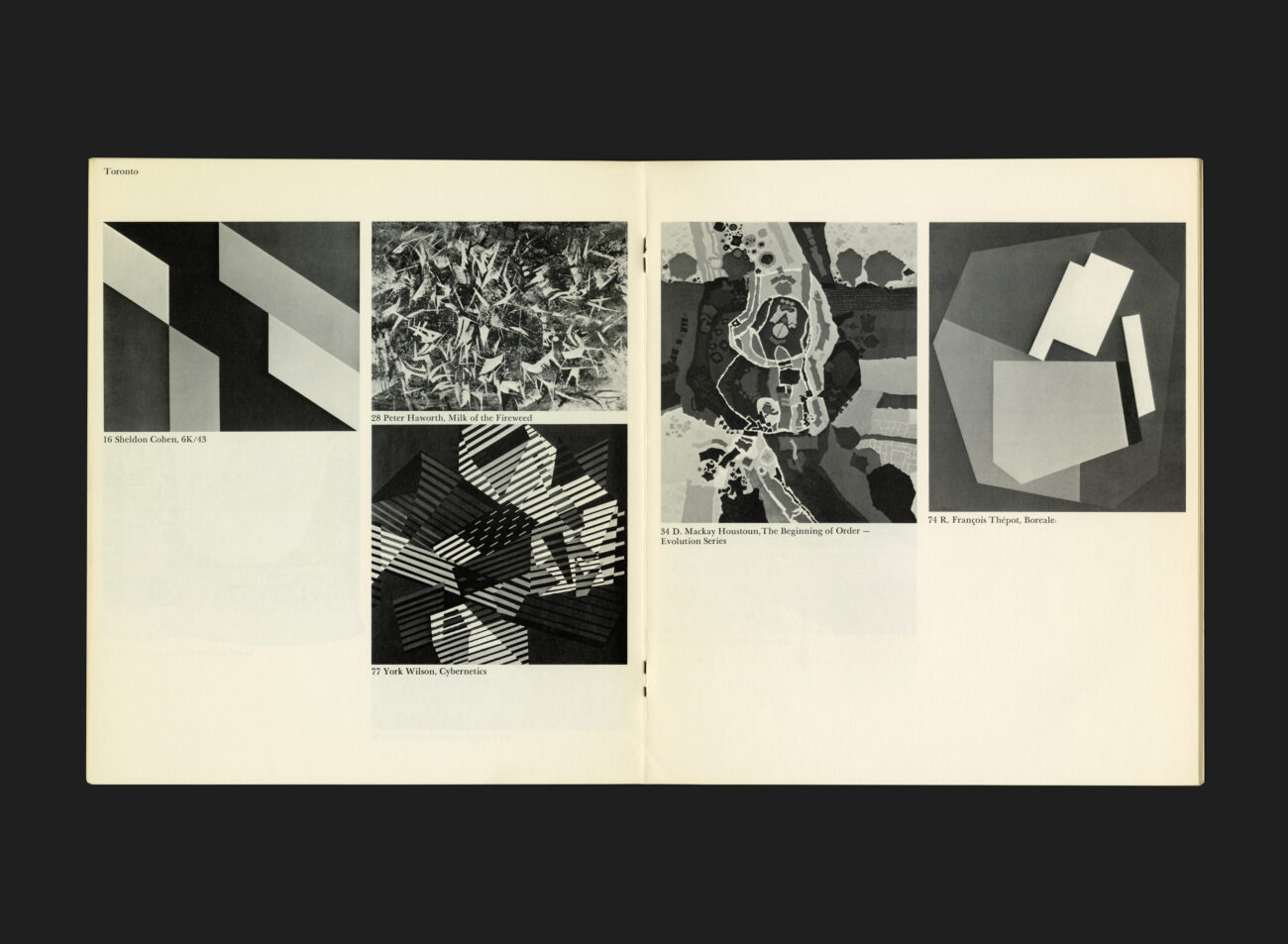
Though modest in scale, the catalogue reveals many of the hallmarks that would come to define Gottschalk’s approach in the decades to follow: intelligent typography, visual restraint, and an overarching clarity of intent. This is design in service of the content, but not at the expense of form.
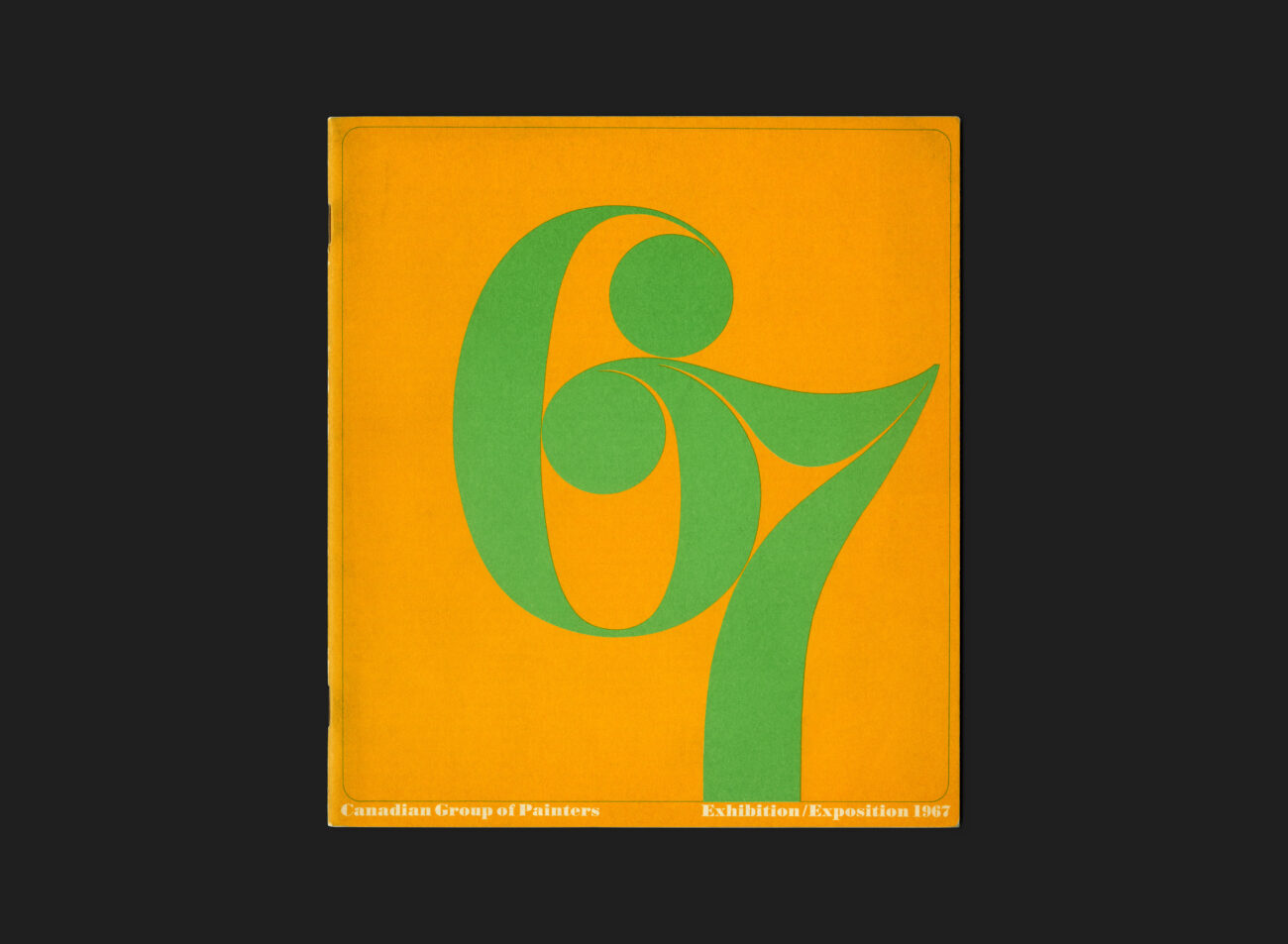
It’s worth noting the historical context: 1967 was Canada’s Centennial, a year of bold optimism and unprecedented cultural output. While Expo 67 dominated headlines, institutions like the Montreal Museum of Fine Arts were quietly expanding their ambitions — reaching across the country, inviting new audiences. Gottschalk’s design work for the Museum, initiated two years prior (1965) and soon to evolve into a long-standing relationship, helped to solidify its visual identity during this formative period.
Printed on uncoated stock. The cover in green and orange ink, and the inside text pages in black ink only. This catalogue stands not only as an artifact of a specific exhibition, but as an early marker in Gottschalk’s Canadian journey — one that would go on to leave an indelible mark on the visual landscape of modern Canada.
All Archives
Go Back