


Trademark: TM75
Title: Brewers Retail
Year: 1964
Designer: Hans Kleefeld
Studio: Stewart & Morrison
Client: Brewers Warehousing Company Ltd.
Sector: Retail, Beer, Ontario
Title: Brewers Retail
Year: 1964
Designer: Hans Kleefeld
Studio: Stewart & Morrison
Client: Brewers Warehousing Company Ltd.
Sector: Retail, Beer, Ontario
In 1927, the government of Ontario succumbed to public opposition and revoked anti-alcohol laws which had been in place for nearly a decade. As part of this shift, the Province distinguished that beer and ale would now be sold through a single network of retail and wholesale outlets, however the government did not want to operate the network itself. To resolve this, the province permitted the opportunity for a new organization to be owned and organized by a consortium of Ontario-based brewers, and thus the Brewers Warehousing Company Limited came to be, using ‘Brewers Retail’ as a consumer facing brand name.
In 1985, Brewers Retail began the process of rebranding its stores as ‘The Beer Store’, a term commonly used by consumers to describe the store. Today, The Beer Store provides in excess of 90% of the beer sales in Ontario, and operates from over 440 store locations, with distribution to the hospitality industry through licensed restaurants and bars, and further more, to government-owned LCBO retail locations.
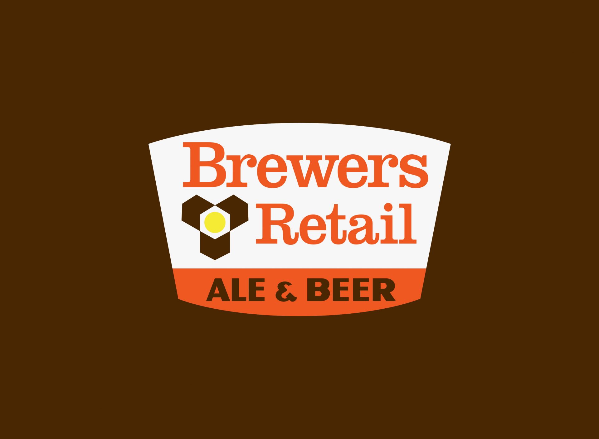
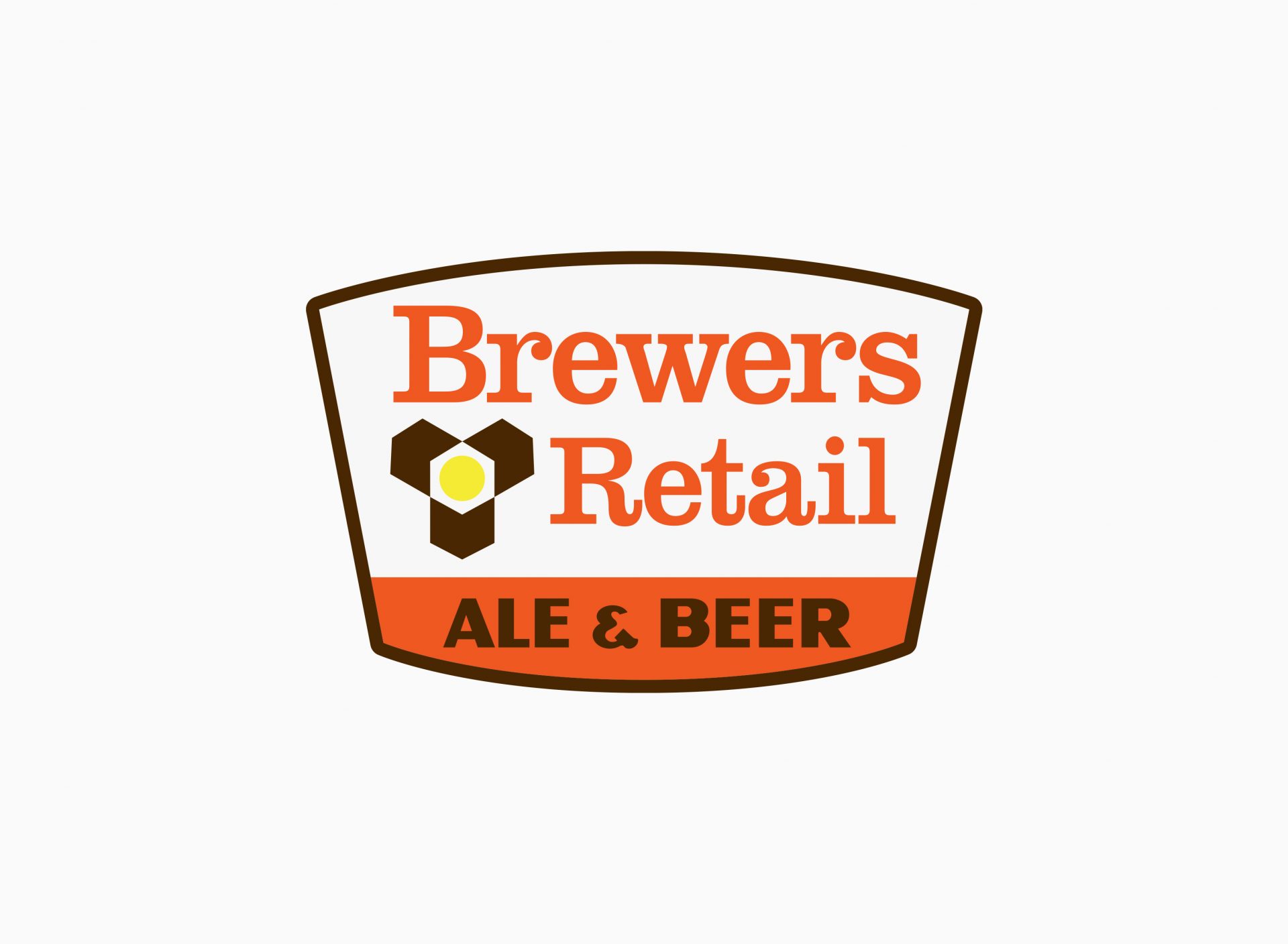
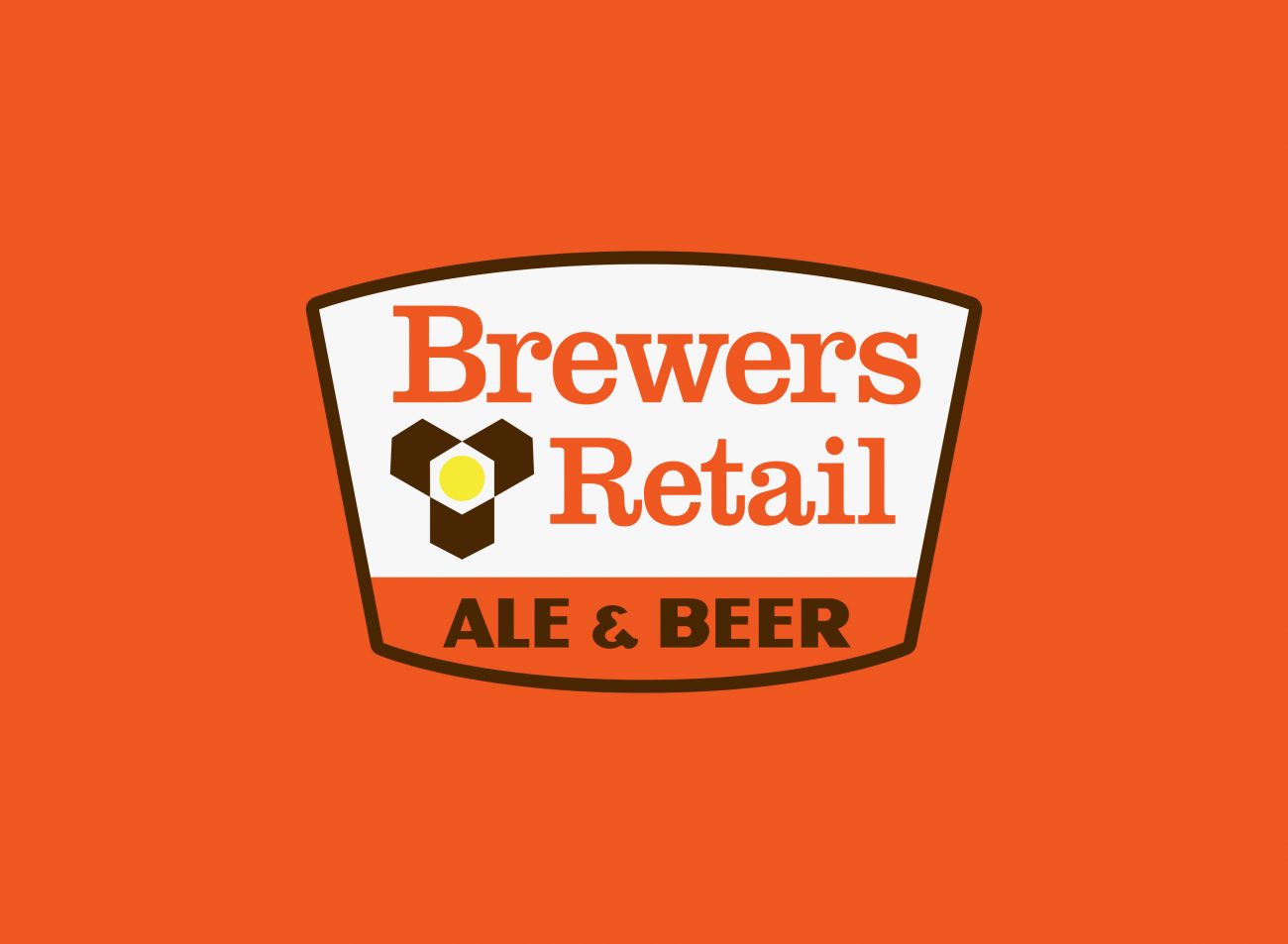
In 1964, a new logo for Brewers Retail was designed by Hans Kleefeld whilst at Stewart & Morrison. This would be one of his earlier projects with the agency, having joined shortly before in the early 60s. The symbol itself is a pure example of modernism, one of reductive, minimal qualities. Whereas, the fuller logo (with wordmark) is a more traditional form of mid-century modern, with its use of the typeface Clarendon and shield shaped container. The symbol depicts an abstracted form of the Trillium flower, the provincial emblem of Ontario, whilst simultaneously evoking the connection to crates and boxes (of beer) — also the view from above, of a bottle itself (the cap represented by the central circle). A further concept of distribution of goods is articulated through the arrow-like elements radiating from the centre. The brand colours: red orange, brown and yellow, provide a distinctive palette for the brand that connect directly to the product itself (beer and coloured glass), yet epitomises the era of modernity, and the visual sensibilities of the time.
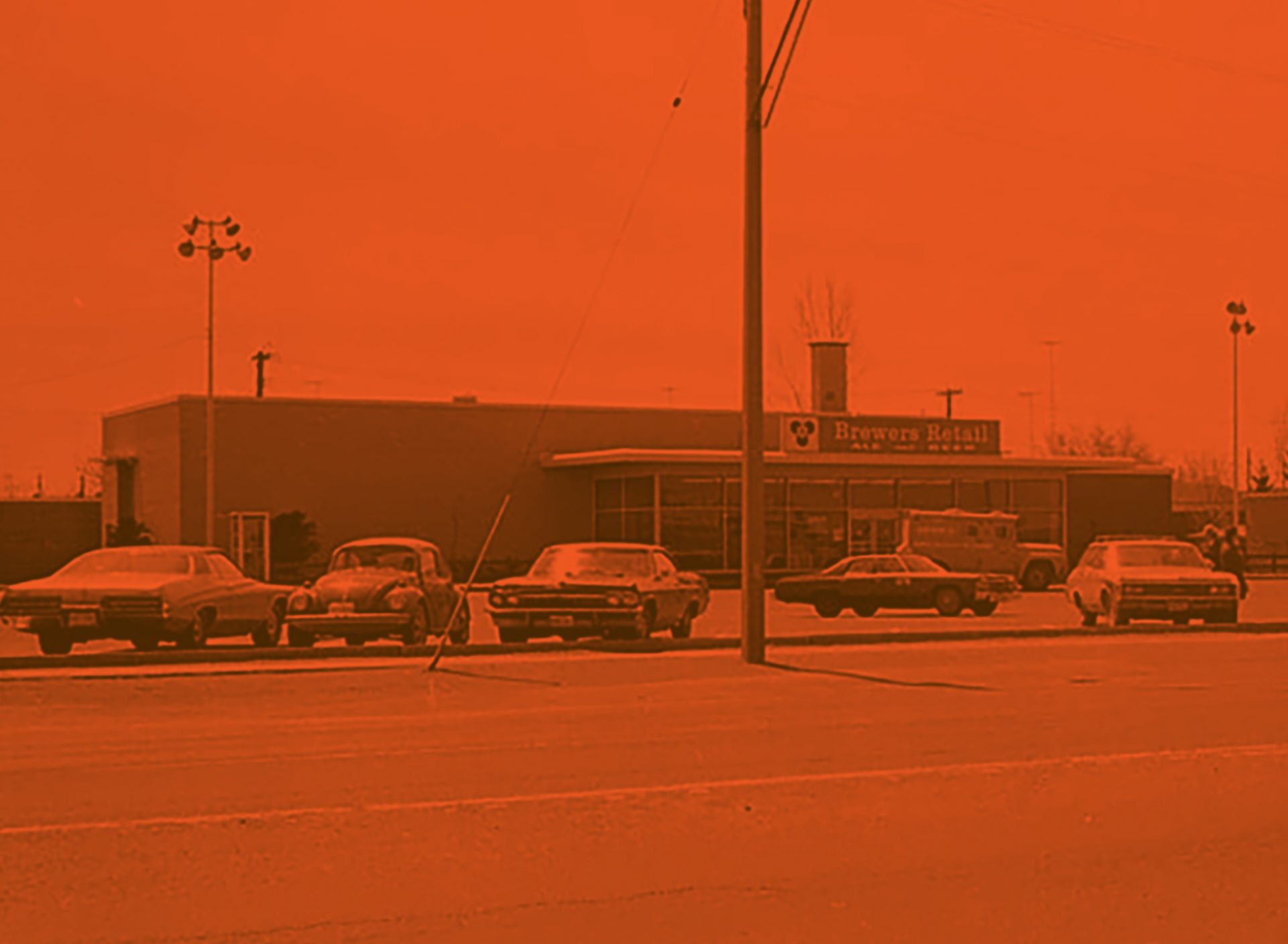
Photo credit (image 9):
Brewer’s Retail, Eglinton Avenue East, Toronto
Copyright was transferred to the City of Toronto by the copyright owner