Comment
Pennwalt Strasenburgh Canada was the Canadian arm of Pennwalt Strasenburgh Laboratories, headquartered in Rochester, New York. Strasenburgh produced and distributed pharmaceuticals internationally with facilities in Canada, Mexico and Ireland. One of Strasenburgh’s core product lines was an amphetamine drug called Biphetamine which was marketed as a an appetite suppressant and prescribed by doctors to help their patients lose weight.
Lawrence Wolf Inc. and Lawrence Wolf (Canada) Ltd. (owned by Larry Wolf) were a design & advertising agency with studios in Buffalo, New York (where the company was founded) and also in Toronto. By 1970 Toronto had become Wolf’s main office with the majority of the companies’ creative output coming out of there. One of Wolf’s larger clients was Strasenburgh. Wolf produced much of Strasenburgh’s branding, advertising, marketing and communications as well as their packaging design.
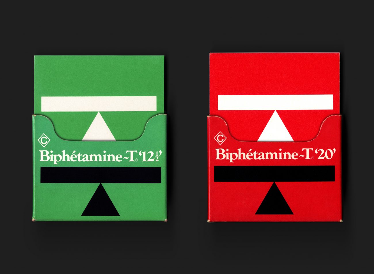
Having spent time ‘in the field’ with Strasenburgh sales ‘detail men’ plus undertaking further discovery and research with Strasenburgh executives, Rod Nash, Wolf’s Creative Director, working with Larry Wolf, became responsible for the identity development of Biphetamine-T, including its packaging and all supporting collateral. The idea behind making a symbolic weigh-scale balance of the ‘T’ was to emphasize a more balanced approach to subscribing appetite suppressants. More balanced than other amphetamines in the market (a market which was increasingly becoming a concern). The two Biphetamine-T packs were in fact sample products, used in sales, to leave behind with doctors for evaluation. Each box housed 2 separate sleeves, each of which housed a sheet of capsules. The green box was used for Biphetamine-T’12½’ and the red box for Biphetamine-T’20’ The number indicated the combined amount of d and dl amphetamine ingredients (of equal amounts) in the drugs. Red being the strongest of the two products. Also the capsules themselves were green (& black) and red (& black).
By the early 1970s there had been increasing concerns over amphetamine addiction, with statistics uncovering that usage of amphetamine-type drugs were common in 5% of all American adults. On the streets, where these prescription drugs had a bigger problem, they were known as ‘Black Beauties’, ‘Black Mollies or ‘Black Widows’ on account of the black on the capsules the drugs were encased in.
All Archives