Comment
The Royal Architectural Institute of Canada (RAIC) was founded in 1907 and today represents over 4,800 Canadian architects, faculty, and graduates of Canadian architectural schools. It’s main purpose is in acting as the voice for architecture and its practice in Canada and provide the national framework for the development and recognition of architectural excellence.
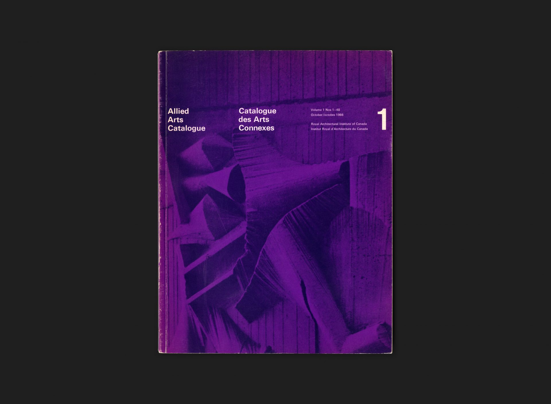
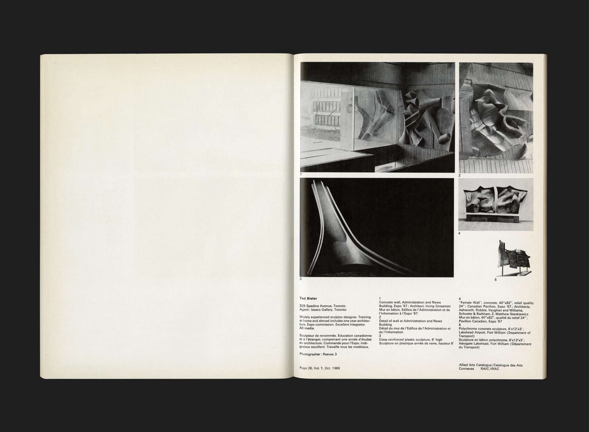
This was the first volume of the RAIC’s Allied Arts Catalogue (it is believed there were only ever 2 volumes published in this format), illustrating the work of 48 artists as a representation of the work of Canadian professional artists in those fields of the arts allied to architecture. The function of the catalogue was primarily to assist architects, other practitioners and professionals in the selection of artists who work within the architectural sphere, by showcasing examples of their work and distinctive techniques.
Produced by Anthony Mann during the period he was a partner of Design Collaborative with Rolf Harder and Ernst Roch (in Montréal) and Al Faux (in Toronto with Tony). It is believed that Mann worked regularly with the RAIC as many of their journals and publications during this period share a visual cohesion with this catalogue — which is credited to him. The cover focusses on a concrete wall sculpture by Toronto based artist Ted Bieler, featured on the Administration and News building at Expo 67 (architect Irving Grossman). The image is overprinted in blue onto a purple background. Typography throughout is in Univers (which was the corporate typeface during this period) and set on grid in the international style. Text pages are generous in that they are printed on one side only adding further emphasis on the artist and their work. Most pages are in black ink only, although there are a few occasional spots of full colour scattered throughout.
SIDENOTE
The cover image was later used by Design Collaborative partners Harder and Roch within the Design Canada XIV Triennale Milan catalogue (but treated in blue rather than purple). You can see this here.
All Archives
Go Back


