


Trademark: TM78
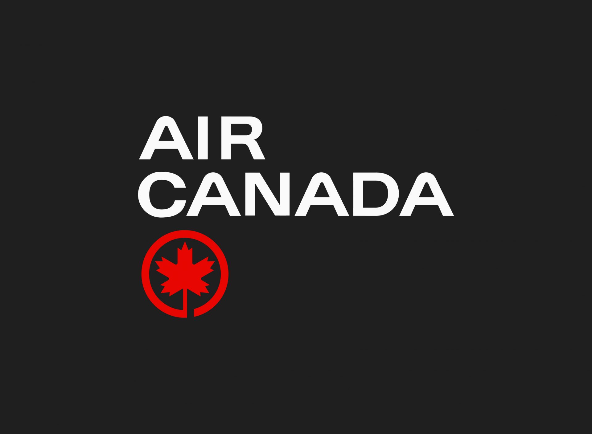
Title: Air Canada
Year: 1963
Designer: Hans Kleefeld
Studio: Stewart & Morrison
Client: Air Canada
Sector: Travel, Airline
Title: Air Canada
Year: 1963
Designer: Hans Kleefeld
Studio: Stewart & Morrison
Client: Air Canada
Sector: Travel, Airline
In April, 1936, the Canadian government formed Trans-Canada Air Lines (TCA) as a subsidiary of the Canadian National Railway (CNR). This came as a result of the need for a carrier to link cities on both sides of the country and with larger commercial aircraft making this possible. Early flights in 1937 consisted of a mix of both passenger and mail services, however, passenger services began to grow in popularity, and the airline soon found itself employing its first flight attendants by the summer of 1938.
By the close of the decade, just 4 years after its inception, TCA had grown to around 500 members of staff. Growth, further reinforced by the launch of its first transcontinental flights in the spring of 1939. In the decades that followed, the airline grew exponentially, consistently taking an innovative approach and achieving many ‘industry firsts’. In 1953, the carrier became the first international airline to utilize computers with remote terminals for reservations, and in 1963, it further pushed it’s progressive approach by being the first airline in the world to replace its piston-power fleet with an all-turbine and jet fleet.
Due to the continued expansion, global reach, and a bid to better connect it with the world in the new era, a bill was proposed in 1964 to change the airline’s name. The name Air Canada was made official on New Year’s Day 1965.
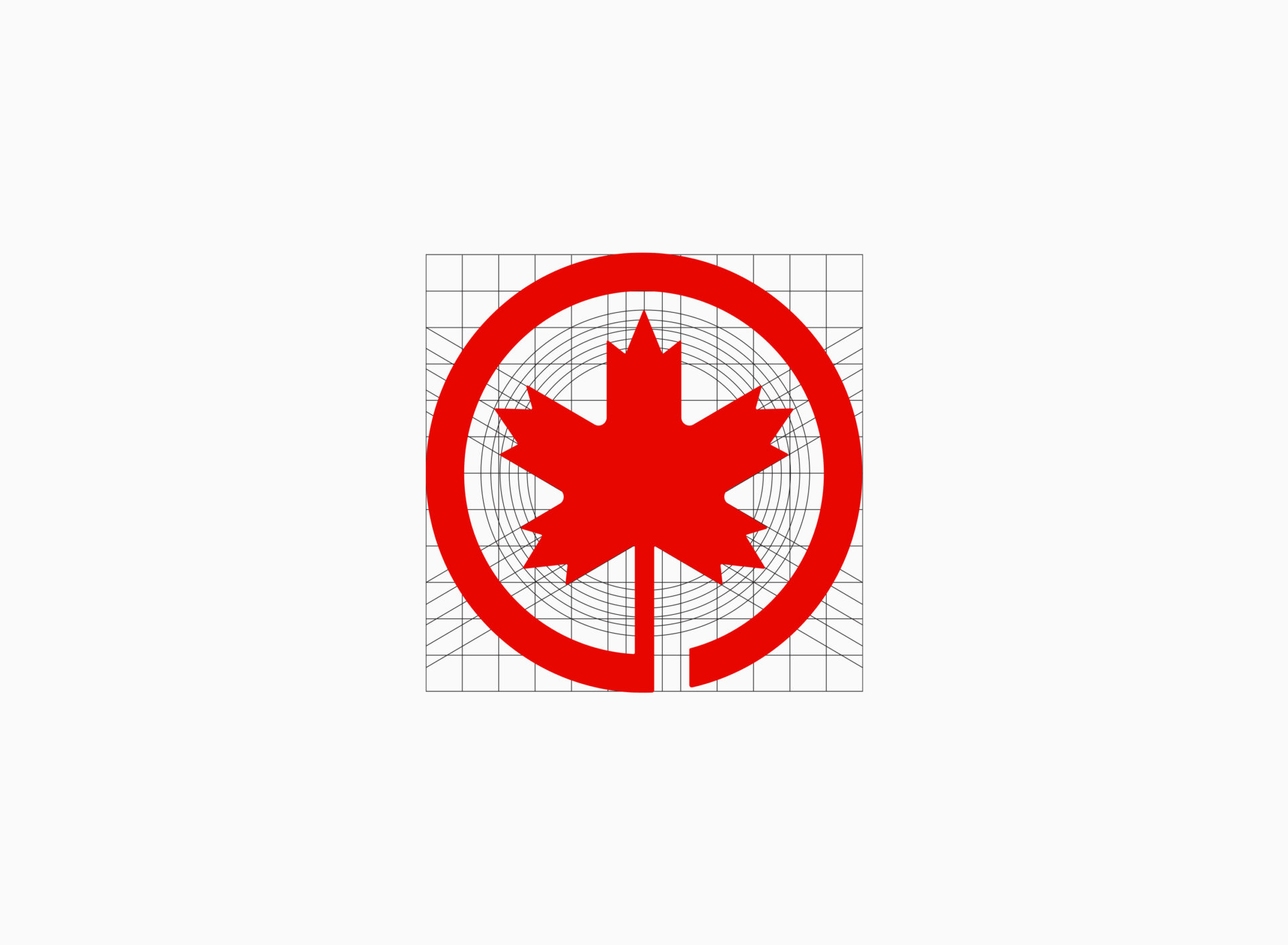
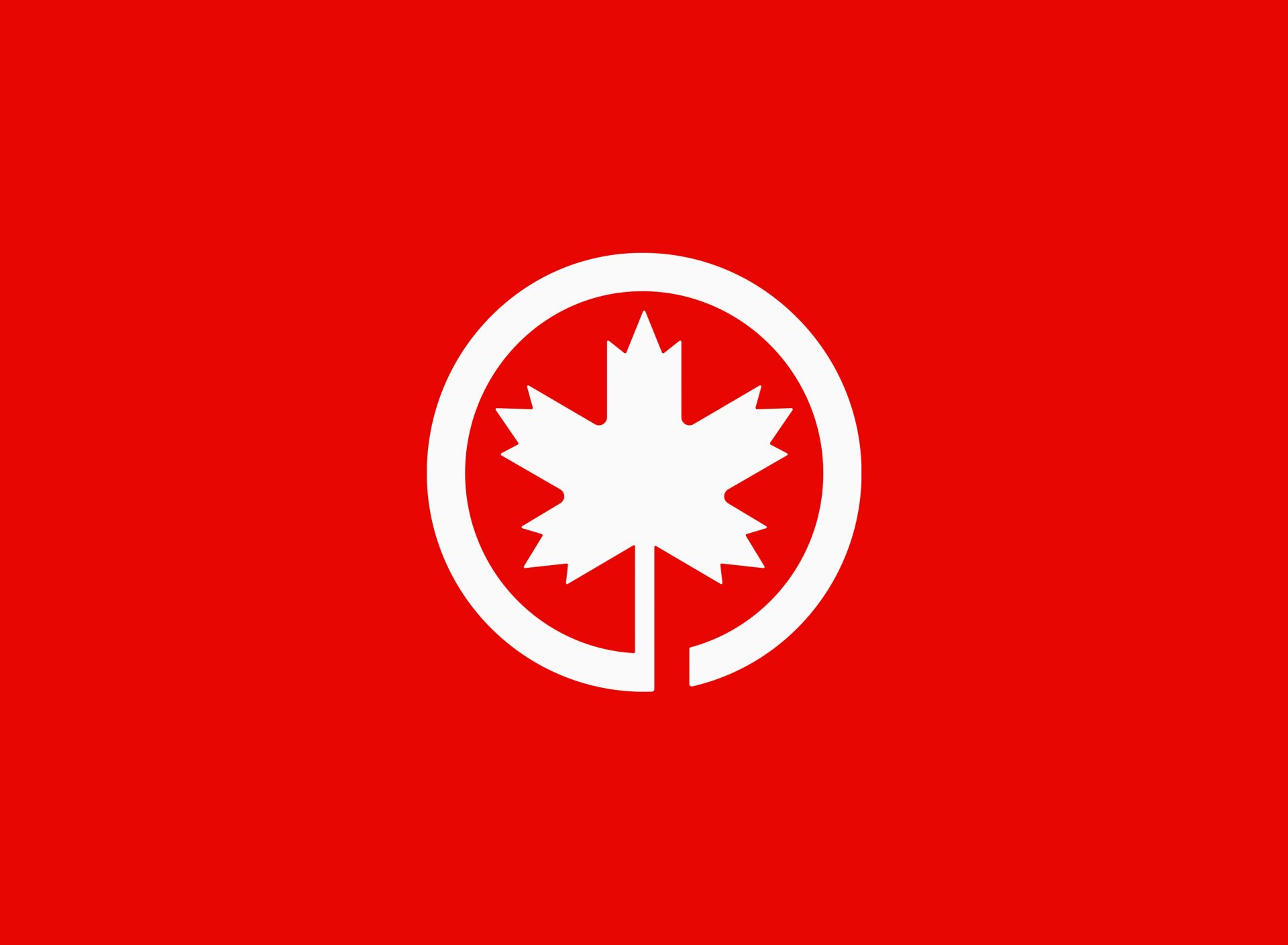
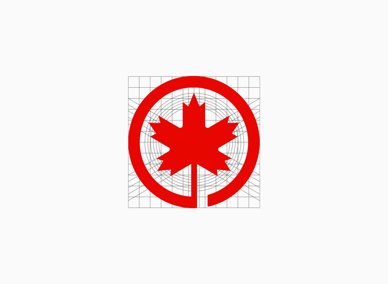
Ahead of the bill being passed, TCA commissioned Stewart & Morrison Limited (in 1963) to design its new new insignia as part of the change to Air Canada, it was felt by both the airline and the designers that, once launched, the momentum of the ‘new look’ must be maintained. The former TCA logo included a hand rendered maple leaf emblem, embedded within a circle. It was decided, on account of the maple leaf being universally recognized as Canada’ national symbol, that this must be retained. Hans Kleefeld took this as a starting point but completely redesigned the symbol, taking a cleaner, more contemporary and stylized approach, incorporating a broken circle at the bottom that starts at its stem. Canada in the centre, leading to travel around the globe. A representation, of an Air Canada passenger’s journey. Simple but ingenious.
This was easier to envision than to accomplish. Even for a corporation the size of Air Canada, the implementation of the initial phase was in itself a major project. Great resources were required to repaint and identify a fleet of aircraft, whole divisions of ground vehicles, hundreds of ticket offices in Canada and abroad, as well as produce thousands of new printed items.
The evidence of public and passenger reaction to the Air Canada visual identification programme, both at home and abroad, was rewarding. It encouraged the management of Air Canada to continue a policy of giving effective graphic expression to its corporate personality.
Stewart & Morrison continued to work in close relationship with the airline. One of the larger projects that followed, included the design of Air Canada ticket and check-in area at the then new Vancouver International Airport. This included a back wall that presented an exciting interpretation of cloud forms combined with diagonal red panels symbolic of the fins and rudders of Air Canada airplanes. This project required the use of an innovative new technology — individual, six by four foot panels of screen processed vinyl film.
Today, Air Canada remains the country’s flagship carrier and the largest airline of Canada by fleet size and passengers carried. The symbol still resembles the same basic concept of Kleefeld’s original, but was redesigned to be more ‘natural’ and ‘human’ in appearance in 1994. It has since gone through several brand refreshes, mainly in terms of the wordmark typography and it’s relationship with the symbol.