Comment
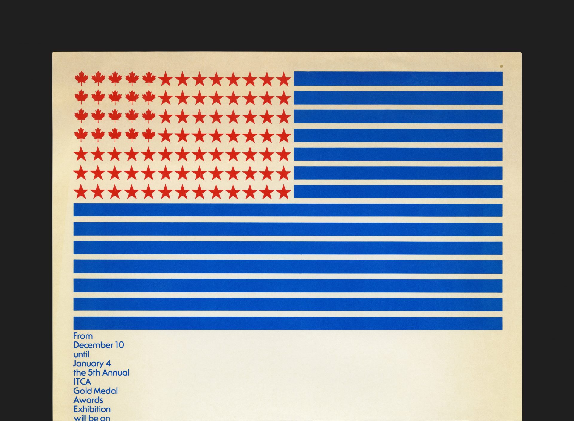
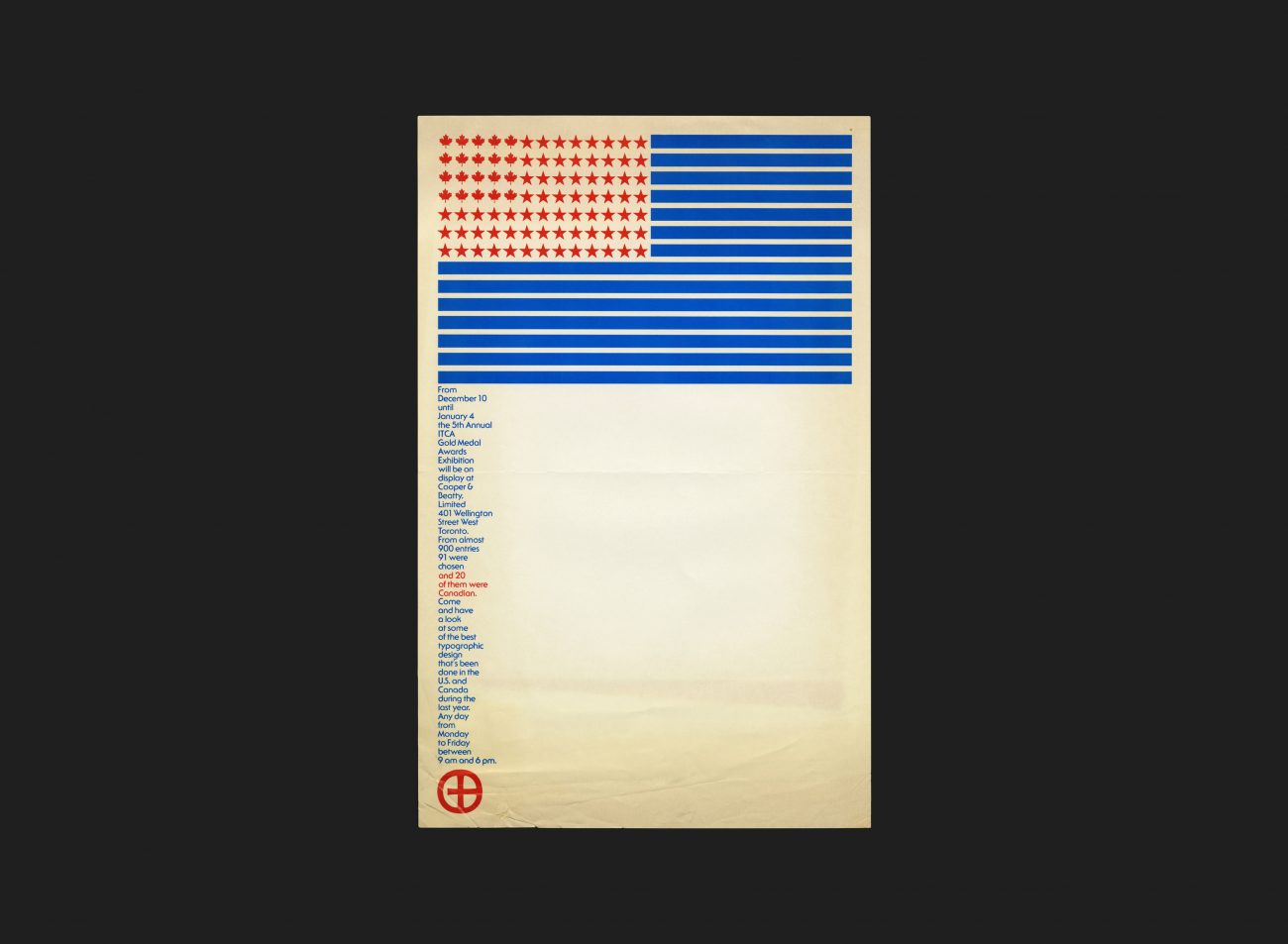
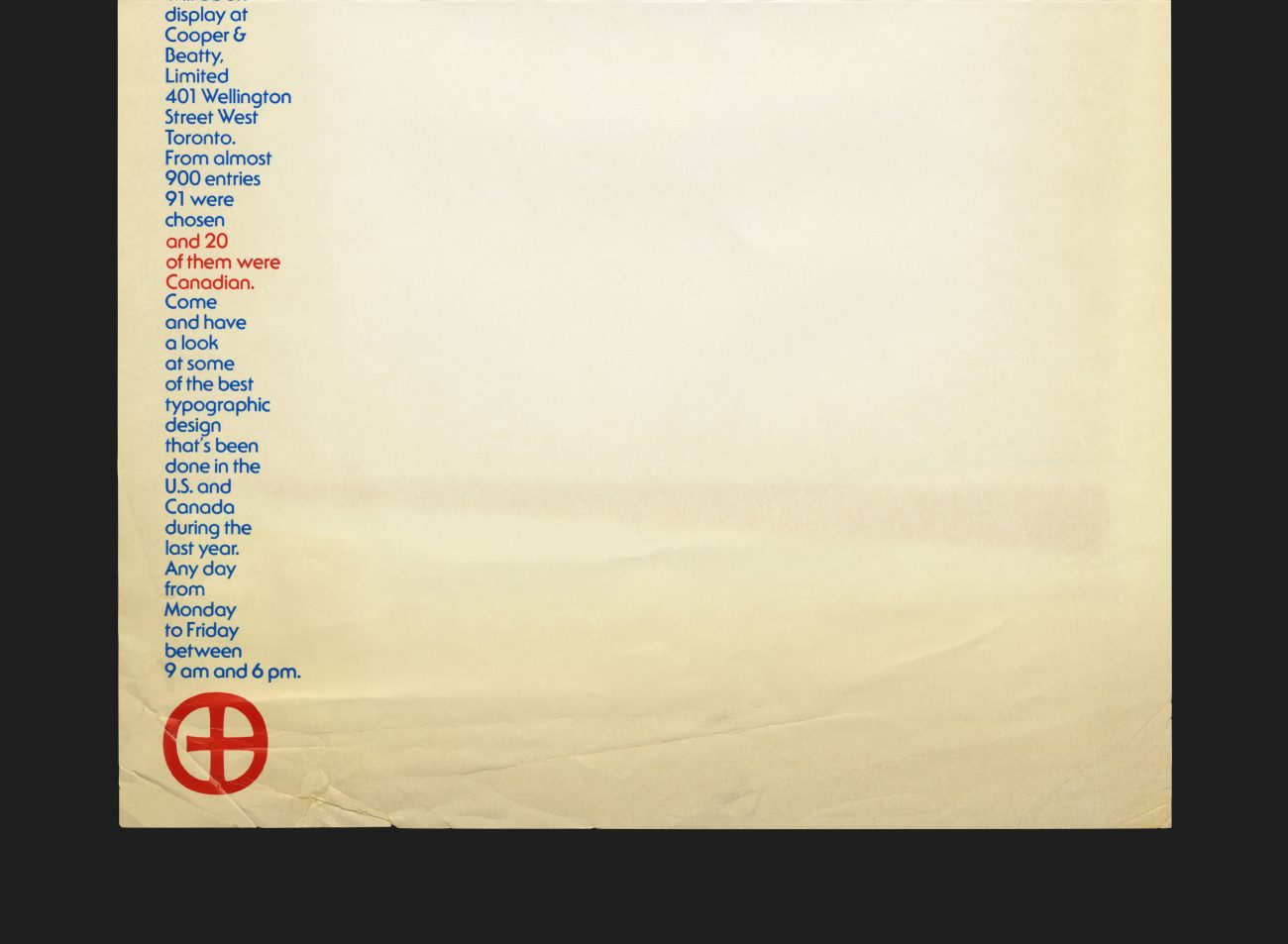
A small poster for an exhibition held at Cooper & Beatty on Wellington Street West, Toronto. The event was staged to showcase the Canadian gold medal winners of the 5th annual ITCA (International Typographic Composition Association) competition. The awards saw nearly 900 entries, of which 91 winners were finalists — 20 originating from Canada. All were judged for their typographic excellence.
The ITCA was founded in Philadelphia, in 1920, and established to represent the interests of typesetters and typesetting companies within the printing industry in the USA and Canada.
The design of the poster presents a clever graphic and typographic composition. The American flag sits, emblazoned across the top half of the sheet. The stars, 71 in total, represent all of the US winners. However on closer inspection, in the top left quadrant of this formation, sits 20 maple leafs, one for each of the Canadian gold medalists. The copy for the poster is set in a narrow single column running down the left hand edge and visually acts as the flag pole supporting the flag above. The poster is printed in red and blue ink only on a semi-gloss coated sheet. Type is set in ITC Serif Gothic, designed by Herb Lubalin and Antonio DiSpigna which was released the year before in 1972. At this time, the font was seen to be quite a progressive development, with its uniquely designed serifs, combining gothic clarity together with traditional roman elegance (providing the readability of a roman and the simplicity of a sans serif). In this same year, the type family was used for the identity for the ATypI conference, held in Copenhagen.
All Archives